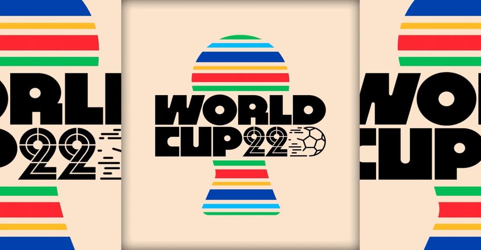
From drop shadows to Memphis design motifs, these retro logos will inevitably take you back to the ‘Blade Runner’ decade.
A good logo is meant to evolve with the times. Just look at the countless iterations the Microsoft logo has gone through since the company launched in 1975. But what happens when logos travel back in time instead of forward?
Portuguese graphic designer Rafael Serra has created more than 100 variations of famous logos from companies including Playstation, Nike, and Instagram rendered in an ultra-retro style that is reminiscent of the ’80s and ’90s.
“I was a child from the ’80s, I grew up seeing retro things,” says Serra, who was fascinated by objects like VHS tapes, cassette tapes, and graphic design on magazine covers from a young age.
In one iteration, Serra’s Spotify logo boasts a bold, purple typeface set against a flattened globe, with the brand’s name translated in Japanese. In another, the Ikea word mark is rendered in light pink, blocky letters, straddled by two intersecting ovals.
The logos are a survey of stereotypical ’80s design motifs. There are drop shadows and sans-serif fonts; circles, lines, and geometric motifs reminiscent of the Memphis design movement; and myriad references to space, like Saturn’s rings and stars.
Some of the companies that Serra included in his series already had logos in the ’80s, but none of them looked as distinctly ’80s as his renditions. Ikea’s now iconic blue-and-yellow logo first appeared in 1967 and has remained largely unchanged since. Coca-Cola’s logo has barely changed since the 1880s.
Serra has been drawing a logo every day for the past three years. The resulting collection is more of a lettering art project than a brandingexercise, but it makes up an interesting (and fun!) repository of retro symbols and trends.
“One thing I like is to mash up different shapes,” Serra says. “My work is a combination of forms, shapes, and textures that resembles that time with fonts from our time.”
ENDS
—
This article first appeared https://www.fastcompany.com
Seeking to build and grow your brand using the force of consumer insight, strategic foresight, creative disruption and technology prowess? Talk to us at +971 50 6254340 or engage@groupisd.com or visit www.groupisd.com/story


