The right words will shape the entire experience.
User testing = trainwreck. We need a writer.
That’s what a former coworker texted me at 11pm one Tuesday night. She was a talented product designer, and she understood the importance of good UX writing. Now, she knew she needed help.
She had recently joined a well-funded startup, and her first few months had been intense. She was tasked with redesigning the company’s most important product. It was going well, she thought.
She was able to simplify the most complicated flows and reduce most of the clutter in the interface. She even polished off a beautiful high-fidelity prototype for testing. But her team didn’t include any writers. And when she put the product in front of users, the words weren’t working.
We got on a Zoom call early the next morning. I asked her what she thought was wrong about the writing. “That’s the thing,” she said. “There’s nothing wrong.”
Every participant had made it through every flow. They all had nice, if predictable, things to say about the product. A lot of them used words like simple and easy. But they didn’t say much more. Asked to describe the product, they blanked. Or repeated themselves. Simple. Easy. Simple. Easy.
There wasn’t anything wrong with the writing. But there wasn’t anything memorable about it either. The product wasn’t broken, it was just boring. It didn’t have any personality.
So we made a plan to fix it.
The product wasn’t broken, it was just boring.
We spent the next several weeks collaborating. Writing and designing in the same massive Figma file. We created a new tone of voice, defined a writing style, and started using language that would better pay off on the product strategy. We updated every screen in the prototype, refining the UI along the way and changing nearly every word.
At the next round of user testing, participants didn’t just know how to use the product. They actually liked using it. The product was still simple. But now it was also unique and modern and smart.
The difference? The writing. It’s possible to add personality in many ways. With colors, typefaces, illustrations, motion, and sound. Here’s how to do it with words.
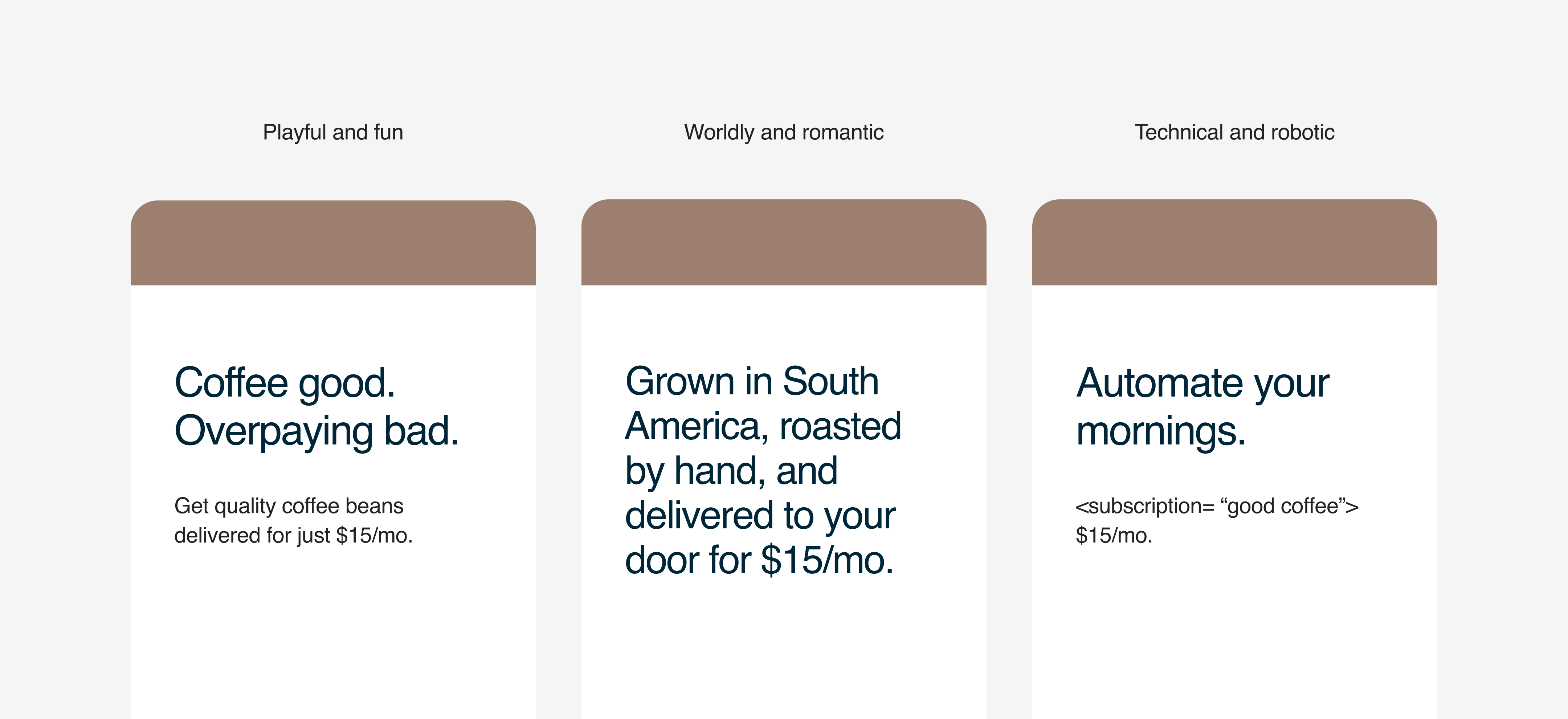
Build a voice from the beginning.
Shape the experience from the very first screen. The first sentence or two will start creating a personality and shaping expectations. Maybe it’s a matter-of-fact value prop. Or an interesting headline. Or a point of view about the world. The important thing is that it sounds like your brand, engages your users, and sets the tone for everything that follows.
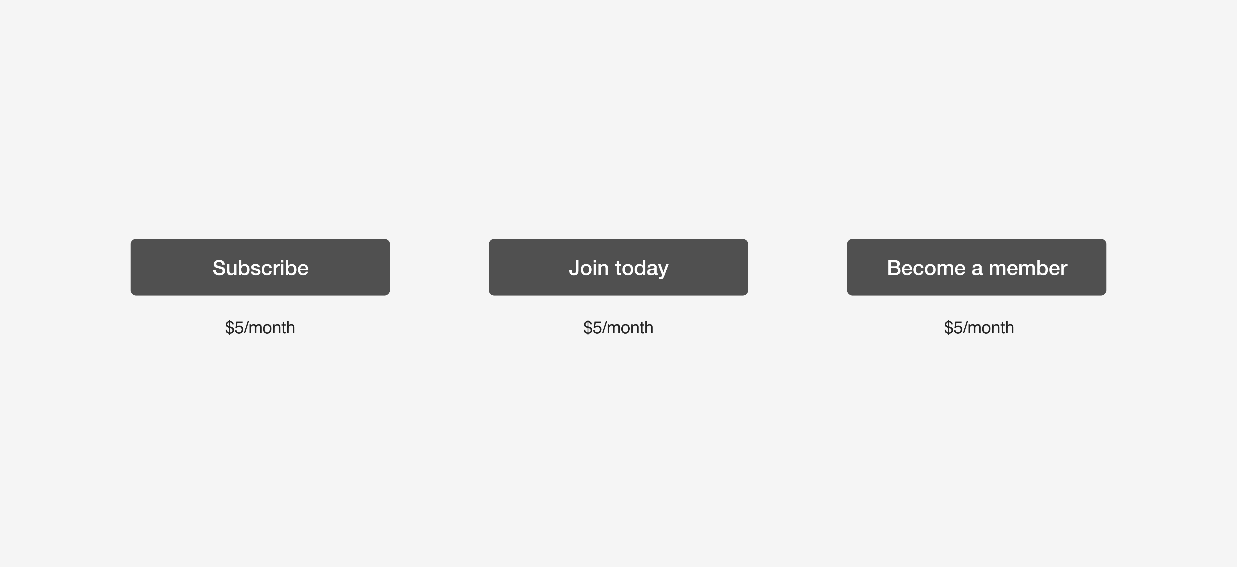
Be thoughtful about vocabulary.
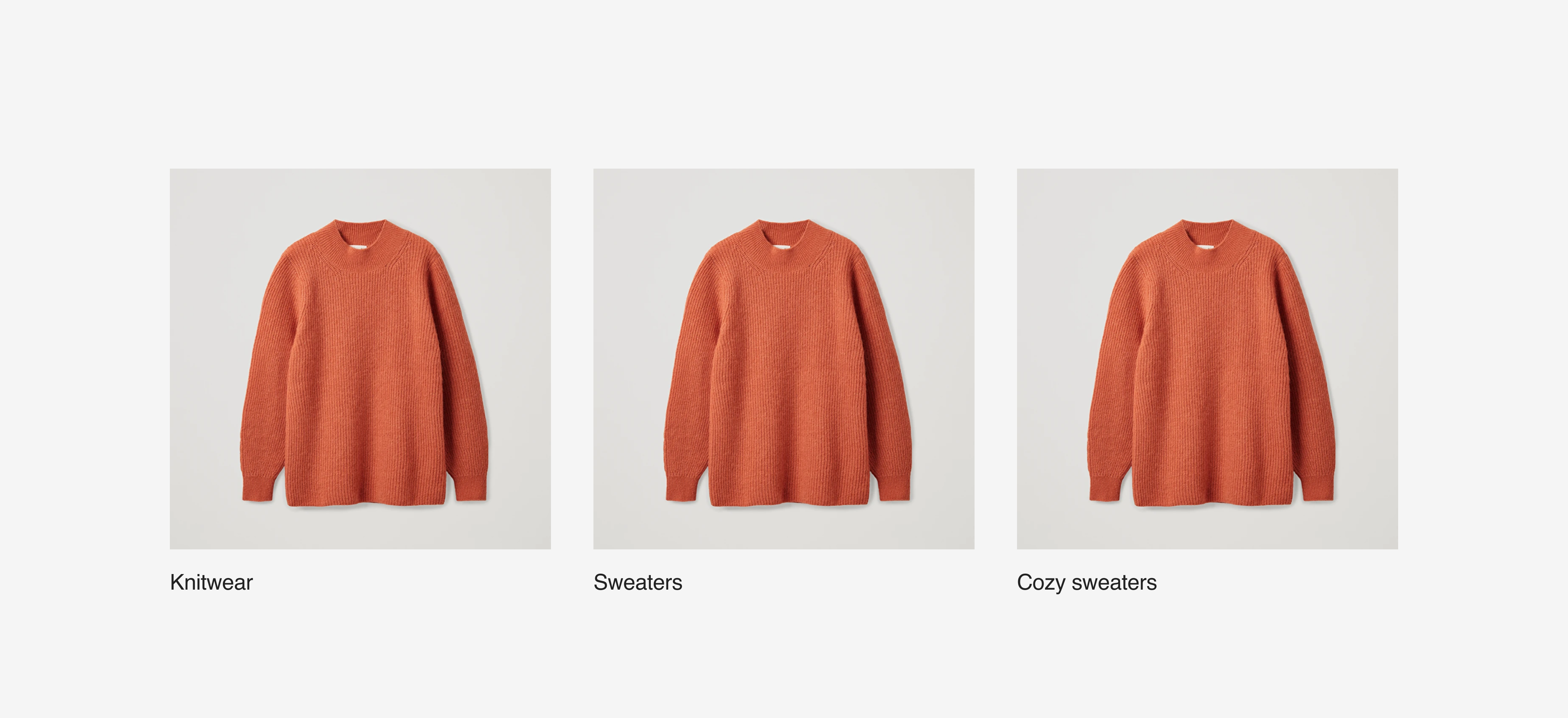
A single word or two can completely change the perception of the product. All those little features, categories, and actions? They need to be named and organized in a way that reflects the brand. In other words, be careful what you call things.

Create the right content.
Good content makes the product match the brand. It helps users understand the experience and recognize what a company stands for. Sure, how you write is important. But so is choosing what to write in the first place. Those two things need to work together. So think about all the articles, FAQs, and extra flows that can shape your product.

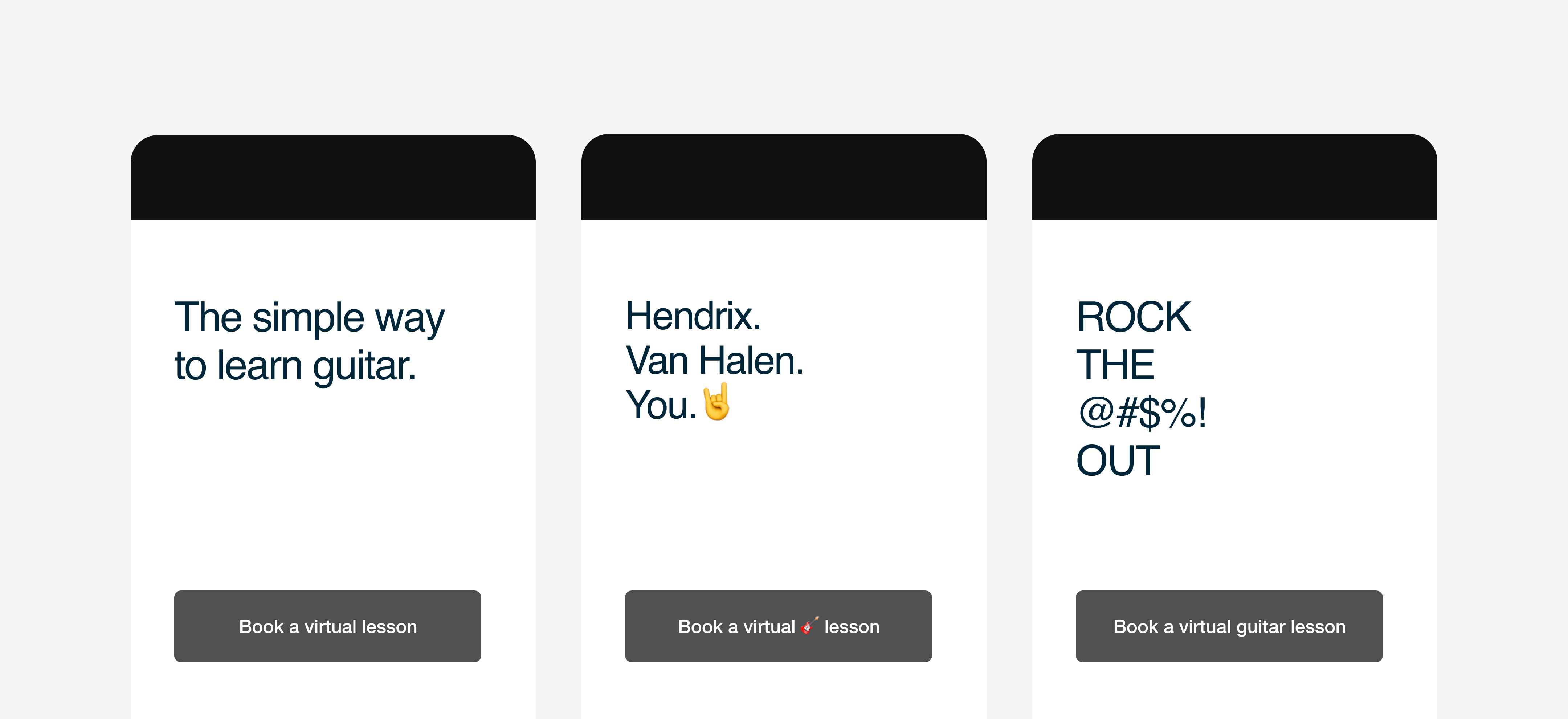
Find moments to add brand voice.
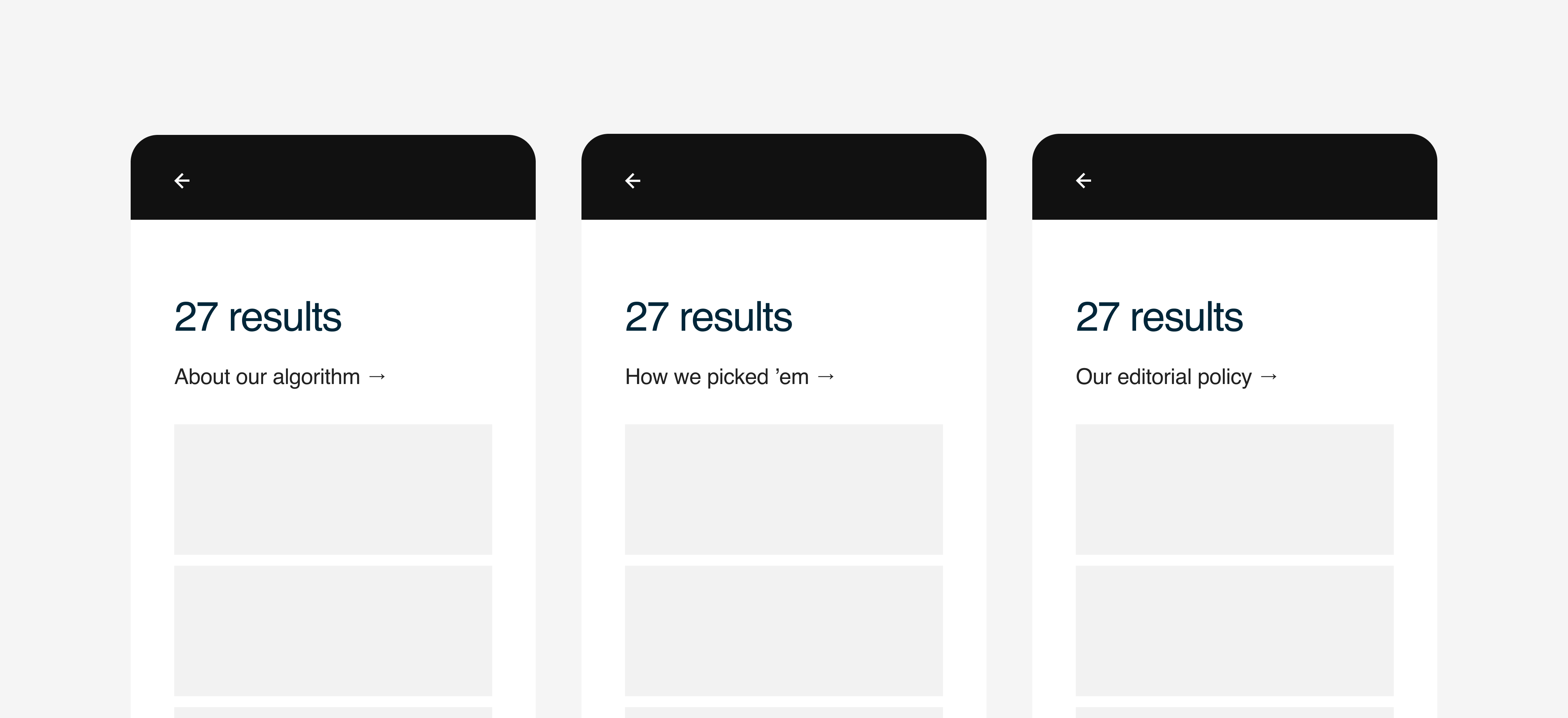
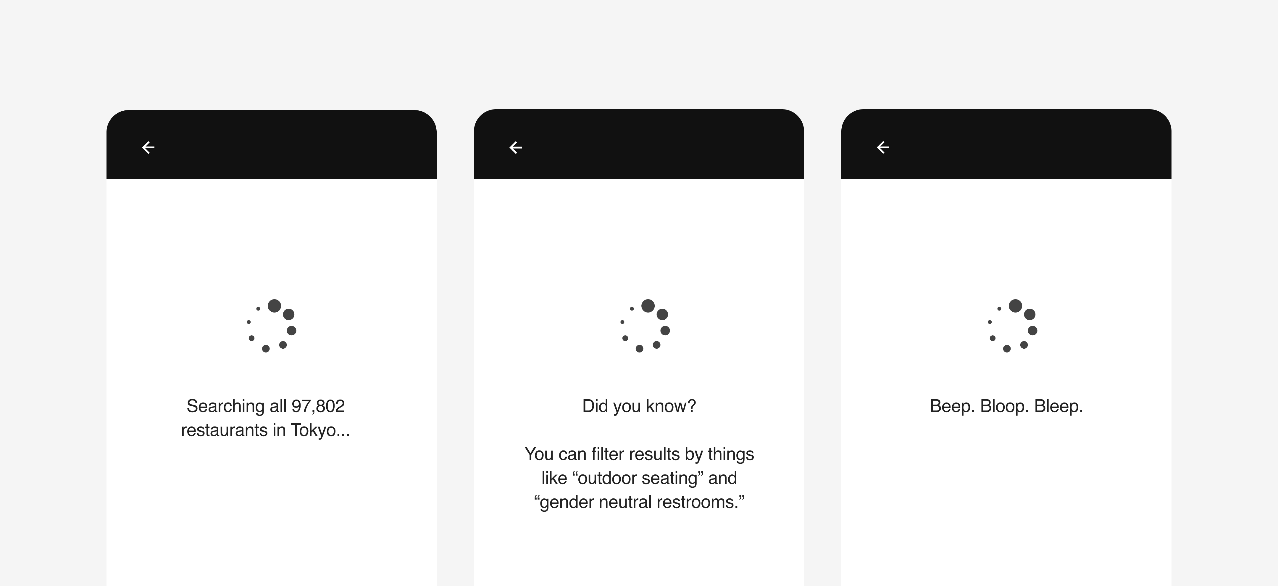
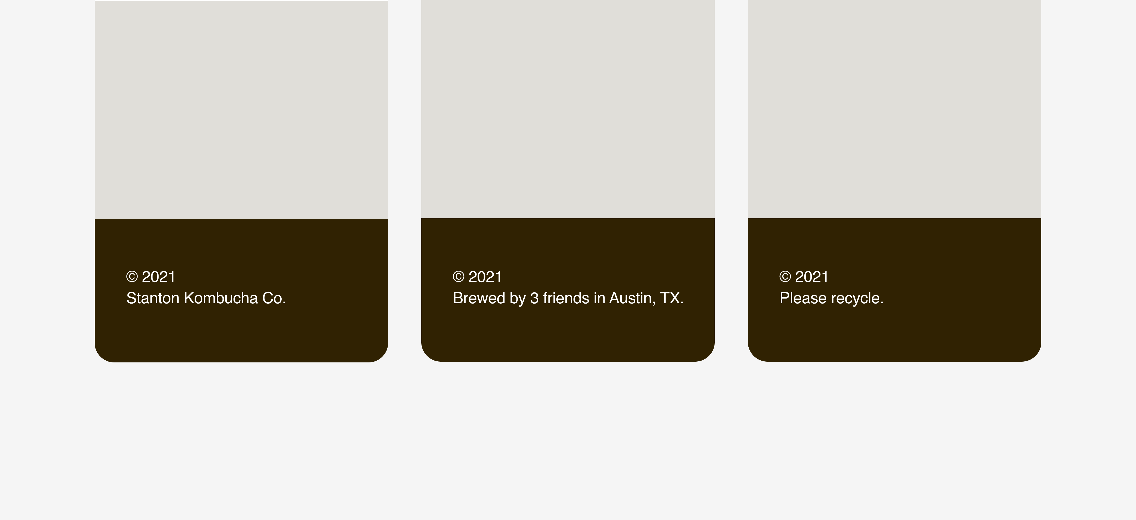
Some people call this “microcopy.” I never liked that phrase, because it makes the writing seem unimportant. The opposite is true. Loading screens, error messages, footers. Those details all matter. Each is an opportunity. Small pieces of writing should help users understand the interface and get a feel for the brand. Write them with the same attention and thoughtfulness as longer, bigger pieces of writing.
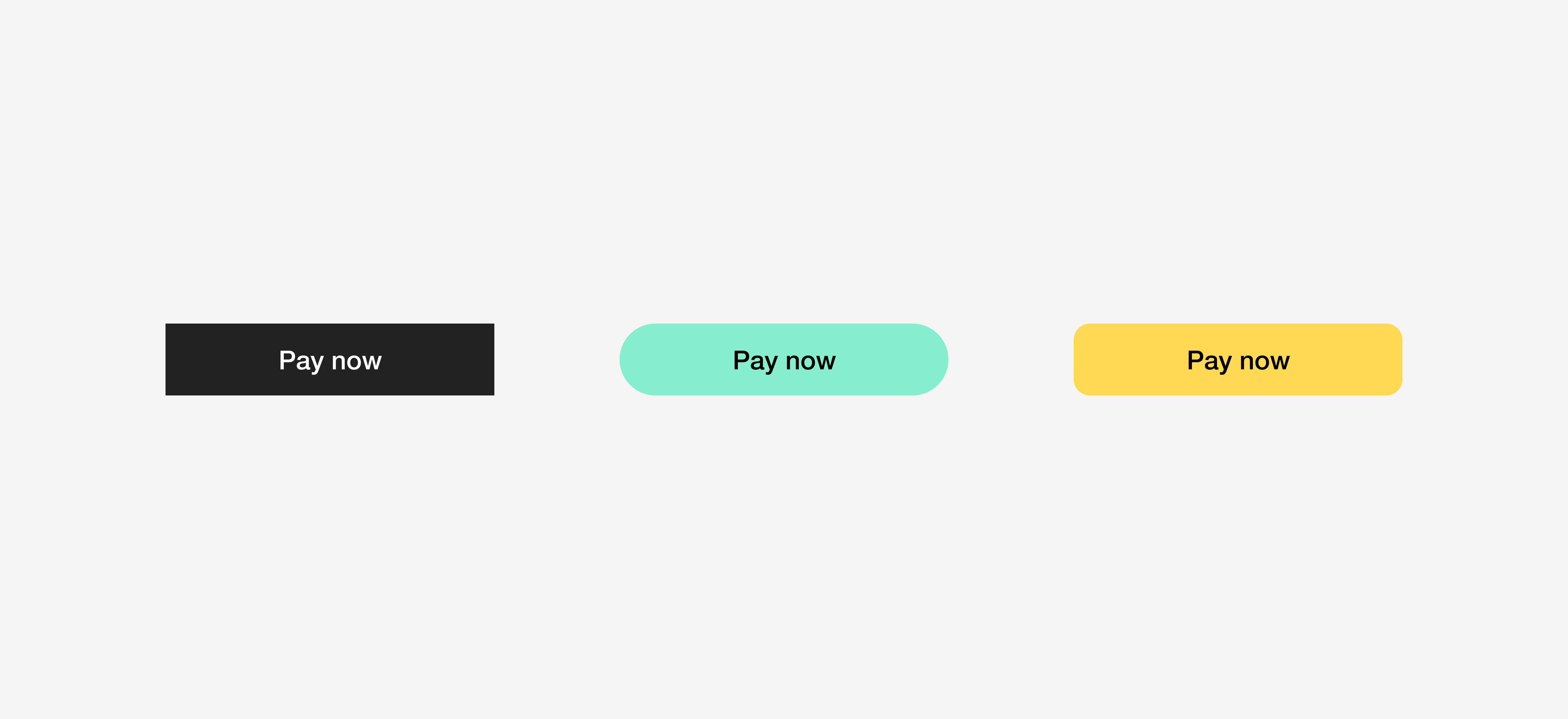
Choose clarity every time.
Some screens in your product won’t have much personality. That’s okay. Flows that involve things like personal data or payments should be simple. When in doubt, keep things clear. There’s no synonym for “ZIP code.” And there’s no better way to write “pay now.”