
Formafantasma’s new website uses Arial and Times New Roman in an effort to be more sustainable.
Sustainability isn’t just measured in pounds, emissions, and material sourcing. It’s also measured in bytes.
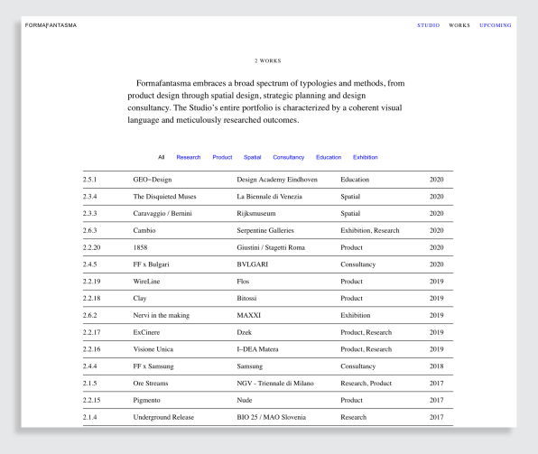
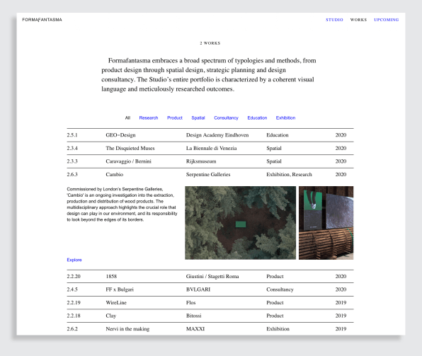
Amsterdam-based design studio Formafantasma, whose work focuses on sustainable design, has a newly redesigned website that’s better for the environment. The site looks about as plain as you can get: It has lots of white space, few images, and only two typefaces: Arial and Times New Roman, in standard blue and black that harkens back to the early days of the web.
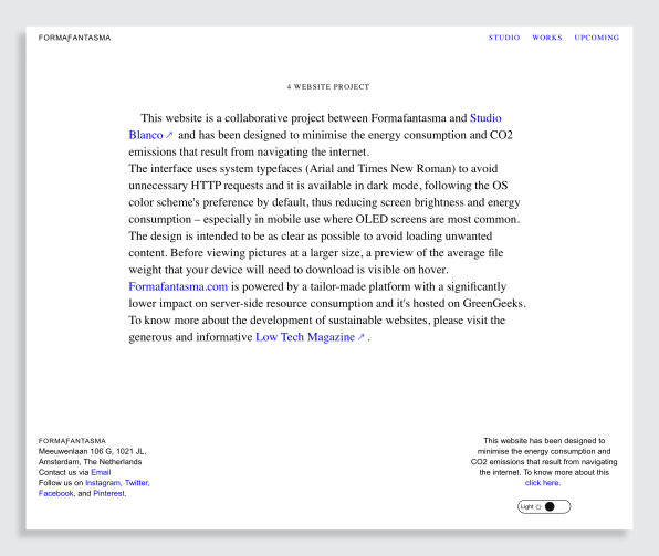
You probably haven’t thought about whether some websites can be more sustainable than others, but in fact, web design choices can affect how much energy the site uses. In this case, the Formafantasma team made visual choices that had a direct effect on the site’s sustainability. They didn’t just choose Times New Roman and Arial because they liked them, but because they’re standard default typefaces—and therefore, the most sustainable typefaces on the web.To understand why, it helps to take a brief sojourn into the inner workings of the web. All the data that makes up a website lives on a server somewhere. So when you visit a website, say, fastcompany.com, your browser is actually making a request to access that information. The host server gives the okay and sends back all the information that makes up the site—whether it’s typefaces, images, you name it—through the internet and back to your computer. “All the content that needs to be loaded in a page, including fonts, logos, etc., are a request to the server,” explains Andrea Trimarchi, a cofounder of Formafantasma. Those requests, called HTTP requests, require energy and storage space. So to make a website as sustainable as possible, those requests need to be as minimal as possible.
Arial and Times New Roman are default fonts on both Macs and PCs, which means there are no extra requests required. “This is also why the ‘FORMAƑANTASMA’ logo is a nonlogo,” says Trimarchi. “It uses Unicode symbols that are visualized and available on all devices in the same way.”Arial and Times New Roman aren’t the only default fonts: Courier New, Georgia, Verdana, and Helvetica are as well, which makes them equally sustainable. Still, when you consider the fact that entire foundries churn out custom-designed typefaces, this is slim pickings.
Though Formafantasma’s type choice is significant, there are other ways to reduce a website’s environmental impact, according to Ben Kiel, a typeface designer and partner in XYZ Type. Using smaller images is actually the most impactful way to lower a site’s footprint, he says. “This is something that’s a bugaboo because web designers always want the smallest possible font file but then load huge images. So focusing on the fonts versus images is like forests for trees.” (Images, which are often measured in megabytes, are usually much larger than custom font files, which are typically measured in kilobytes.) “It doesn’t necessarily mean that you can’t use custom fonts, because custom fonts can be small,” he says. “It means that you have to make deliberate choices.”If you’re able to make the visual tradeoff, these sustainable design choices can also improve the user experience because pages load more quickly, Kiel adds. Serving smaller file sizes is important for mobile bandwidth, according to Kiel, and can be cheaper for users who pay for data. (Tracking code also plays a role: The fewer trackers you have, the less energy you’ll use and the faster your site will be.) In all, the Formafantasma site is an exercise in restraint that puts that old design mantra “less is more” to good use. And even if custom typefaces aren’t the biggest energy suck on their site, the stark visual look emphasizes the studio’s sustainable design mission and makes it easy to navigate. Kiel encourages web designers to think of these design decisions even more broadly. “Only serving people what they need to display the page is just good design.”