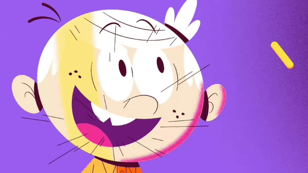
Designed for today’s kids and their nostalgic parents, Nick’s visual identity looks a lot like the ‘90s—and that’s the point.
If you grew up in ’90s America, you know exactly what these are: symbols of a care-free, mess-allowed childhood. Symbols, also, of the country’s first-ever children’s cable network: Nickelodeon.
The beloved splat disappeared from the brand’s visual identity in 2009 but last week, Nickelodeon announced its first rebrand in over 14 years. And paraphrase every ’90s kid on the internet: the splat is back!
But why now?
The thing is, the splat wasn’t always there. When the cable network first launched in 1979, it sported a simple black wordmark that changed slightly when it gained a pinball logo in the early 1980s. By then, the network had suffered significant financial losses, but with a major restructuring in 1984 came a new brand identity: the pinball logo was replaced with a refreshed wordmark spelling out “Nickelodeon” in a chubby typeface called Balloon, overlaid on top of an orange blob.
The shape of that blob would go on to morph into dozens of variants over the next decade or so—an orange leaf, an orange blimp, a starburst, a different kind or starburst. The most frequently used variant however was . . . the splat, inspired by Nickelodeon’s now trademarked green slime, which made the network’s hugely popular television program You Can’t Do That On Television. (Yes, you can trademark pretty much anything.)
Then came 2009, and the splat was no more. Sabrina Caluori, EVP of global kids and family marketing at Nickelodeon and Paramount (which owns Nickelodeon), doesn’t know why the splat was discontinued, but she does know why it is coming back: “What we realized now is that today’s parents like myself have a relationship with our brand and many of them are former Nick kids, and many of them just want a space for their kids to be kids, and they want an opportunity to tap into the kid inside themselves.”
The rebrand then, is targeted as much at today’s generation of children as it is at their nostalgic parents, mostly because the relationship between kids and parents has changed from the ’90s. Indeed, Caluori’s team found that quality time is a “top passion point” both for kids and for parents, and that more and more kids and parents are watching TV together. “We see Nick as a way to bring families together around the joy of childhood and fun,” says Caluori, a self-described “Nick kid,” whose very own kids recently gave her a Mother’s Day card with a splat on it.
But something else has changed, too: Nickelodeon is no longer just a cable network. It’s an entire ecosystem of resorts, theme parks, and even a pop/R&B girl band. Today, Nickelodeon is also competing with an onslaught of entertainment companies from Disney, Pixar, and Netflix to social media, all of which act as distractions from the hyper-focused entertainment ecosystem Nickelodeon thrived in the ’90s. A rebrand could help the company stay relevant for old and new generations and in a completely changed landscape.
And so, it is 2023 and Nickelodeon is doubling down on its ’90s DNA. To develop the new identity, its marketing team partnered with design agency Roger to set out a new style guide embracing the kind of creative freedom and irreverence that once defined Nickelodeon but that Caluori says had gotten lost over the years. This meant recommitting to orange, updating the famous “Nick Nick Nick” mnemonic, which Caluori happily obliged and hummed during the interview, and of course, going hard on slime. The team even built a slime generator, which does exactly what it says on the tin: bring slime to life at the press of a button.
Once the new brief was in place, the team brought six animation houses into the fold. Each of them designed an on-air spot featuring variations of a bored kid sitting in a waiting room, or at the dinner table, or walking on the street. The kid notices a bright orange splat on the floor or the ceiling, then pokes their head, finger, or foot through it, only to be whisked away in a world filled with Nickelodeon characters.
The aptly titled “Portal to Fun” campaign, developed together with ad agency Callen, launched last week and is now running on the TV network but also throughout social media and on YouTube. In the summer, the Nick team will go on the ground at 400 schools to organize “We Make Fun” parties as a “Portal to Summer” where kids can vote to slime their favorite teacher. As Callen puts it: “We want to show kids that the splat isn’t just a logo mark, it’s invitation to an outrageously good time, if you dare to explore it.”
—
This article first appeared in https://www.fastcompany.com
Seeking to build and grow your brand using the force of consumer insight, strategic foresight, creative disruption and technology prowess? Talk to us at +971 50 6254340 or engage@groupisd.com or visit www.groupisd.com/story


