
For the first time in more than 20 years, Velveeta is updating its logo.
Gone is the red underline, white background with blue trim, and “liquid gold” description. All that remains, really, is Velveeta.
“Our new logo is simpler, bolder, more creamy and more expressive,” said Leah Bowman, associate brand manager of Velveeta at parent company Kraft Heinz.
The century-old cheese brand’s fresh look, created by design firm Jones Knowles Ritchie, will appear on all Velveeta products in 2022.
Better on Instagram
Velveeta is the latest brand to replace the shine and dimension in its logo with flat simplicity.
In recent years, PBS, Volkswagen and Warner Bros. have all done something similar.
Companies tend to claim their redesigned logo signals the business has transformed or entered a new period.
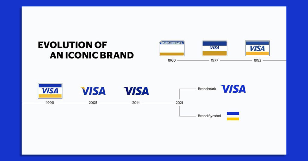
Both Visa and Mastercard, for example, have created nameless symbols to convey they offer more financial services than just a plastic credit card.
Seeking distance from its namesake line of jams and jellies, the J.M. Smucker Company swapped the two red strawberries and Smucker’s banner in its corporate logo with colorful, yet slightly abstract, berries and leaves meant to connote the company’s more diverse portfolio of coffee, pet food and peanut butter.
But all this activity is happening for other reasons, too.
People are spending more time online, and complicated, ornate logos with excessive details (e.g. “liquid gold”) don’t look good on a smartphone.
According to Andres Nicholls, senior partner and global executive creative director at consultancy Prophet, “Instead of trying to create highly elaborate logos,” it’s important for brands today to make something “legible and easy to recognize in the sea of content, while also displaying the attributes that define the brand’s personality.”
Nicholls noted that, in the past, brands felt pressure to tell a whole story through their logo. That’s no longer necessary with social media. At present, a logo serves more as a “part of the overall experience, instead of being the experience,” he said.
In addition to brands simplifying their logos to appear across multiple media and devices, they’re also making a suite of assets, explained Clark Goolsby, chief creative officer at creative agency Chase Design Group. A set might include a clean main logo, a distilled smaller logo, and an icon logo built for platforms like Instagram.
“A lot of brands really struggle to fit their logo into that little tiny circle,” Goolsby added.
Forever young
Another factor spurring older, established companies to reinvent their image is changes in consumer preferences.
Fair or not, digitally native startups born with a concern for the planet or focus on wellbeing tend to have a certain credibility with Gen Z and millennial shoppers that large corporations don’t. As a result, legacy brands are trying to obtain some of this trust by embracing the design language and minimalistic style of young brands.
“Established brands often have aesthetics that feel out of step with trends utilized by newer brands,” said Goolsby. “These trends not only feel fresh, but also often represent health, wellness and sustainability.”
The big idea behind Burger King’s esteemed “Moldy Whopper” campaign, for instance, was to convince the public its menu items are made with natural ingredients. Real food, left alone over time, goes bad.
In January, the restaurant chain unveiled a retro-looking logo that both fits this message and falls in line with the current fashion. No shine. No blue swirl. No artificial preservatives. Just round text within a plain bun.
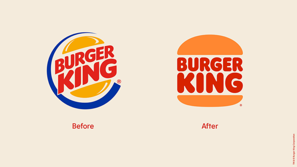
The design firm behind Velveeta’s upgrade—Jones Knowles Ritchie—is also responsible for Burger King’s revamped look.
And all of this matters.
“Your logo is often the start of your journey as a credible business,” Clifford Skeete, global executive creative director at graphic design service Vistaprint, recently told Adweek. “Your logo instantly tells customers who you are, what you offer, and what they can expect.”
A new vibe
To help shift how shoppers perceive Velveeta, the brand is also debuting a campaign titled “That’s La Dolce Velveeta”—a play on the Italian phrase “la dolce vita,” which translates to “the sweet life.”
In a handful of spots produced by creative agency Johannes Leonardo and shot by film director Harmony Korine, who recently worked with 7-Eleven, various people lounge about delighting in their Velveeta to an operatic soundtrack featuring a swelling string section.
“Instead of trying to play inside of the CPG category, we turned Velveeta into a lifestyle brand,” Jeph Burton, group creative director at Johannes Leonardo, said in a statement.
For the nine months ending Sept. 25, Kraft Heinz, the maker of Velveeta, Bagel Bites and Oscar Mayer, reported net sales of $19.33 billion, which is roughly flat compared to the same period in 2020.
…
This article first appeared in www.adweek.com
Seeking to build and grow your brand using the force of consumer insight, strategic foresight, creative disruption and technology prowess? Talk to us at +971 50 6254340 or mail: engage@groupisd.com or visit www.groupisd.com/story
