
The Oscars don’t have a best poster category (yet), but if they did, there would be a clear winner.
When the 95th Academy Awards kick off on March 12, there’s going to be, once again, one notable category missing for design and film aficionados: the Oscar for Best Poster.
Despite the humble poster serving as a visual celebration of any given film, the industry’s top U.S. awards program celebrating visual storytelling has never tipped its hat to the medium. (The closest type and design have come to the festivities was when a “Best Title Design” category was officially proposed—and rejected—in 1999.)
So, what gives?
Certainly it’s not a question of the challenge the medium presents, as any designer who has had the task of condensing 140,000 frames into a singular image would likely attest. After all, the best posters are more than the sum of their compositions. In addition to serving as branding and advertisement, they become a film’s visual legacy (for better or, in some cases, worse). A one-sheet to rule them all.
For now, we’re picking up the Academy’s slack, thanks to the wisdom and insights of five creatives with extensive hands-on experience in the world of film posters and key art: Jillian Adel of Studio of Earthly Delights, Eric Garza of Mondo, U.K. illustrator and designer Matt Needle, Diane Nguyen of Macaroni Pictures, and Eileen Steinbach of SG Posters. They combed through the posters for every film in the 2023 Academy Awards roster to select their favorite design, and here they offer a few thoughts on it. Despite a crowded field of 60 candidates—and the designers all being polled separately—if we had one of those hallowed golden statuettes, we now know exactly who we’d send it to.
AND THE WINNER IS . . .
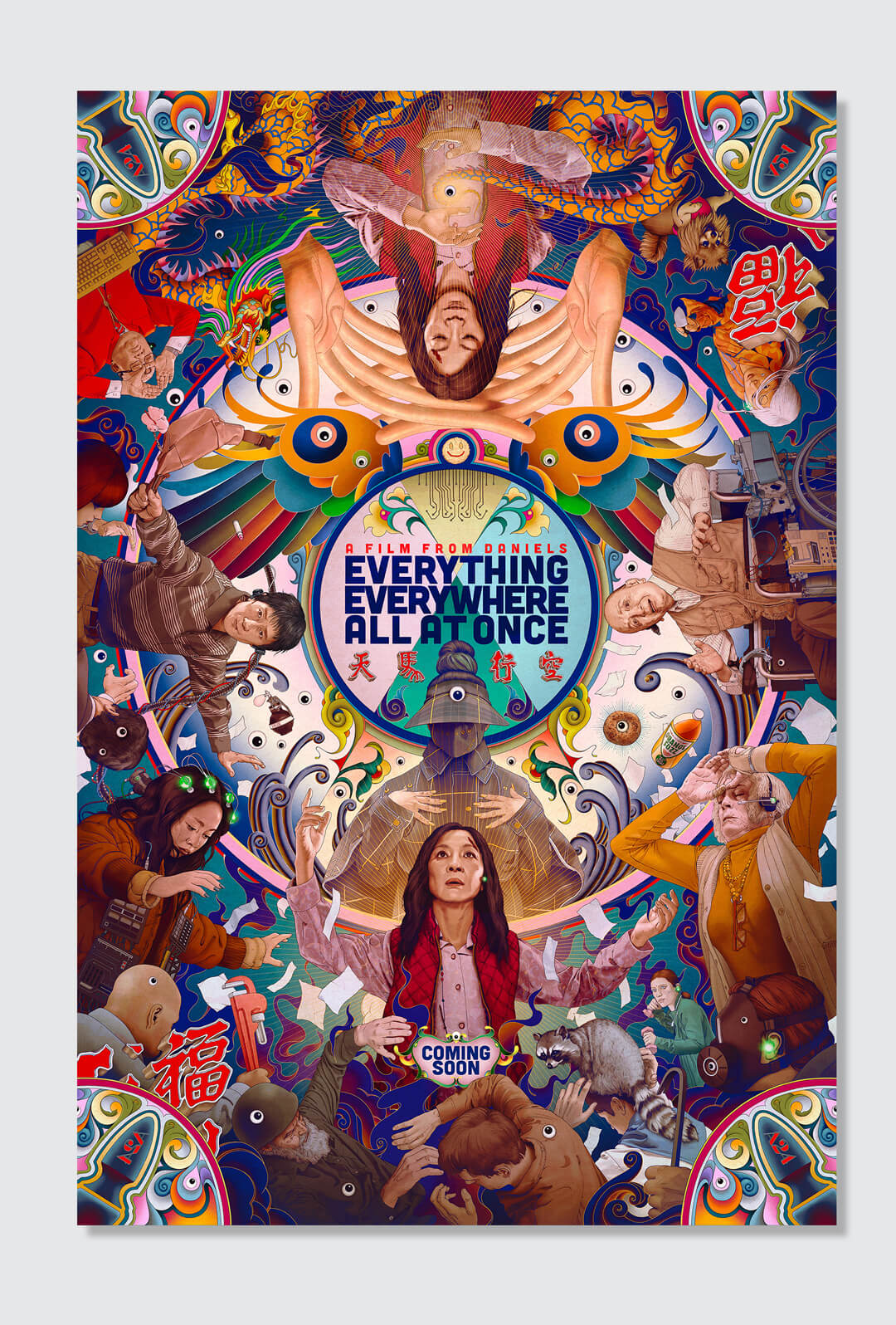
“Somewhere in the multiverse, there’s a major awards ceremony with a Best Poster category. No matter which dimension, the winner is probably James Jean. He’s a constant who consistently operates in a league of his own. His artwork for the Daniels’ Everything Everywhere All at Once is yet another testament to that. How do you even sum up a film as brilliantly enigmatic and kinetic as this? You throw everything in it—all at once. Plus, Raccaccoonie. The kaleidoscopic artwork is a virtual masterclass in composition and color, punctuated by James’ utter domination with a brush. It’s fantastic to see the Daniels and A24 celebrating art in movie poster design, and looking this good while doing it. Here’s to hoping that other multiverses’ Best Poster category crosses over into our reality someday.” —Eric Garza
“Immediately, the poster that stands out head and shoulders above the rest is James Jean’s fantastic work for Everything Everywhere All at Once, one of my favorite films of last year. It’s a film that is so insane, yet the poster matches its vibe and energy in every way. It packs so much into one image but gives away very little of the narrative of the story; instead, it lets you into this world that the directors have created.” —Matt Needle
“I’m an absolute minimalist at heart, but this year’s best poster to me was definitely the absolutely mind-blowing, beautifully maximalist Everything Everywhere All at Once by legendary artist James Jean for AV Print. The kaleidoscopic piece not only gets across the feeling and the whole idea of the film and the multiverses perfectly—and therefore is highly conceptual within itself—but it’s also bringing a fresh new wind into the world of key art. It’s an artistic approach with so much technical skill involved that’s so innovative that it leaves you speechless for a moment. It’s art. I’m certain it will be a poster that’s going to be referenced and talked about for a long, long time.” —Eileen Steinbach
WORTHY RUNNER-UPS
“I LOVE the Everything Everywhere All at Once poster. It’s intriguing, eye-catching and communicates how bonkers the film is without giving anything away. Sometimes, you have to grab a potential moviegoer’s attention within a matter of seconds, and I think this poster does it very well. Definitely did a double take walking by this in a theater.” —Diane Nguyen
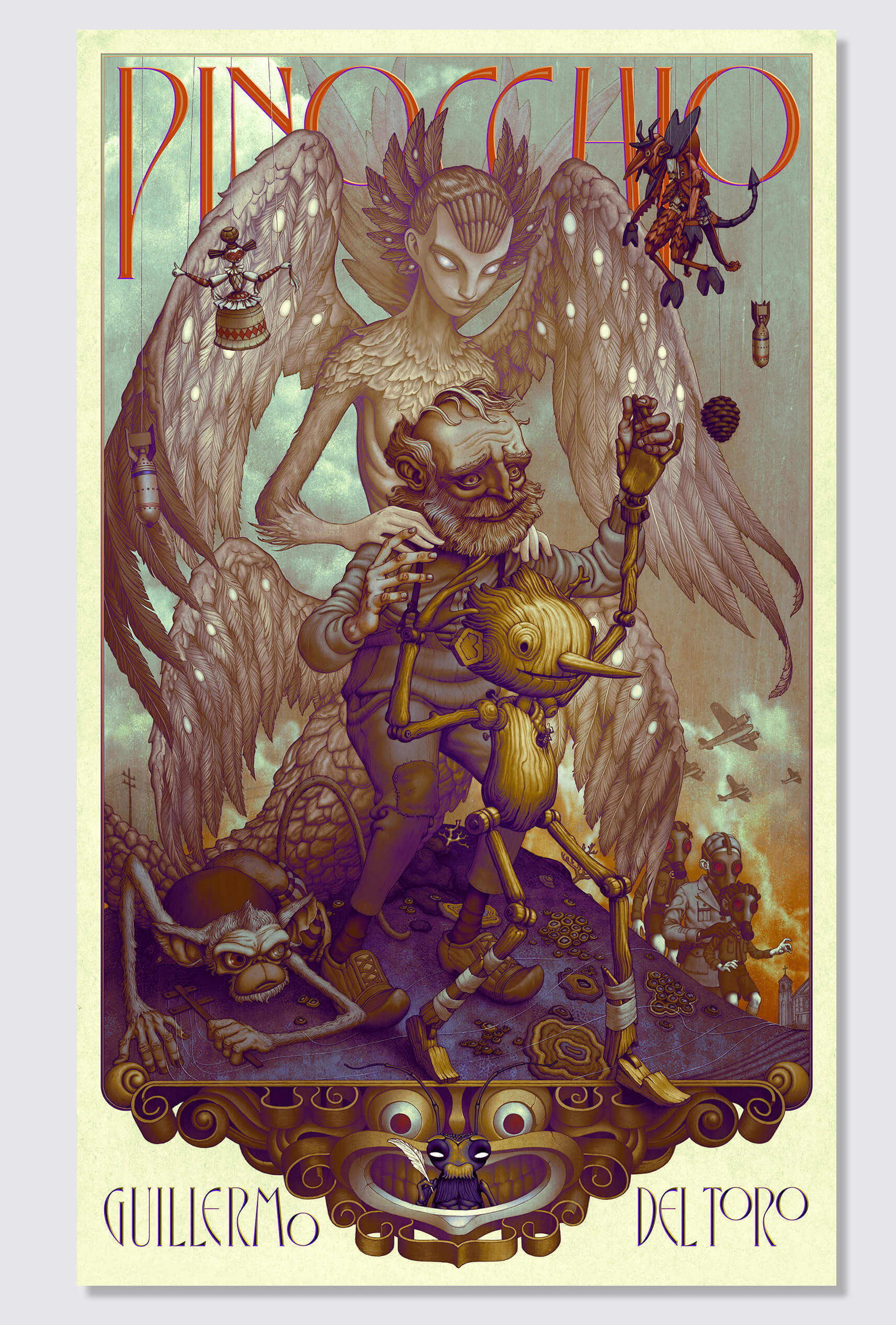
“James Jean really puts up a fight against himself, having also done the Everything Everywhere All at Once poster, which is also great. But the Pinocchio poster, besides existing as a beautiful illustration with a haunting style apropos of a Guillermo del Toro film, feels incredibly considered and interesting compositionally. I feel like film posters usually prioritize one thing: craft, composition, or typography. If you’re lucky, two out of three. But this feels like all three were equally considered. The illustration’s hierarchy is super successful with the main characters front and center to catch your eye, but in positions that are engaging and make you look a little closer. Then, once you do get closer, you have so many interesting story elements to look at. They are all wrapped up in a panel that fits well on the page and integrates lettering in a style of the time. The way the type weaves through the characters and fits below the frame, as well as the way Pinocchio begins to step out of the frame—insinuating his journey to ‘step off the page’ and become real—are all [chef’s kiss gesture]. Lastly, but definitely not least, is the illustration style itself, which walks the line between friendly, ethereal, and dramatic in a way that lets you know this is not your typical rendition of a children’s story.” —Jillian Adel
ENDS
—
This article first appeared https://www.fastcompany.com
Seeking to build and grow your brand using the force of consumer insight, strategic foresight, creative disruption and technology prowess? Talk to us at +971 50 6254340 or engage@groupisd.com or visit www.groupisd.com/story