But for one passionate defender, Pentagram could have been replaced as the designer of the Hillary logo, just two months before it debuted.

[Photo: Timothy A. Clary/AFP/Getty Images]
Pundits all across America are poring over the Podesta emails, emails released by WikiLeaks that show the behind-the-scenes dealings of Hillary Clinton’s presidential campaign. At the end of the day, those emails might end up containing more tasty risotto recipes than actual scandals.
But for design lovers, there’s at least one bombshell: If not for a passionate email written by one of Coca-Cola’s chief marketing gurus, renowned design firm Pentagram could have lost Hillary Clinton as a client just two months before her logo debuted to the world.
Reporting on leaked emails is justifiably contentious, as conversations that participants had every reason to believe were private are given scrutiny they were never meant to have. (Pentagram partner Michael Bierut, who oversaw designing the identity, declined to comment on the record when we reached out to him.) Still, we think this exchange—already, at this point, a matter of public record as part of the greater Podesta email leaks—is worth highlighting. Not just because it’s a rare glimpse behind the design process of a major political campaign, but because some of the arguments could be assigned reading in any branding class.
The exchange in question involves Wendy Clark, a Coca-Cola marketing veteran who consulted on Hillary’s branding before becoming the North American president and CEO of the ad agency DDB Worldwide, and Joel Benson, the chief strategist for the Clinton 2016 campaign.
The thread kicks off on February 14, 2015, as Benson worries that the identity Pentagram is crafting for Hillary doesn’t equal the messaging of the logo designed for Obama’s 2008 campaign. Specifically, Benson worries that there is a “lack of action or anything suggesting forward movement” in the mark. He writes:
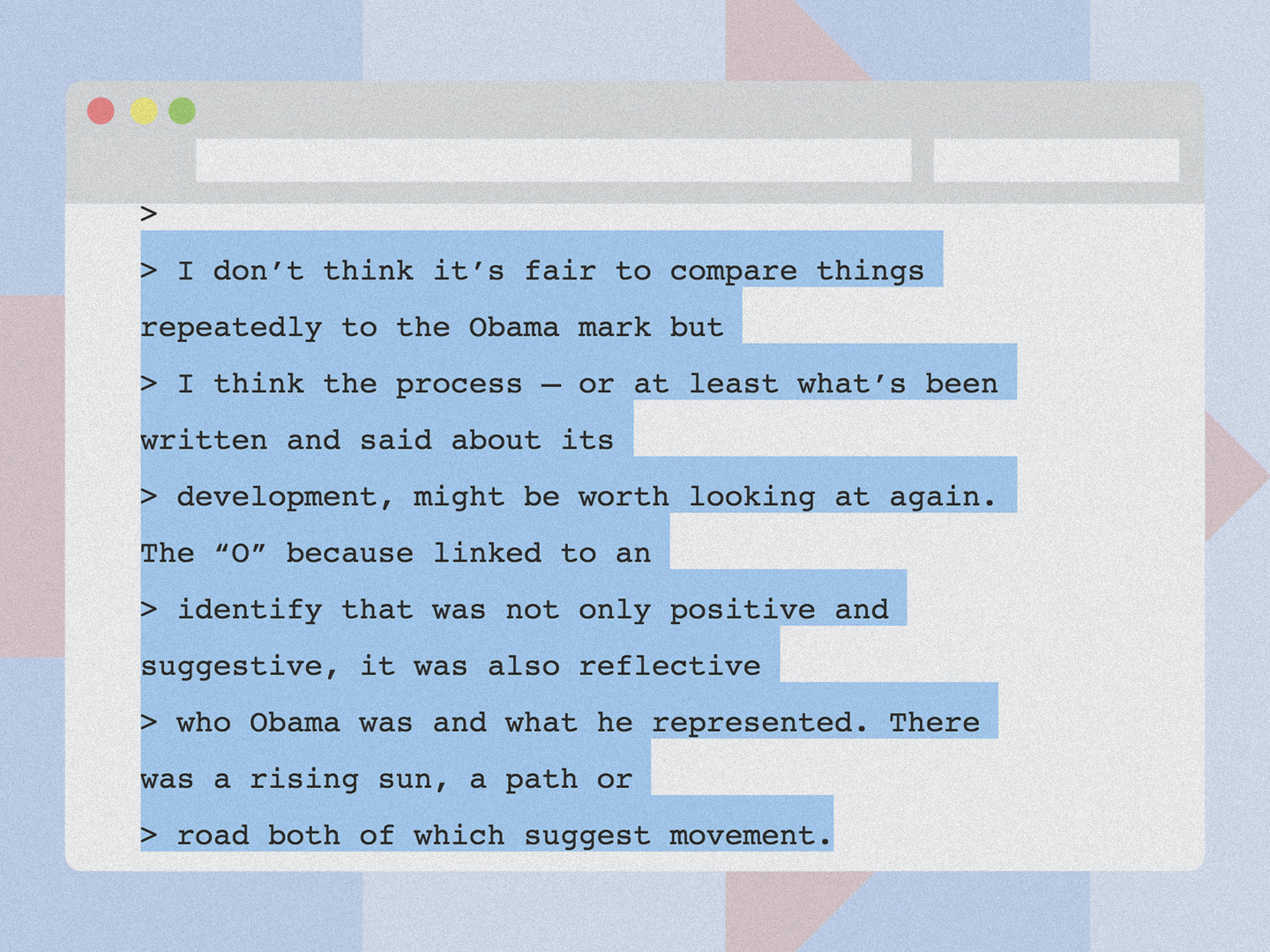
I don’t think it’s fair to compare things repeatedly to the Obama mark, but I think the process—or at least what’s been written and said about its development—might be worth looking at again. The “O” because, linked to an identify that was not only positive and suggestive, it was also reflective who Obama was and what he represented. There was a rising sun, a path or road, both of which suggest movement.
Benson expresses doubt that the Hillary logo shows this same sense of forward momentum. That could mean that at the time Benson wrote his email, Hillary’s logo did not contain the aisle-crossing arrow that became a hallmark of her identity. Benson further complains that instead of figuring out a way to introduce movement into the logo, Pentagram seems too strongly focused on the idea of using the mark as a “window,” representing the openness and transparency of the Hillary campaign—a design motif that, indeed, has become a central tenet of Hillary brand’s, as the “H” logo is a transparent mask overlaid on different campaign images.
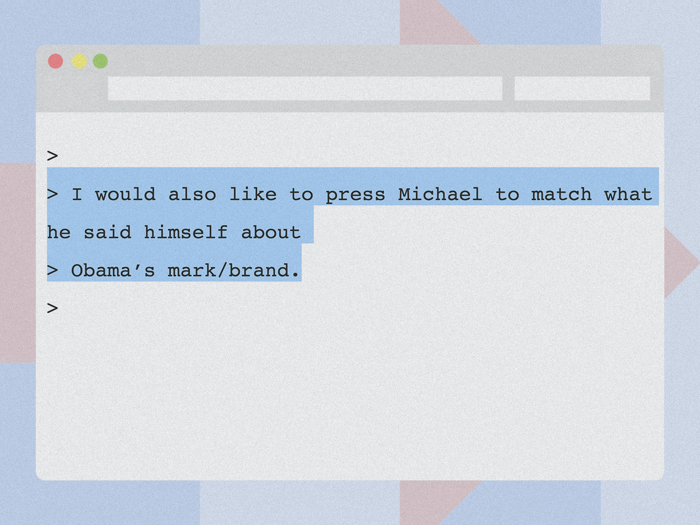
Benson finishes: “I would also like to press Michael to match what he said himself about Obama’s mark/brand,” referring to Pentagram partner Michael Bierut’s statement that Obama’s branding was “just as good or better” than the best commercial brand designs. Yet Benson seems skeptical Pentagram is up to the task, at least when it comes to the current team. He suggests the Clinton campaign ask Pentagram to put different designers on the brief; he even suggests that the campaign bring in smaller design firms to take a crack at the logo. “This is not a knock on Michael or Pentagram, who are terrific in the world of corporate branding,” he writes. “But I think we’re looking for something in the mark [that]can present the discipline of a corporate brand while creating the truly dynamic potential we want in a political mark.”
Later that same day, however, Wendy Clark replies in a self-professed design “diatribe,” schooling Benson on what she (as a marketing consultant for the Clinton campaign) and Pentagram were trying to achieve.
To be clear, a logo can communicate and aid attribution of qualities, but it is not a proxy for the messaging of the campaign until they are relentlessly connected and delivered, repeatedly and consistently. That’s when brands take on meaning.
As Michael has used previously, no one would look at a red Target logo and think: design for all — fashionable yet affordable choices for my home and family—expect more, pay less. But their relentless, contemporary, fashion-forward products and aligned messaging has imbued that logo with meaning just that.
Similarly, Apple, the world’s most valuable brand, launched with their rainbow apple mark in 1976. It simply stood for creativity, thinking differently. Their repeated, consistent use of the mark along with some of the world’s most creative advertising has imbued that bitten apple logo with meaning, but no one would look at that mark stand-alone and say it means Apple is the leader in human-centered designed, electronic devices with a vision for the future.
In other words, these logos only have those meanings because the companies associated with them have earned them. She goes on:
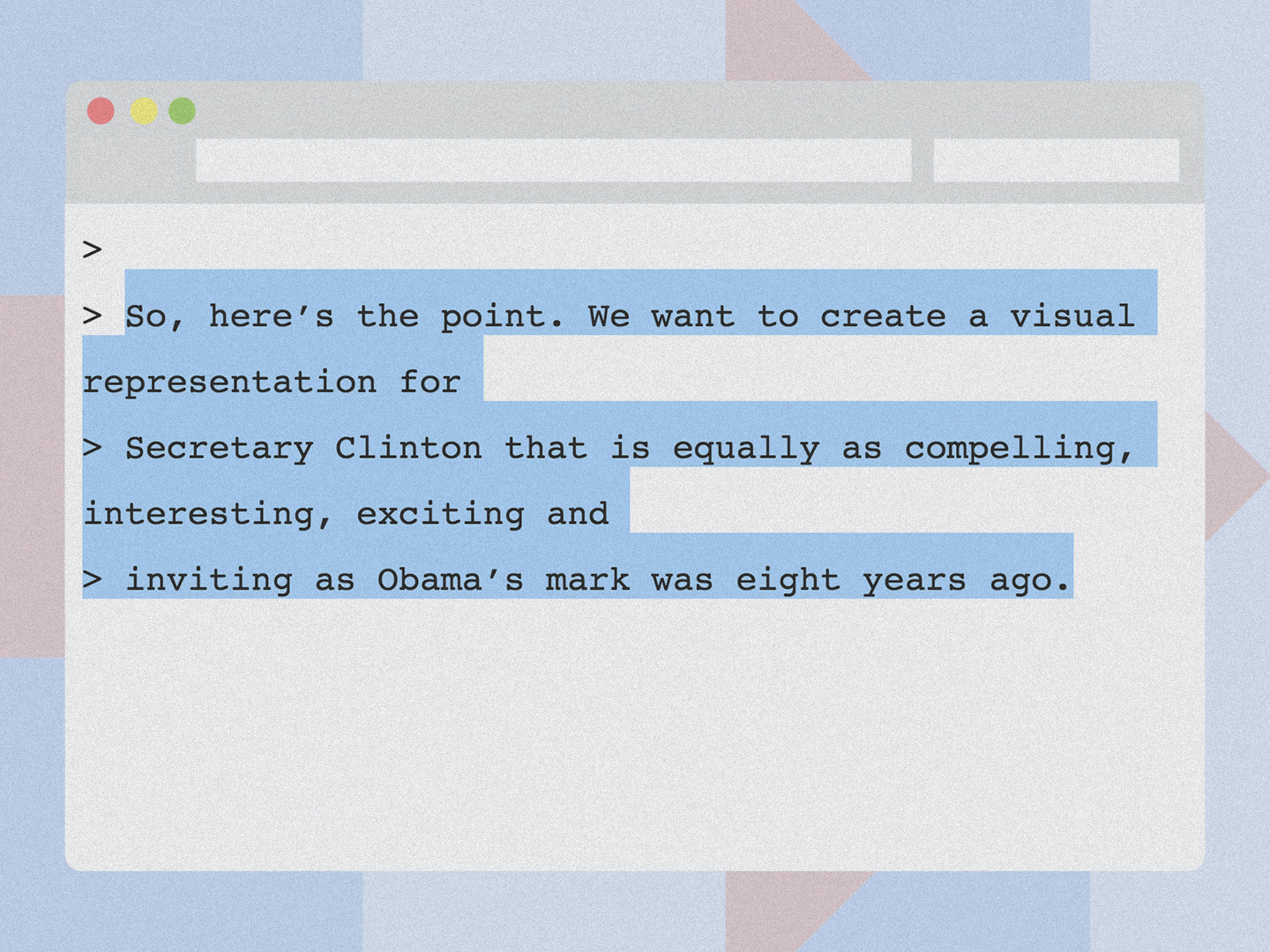
So, here’s the point. We want to create a visual representation for Secretary Clinton that is equally as compelling, interesting, exciting, and inviting as Obama’s mark was eight years ago. And to use techniques that some of the best brands have done and continue to do around the world. And again, the mark is simply one aspect of a bevy of connection points (messaging, speeches, PR, advertising, web, etc.).
Has the Clinton 2016 campaign earned the message of its logo yet? I’d argue that despite earlier criticism, it has, with the aisle-crossing arrow becoming ever more poignant and effective as a symbol of nonpartisan solidarity in the face of a Republican nominee who views seemingly everyone who criticizes him—even members of his own party—as a future enemy of his presidency. Clark’s eloquent rebuttal to Benson is something to keep in mind the next time the internet collectively hates on a new logo, especially an abstract one. Give it time. Logos, like wines, need to age into themselves.
This article first appeared in www.fastcodesign.com
