
Buried on a product page, this little design story shares a lot about Nike’s focused thinking.
Nike turns 50 this year, but its designs have never looked better. The other night, upon reading a blurb buried deep inside one of Nike’s countless shoe descriptions, I got a taste as to why. What could have been a throwaway bit of copywriting revealed that Nike is completely overthinking its designs—in the best way possible.
As Hypebeast recently put it, the company is already having a “huge year,” full of experimental, genre-bending releases. And it’s only February. The truth is that Nike’s taste quotient has been dependably high for a few years now—ranging from its sustainable Space Hippies to its easy-on Go Flyeases—and with perfect timing, to boot. Sneakers are the democratized art of our era, and you don’t need to shell out thousands of dollars on limited edition drops resold on StockX to take part. Starting at around $75 (on sale), you can buy an awesome, maximalist sculpture that you can wear.
Peruse Nike’s retail page at any given moment, and it’s impossible to not fall in love with something, like: LeBrons that harken back to Jordan infrareds from the ’90s. A textile-heavy trail runner that I might describe as a reverse-leopard print. Cleats that resemble the hot purple flames from high temperature combustion. A mixed-material high top, chock-full of interior design patterns of the ’80s. Sunny trail runners that you’ll want to suck on like a Lemonhead. Are any of these shoes my taste? At least for a few fleeting moments, yes. I can appreciate their statements as individual objects, each offering its own little design universe to explore. (I also recognize Nike’s strategy: Throw enough variety at the wall, and something will resonate with me enough that I’ll eventually buy it. And, hopefully, ditto with all of you.)
This embarrassment of riches isn’t the mere result of Nike being a $31 billion company and the world’s largest shoe producer. Because designing things this compelling, at scale, is hard. Apple built its empire by executing a handful of products exceedingly well, while dialing back on the expression of its physical designs, to fit quietly anywhere in your life. Nike’s design language is, by contrast, varied and expressive. Sure, Nike organizes a cross-product, seasonal color direction for its products; and at the Tokyo Games, you may have noticed its “rawdacious” color strategy that had futuristic neons clashing with naturally colored, sustainable materials. Still, Nike ships countless new SKUs every year, full of different materials and technologies. Quite simply, Nike designs a lot of products, very differently, and very well.
How does Nike do it? You can point to its major investments, like the new LeBron James Innovation Center, the world’s most technologically advanced research facility where designers work alongside scientists. There you can see, as I did last year, how Nike validates colorways in a room that can simulate everything from daylight to your office’s soul-sucking fluorescent-bulb lighting, and asking consumers to grade how a particular shade of white looks in each context.
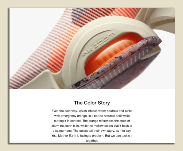
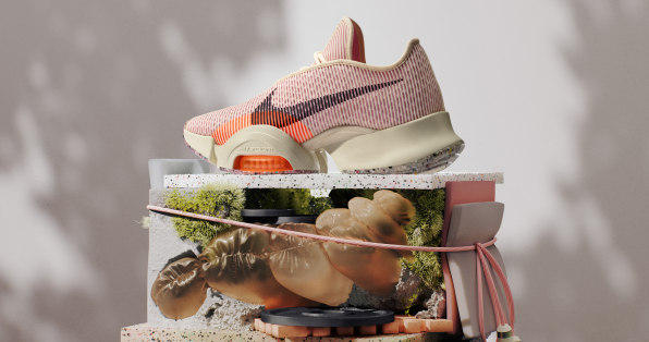
But it was actually on Nike’s own retail site that I got a clearer answer. Far at the bottom of its page for the Nike Air Zoom SuperRep 2 Next Nature HIIT trainers—a model that actually came out last September—Nike shares the “color story” behind the product. Until then, I’d never realized these stories were even on Nike’s site, albeit buried deep, deep below prices, photos, and descriptions.
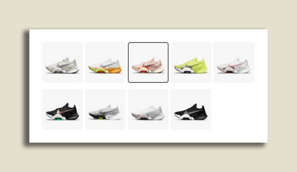
Of the nine different variants of this particular shoe—nine!—this singular “coconut milk” version contrasts earth tones with a neon orange. On paper, that might seem like an arresting mix . . . a few calming, natural colors mashed up with one so alarming as to burn sunspots into your corneas! Yet, the juxtaposition works, and furthermore, it comes with a poignant description of why the colors are presented on this shoe as they are.
“[T]he colorway, which infuses warm neutrals and pinks with emergency orange, is a nod to nature’s peril while putting it in context. The orange references the state of alarm the earth is in, while the mellow colors dial it back to a calmer tone. The colors tell their own story, as if to say, Yes. Mother Earth is facing a problem. But we can tackle it together.”
Now, look, I get that you might read this “color story” with a groan. Maybe on a bad day I would, too. But designers do sincerely think like this! They are constantly overthinking, in fact, to imbue whatever they make with vast amounts of intent. In this case, Nike’s designers were building a colorway for a new, more sustainable cross trainer—the SuperRep 2—and they were hunting for the right mix of colors to enhance that statement . . . and sure, probably ride the neutral-color shoe trend while they were at it. What Nike designers were creating was not merely a narrative ascribed to an object at random, but something of a self-aware shoe that recognizes its own footprint (no pun intended).
You might argue that it’s at least a little hypocritical for any apparel company to sell products while making a case for the environment, or that the most ecologically friendly new shoe to buy is, well, no shoe at all. These are perfectly fair takes, and I have no rebuttal. Still, when I find myself wondering, “Why is Nike design so good right now?” or “How does Nike perpetually make products that feel like they’re from two or three years in the future?” The answer is right there in this little description.
…
This article first appeared in www.fastcompany.com
Seeking to build and grow your brand using the force of consumer insight, strategic foresight, creative disruption and technology prowess? Talk to us at +971 50 6254340 or mail: engage@groupisd.com or visit www.groupisd.com/story