
The 14 Most Important Interfaces Of 2017
We went on and on about new smartphones and stunning new buildings this year, but many of the best designs of 2017 were actually hidden in the software all around us. It’s the little things–from the interface on that new Pixel 2 to the algorithm that designed this new concert hall–that are really changing the way we use products.
In 2017, we saw that play out again and again, across social media and even social justice. It was software that drove the biggest stories this year, and gave us a glimpse at what next year’s technology will bring. With that in mind, we looked back at the best interfaces of the year.
MICROSOFT FLUENT DESIGN
No company–not Apple, Facebook, or Google–has quite figured out how to integrate the old world of 2D devices with the new world of 3D or mixed reality hardware. Enter Fluid Design by Microsoft. It’s not a finished product, but a thesis: that animations and objects need to translate from screens to augmented reality with one unified, familiar language. And it’s just this sort of thinking that may one day let you go from a laptop to a pair of holographic glasses, all without getting sick to your stomach.
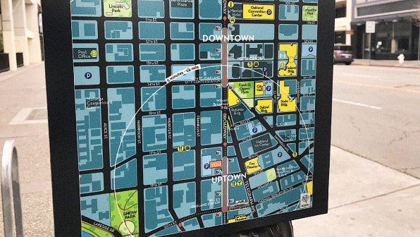
MAPBOX TIME MAPS
Maps are typically drawn from a perfectly scaled version of the world around us. They’re a perfect indicator of distance. But when you’re commuting in a city, the distance from a restaurant and the time it takes you to get there are not synonymous. So designer and software engineer Peter Liu built a new type of map, organizing the places you want to go into concentric circles that measure minutes rather than miles. As a result, you can pick the perfect coffee shop by the time left on your lunch break, rather than squinting at the route in Google Maps.
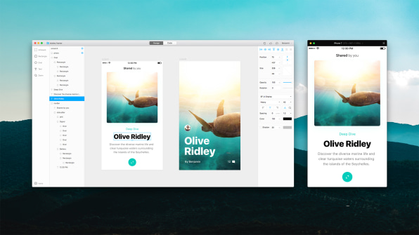
LOTTIE, BY AIRBNB
The beautiful, fluid interfaces that designers dream up are often just graphic concepts that get tossed to the engineering team to actually build. Lottie, developed by Airbnb, thinks up another workflow. It allows a designer to create a UI animation in something like After Effects, then export that directly into an app–no engineering considerations, or compromises, required.

THE HATE CRIME INDEX
Most hate crimes go underreported–they may be highlighted by a local news station, but many never penetrate the national news conversation. The Hate Crime Index, by Google News Lab and Pitch Interactive, allows you to search a term, like “Muslims” or “women,” and see all of the hate crimes that fall into these umbrellas–right along with related names like “Donald Trump.” Of course, a ton of machine learning and natural language processing makes the results possible. But for the end user, mapping the interconnections of bigotry is as simple as clicking and typing.
GOOGLE’S PANIC MODE
We’ve all been there. You hit the back button in a browser, but you’re stuck in a loop on the website you were trying to leave. Now, Google is designing its UI to accommodate this specific moment of user panic. In Android 7.1, the company debuted a “Panic Detection” mode. It’s code within Android that spots when you start tapping the screen like a panicked woodpecker. And when you do, the OS automatically takes you back to the home screen. It’s like an emergency eject button for UI, based upon pure, frustrated human fight or flight response.
OCULUS DASH
Oculus Dash radically rethinks that flat desktop screen as something more suitable for virtual reality: the command bridge of the Starship Enterprise. Essentially a VR operating system that sits on top of Windows, the interface puts a long bar at your waist, where it floats almost like a banister. You can swipe it to swap apps, and up top you have windows of all your open apps, which can live at various depths and sizes. Moving them is as easy as dragging and dropping–but with your whole hand, rather than a mouse. Oculus Dash isn’t out until next year, but working in VR might just go mainstream one day, after all.
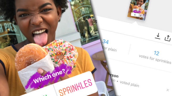
INSTAGRAM’S POLLING STICKER
Instagram Stories aren’t just a Snapchat knock-off; the feature has actually improved on many of Snapchat’s ideas. A bright moment was Instagram’s voting sticker, which could be stuck onto a video to let someone’s followers vote on anything from their favorite doughnut to pair of shoes. It’s easy to imagine that this simple tool, an interactive sticker, could evolve into something bigger, and soon. With such a button, Instagram can make videos truly interactive, and it could also let you essentially channel surf, one clip to another, outside the bounds of any single, finite Instagram story and into the bottomless well that is the Instagram community.
INSTAGRAM ARCHIVING
Another idea from Instagram is so good that we put the company on our list twice. It’s archiving. Thus far, social media users are forced to either have a post live in public forever, or delete it forever–a lousy catch-22 in a world where many of us have recorded our lives on social media. With archiving, Instagram lets you go to any old image, tap into the options, and hit “archive.” The post will go into a private gallery. And if you ever want to return it to your feed, there’s a button to unarchive it, too. It’s simple, instantaneous, and, most important, noncommittal.
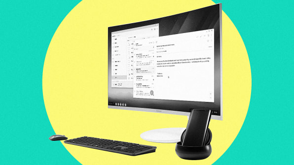
SAMSUNG DEX
At some point or another, everyone has wished that their smartphone could just turn into a computer–if only for a few moments. Samsung made that wish real with the Samsung Dex, which is a $150 dock for Galaxy smartphones that turns the Android phone into a desktop computer, complete with a full desktop interface. The Dex turned out to be a promising, if imperfect, device; it doesn’t seem to have changed the world, but it’s one proof point of many that Samsung is working hard to polish its design. And let’s be honest: If Apple did the same thing with an iPhone, we’d all be reading this on a iDex right now.
THE NEW FRAMER
A ubiqutious UX prototyping tool for a few years now–it’s popular at Google and Uber–Framer continues to be all the rage. The big difference with the new version of Framer, released this year, is that it’s meant to be an end-to-end design tool in which teams can develop, design, and prototype ideas without having to integrate other tools or input files created in other programs. And for those with questionable design chops in the first place? The system also uses algorithms to automatically balance layouts for you.

AN ALGORITHMIC X-RAY
Algorithms are a black box that make decisions that even their creators don’t understand. So how do you know if they’re rejecting a mortgage loan because of credit, or because of race? Try Themis. It’s a freely available bit of code that can mimic the process of entering thousands of loan applications or criminal records into a given website or app. By changing specific variables methodically–whether it be race, gender, or something far more abstract–it can spot patterns of prejudice in any web form. Now, you’ve got us. Themis is more code than product. It isn’t a fully, self-contained app with a beautiful UI that can allow a layperson to spot hidden inequality. But it’s a critical step to getting there.
AN ALGORITHMIC EXPLAINER
So you can ID a prejudiced algorithm. But what if you just want to understand why Amazon changed the price on a pair of socks? The U.K. studio If developed a concept for how we could look inside algorithms to understand what we’re seeing and why. Developed for the U.K. government’s open call to make its digital services more transparent, If presents several straightforward bits of user interface that can clarify esoteric, automated processes. It’s not cutting-edge design or anything. It’s links. Buttons. Lists. What’s radical has nothing to do with the interface but the intent of the interface: its willingness to bring the user behind the algorithmic curtain at every step.
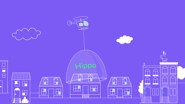
HIPPO INSURANCE
Hippo aims to turn home insurance from a service you grudgingly sign up for when you buy a house, to something you love (or at least like) because it’s become a service to you–just as friendly as Warby Parker. The UI is airy and conversational, rather than chock full of fine print. And Hippo will eventually evolve to become a service that’s intelligently pinging you at the right moments. For example, it will monitor your house to check its condition, and use data to monitor what claims your neighbors are making–all so that it can periodically nudge you to take better care of your house (and save itself some level of risk on insuring you!).
BETTER BILLS
Bills stink, and not just because they’re asking you for money. They’re hard to understand, on a design level. Here’s something you probably didn’t realize: One company, named Broadridge, handles most of them. It sends out 5.5 billion bills and other regulatory communications for over 5,000 companies a year. This year, after collaborating with the mega-consultancy Huge, the company presented a series of concepts for a better bill. They’re all worth your attention, and tease an era when maybe, just maybe, companies will attempt to save us money, rather than steal it away with confusing legalese and variable APR.
–
This article first appeared in www.fastcodesign.com
Seeking to build and grow your brand using the force of consumer insight, strategic foresight, creative disruption and technology prowess? Talk to us at +9714 3867728 or mail: info@groupisd.com or visit www.groupisd.com