
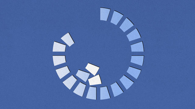
The human neck was not designed to be used like a joystick, and other things we learned from this year’s most notable UX.
Here are our favorite—and least favorite—UI projects from the year.
THE BEST

Clara
In a world where every speaker in your home wants to crack a joke, Clara is a quiet revolution in AI assistants. Rather than living in some product or app, Clara is a virtual person that you simply CC on emails. She then gets to work scheduling meetings or dinner reservations on your behalf. Never mind that Clara is really a small sweatshop of people doing these tasks for you while Clara’s own AI grows up. Clara frames AI not as a friend who needs your attention, but as a powerful tool that you could mindlessly loop into any email on any platform. It made giving up my Clara trial account feel like I was handing over my personal time machine to the year 2030.
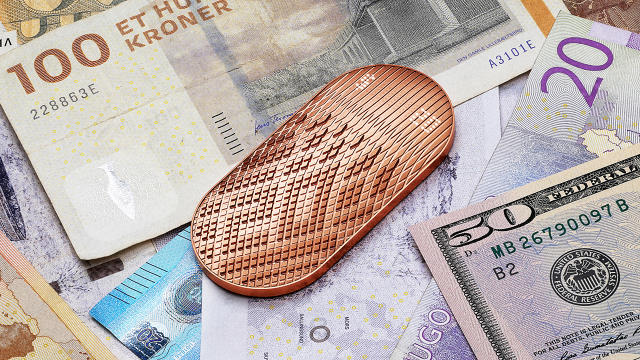
Scrip
Spending cash is literally painful to the human psyche, while spending credit is not. For the sake of our budgets, NewDealDesign wanted to bring some of that pain back with a concept called Scrip—an oversized copper coin that reshapes its surface to various denominations of currency, letting you flick over $1, $5, or $10 at a time to pay for your items. The idea is to move users to acknowledge the money they’re spending with this tangible interface, without losing the convenience of a credit card. Scrip might not actually exist anytime soon, but NewDealDesign tells us that unnamed, major players in the financial industry reached out after seeing the concept. So maybe its painful UI could influence the future of payment after all.
Pearl
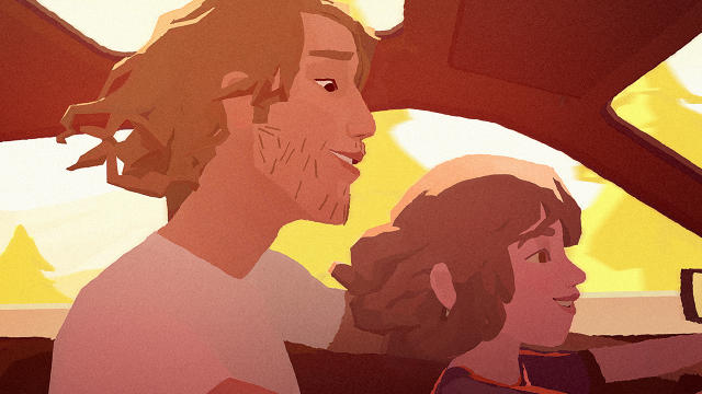
Despite one-off projects by Hollywood directors like Justin Lin and 360-degree documentaries released by major media companies like the New York Times, VR storytelling doesn’t really gel like a regular old movie does. Or it didn’t, until Google put Pearl on the HTC Vive.
Directed by Academy Award winner Patrick Osborn, the six-minute short puts you in a car with a father and daughter, capturing hundreds of miles driven and two decades lived. But while it’s an animated movie, Pearl is a trojan horse of narrative UI, a master class in how visual storytellers can use environment, framing, sound, and other elements to lead a viewer’s attention even though that viewer can literally look anywhere. You can watch Pearl in a browser, but if you have the chance, I’d recommend the full experience on an HTC Vive headset. It’s Oscar-worthy.
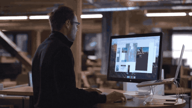
Adobe XD
Say you want to mock up an app. Not just the screens, but the flows and animations; you want a full prototype while you wait for your engineers to figure out the algorithms. Until this year, the only answer was Sketch—an app with all the complexity of Photoshop, loaded with a suite of plugins.
Adobe XD, on the other hand, launched this year with a toolbar of just six buttons. Yet the app allows you to build the entirety of an app prototype and see it working on your phone or tablet in real time. Its best UI detail is how it links buttons to various pages. It uses arrows—long stretch arrows—that you drag from one place to another. It’s the definition of intuitive. XD is slowly gaining features in prerelease and has yet to replace Sketch, but it shows Adobe continuing to refine its creative interfaces with more utility and less bloat.
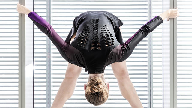
Biologic
Wearables like the Apple Watch generally ask for a lot of attention in exchange for only minimal utility. Every vibration says “Hey, look at me! Look at me! Ignore your spouse! Gap emailed to let you know that they have a sale going on!”
But what’s the alternative? Don’t wearables need some sort of interface to be useful? Maybe not. Biologic is a synthetic bio-skin, made by MIT’s Tangible Media Group, that asks nothing of you. When you get hot and sweat, its flaps curl open to provide air circulation. There are no motors or batteries—but just as importantly, there are no beeps bugging you or buttons to hit, either. It’s the epitome of “calm computing.” Biologic uses the natural behavior of Bacillus Subtilis natto bacteria, which expand and shrink in response to atmospheric moisture, to cool you off without distracting you. Meanwhile, MIT is working Biologic technology into lamp shades that react to light, and tea bags that can signal when they’re done.

Amazon Go Grocery Store
What if you could just walk into a grocery store, take what you wanted, and walk out? That’s the shopping experience at Amazon’s Go grocery store, which opens officially next year. So how does it work? Err, no one knows for sure, actually. But it appears to scan your phone when you walk in via RFID, much like getting on an RFID-enabled subway system. From there, face tracking surveillance around the store follows you to watch what you buy. Honestly, though, who wants to think of Big Brother watching when Amazon lets you shoplift Chobani to your heart’s content?
Tiltbrush
There’s a moment that happens to everyone who uses Tiltbrush for the first time. They hold a wand in front of their face, confused. Then a moment later, their jaw drops, awestruck, as they realize they can draw light in midair. A minute later, and they’re using Tiltbrush’s controls like an old pro, simply creating what they imagine.
Tiltbrush finally went live for the public to try this year, after being in demos since 2014. Its UI magic relies upon good old skeuomorphism to work: Your left hand becomes a cubed palette with controls like color and stroke style. Your right hand becomes a paintbrush with one function: Painting. If you want to change your paint, you simply tap your brush to the appropriate part of the palette.
But inside virtual reality, what should be a cloying design becomes something like literal skeuomorphism. It’s still a visual metaphor for our benefit, like the felt poker tables of iOS’s old Gamecenter, sure. But to paraphrase Ben Stiller in Dodgeball, it’s a metaphor that actually happened. In virtual reality, you can actually wield functional tools that were nothing more than an interface metaphor just a year or two ago. In other words, an old fishing video game might have shown you a pole button, but virtual reality allows you to grab that pole and and cast out your line. Because it’s so literal, UI can be both more intuitive and more satisfying to the human touch than ever before.
We might not be using the Tiltbrush app in 20 years, but I guarantee we’ll be using something that looks a whole lot like it. Because Tiltbrush is just painting—in midair.
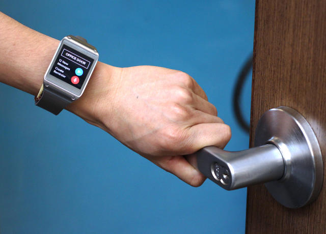
EM-Sense
Smartwatches are kind of useless beyond fitness tracking, but what if they could sense anything you touched? That’s the idea behind EM-Sense, created by Carnegie Mellon in conjunction with Disney Research. Built into a smartwatch, EM-Sense measures the electromagnetic resistance of objects you touch. And with that information in hand—ahem—it can do all sorts of things, like pop up a contextually relevant menu, or just automatically unlock your smart door without an additional prompting.
The team continues to play with similar technologies. A follow up called ViBand, for example, requires no special hardware. Using a totally stock smartwatch, it can read the vibrations of anything from your own hand gestures, to the whirring of power tools, to understand exactly what you’re doing at any given moment.
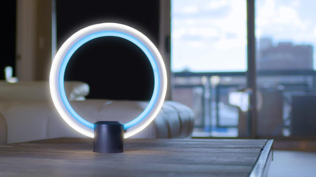
Alexa In Everyday Things
I’m still not so convinced that Alexa is anything but a salesperson who lives in your home. But as a user interface, Amazon is making smart moves in increasing Alexa’s reach across devices by opening up the technology for third parties to incorporate. Most recently, GE built a desk lamp that includes Alexa at its core, while a new development kit by Conexant, a maker of voice processor chips and software, will allow hardware developers to prototype new Alexa devices in days rather than months. Consider that one day the world could be so technologically advanced that you could talk to any device you own. Alexa’s easy integration is laying the foundation for such a future—if Google doesn’t beat it there.

Brain to Brain Interface
User interface design is centered around human-computer interaction (also known as HCI). But artist Dmitry Morozov imagined hist project, 2ch, as human-human interaction instead—by enabling humans to communicate with one another wordlessly. 2ch is pyramid full of motors, hoses, robotics arms, and video monitors. Users wear EEG skullcaps that read their brainwaves. The goal is to use their brainwaves to get their half of the pyramid device whirring in sync with the other half, a process that can take two to three hours of mutual work. For all of our efforts in communicating more easily with computers, it’s easy to forget that the final goal of UI could be to communicate mindlessly with one another.
THE MOST SURPRISING
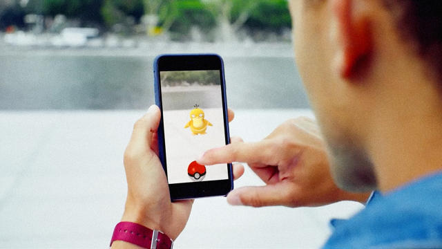
Pokémon Go
What can be said about Pokémon Go that hasn’t already been said? Sure, its numbers have fallen off since it hit this summer, as 10 million people flicked virtual pokéballs at Rattatas that seemed to be standing in the real world. But this addictive augmented reality gimmick, coupled with its gameplay that forces you to walk around and explore your city rather than plant on the couch and veg, still entertains hundreds of thousands of people each month. Pokémon Go’s interface changed the rules of gaming. Don’t be surprised when others copy its tricks for years to come.
Facebook’s Artificial Waiting Patterns
When Facebook offered to do a security check for me—and I watched a progress bar slowly grow on my screen—I suddenly realized that I’d been had. After all, Facebook can generate my algorithmically attuned feed in milliseconds. What was I doing waiting on “security?” Facebook fessed up to this little UI lie, and a number of other people in the industry spoke to me about the matter, too. In 2016, our web became so fast that we don’t really have to wait for anything. But the human psyche hasn’t caught up, and we still don’t always trust when important things happen instantly. So artificial waiting was born, and now, it’s on sites and in apps all around us. I wonder how long it will be until we decide that waiting for anything, no matter how important the information may be, is just a waste of our time?
THE WORST
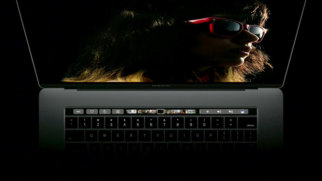
Apple Touch Bar
Apple. What were you thinking? The Touch Bar, which debuted in this year’s Macbook Pro update, is something like a mini iPhone strip that sits above the keyboard. Obviously it sounds like a great idea: It allows apps to add their own unique buttons for the user to press in space otherwise wasted by F-keys. The problem is that it’s not tactile the way actual keys or buttons are, so it has none of the muscle memory quotient that many pros rely upon with their keyboards. Instead of really solving an interface dilemma, at best the Touch Bar simply moves an interface that would have been on the screen to the keyboard, forcing you to glance down from your work, and hunt and peck for the right button, like it’s 1993. And at worst? Can we all be honest about its design? This looks like something HP would have released about five years ago.
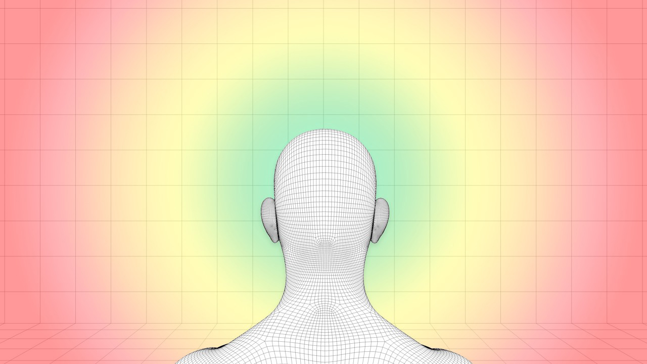
VR Neck Controls
It was the worst trend to emerge with the rise of VR: Neck controls, or what are sometimes euphemized as “gaze controls.” These controls basically turn your neck into a joystick. And let me tell you, the human neck was not designed to be used like a joystick. One can understand how the VR industry thought this was a good idea: With no single control standard, the only common factor across all headsets was the user’s head. So why not use that head?
And indeed, UsTwo used gaze control to some success in Land’s End. But for most games, it’s just exhausting, and after 20 minutes of swinging your head around as a makeshift starship turret, you’ll long for a good old-fashioned gamepad—immersion be damned.
This article first appeared in www.fastcodesign.com
Seeking to build and grow your brand using the force of consumer insight, strategic foresight, creative disruption and technology prowess? Talk to us at +9714 3867728 or mail: info@groupisd.com or visit www.groupisd.com