Branding experts weigh in.
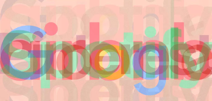
Why do so many tech companies’ logos look the same? From Google and Airbnb to Spotify and Pinterest, these companies have gradually shifted their branding from idiosyncratic typefaces to remarkably similar sans-serif fonts. This month, a viral tweet from the type studio Oh No Type Co compared those four companies’ former and current logos, demonstrating how alike each company’s current branding looks.
EVERYBODY FALL IN LINE! pic.twitter.com/B9JU5nvpMu
— OH no Type Co (@OHnoTypeCo) February 13, 2018
Is there a technical reason for this shift? Are there cultural forces at play? Are these companies trying to project a different message now that they’re billion-dollar corporations? Co.Design reached out to branding experts who’ve worked with tech companies to demand answers. These are their theories.
SANS SERIF = SIMPLIFICATION
“My theory is they want to integrate their look and feel from a logo standpoint with their UI. They’re looking for a really cohesive identity, a cohesive experience and look and feel. As they look at their UI for their apps, for their website, or their interface, they’re trying to simplify it. As you simplify, you move away from some of the quirkier and more unique logotypes that these companies originally launched with.” –Howard Belk, co-CEO and chief creative officer at Siegel+Gale
“The amount of visuals the consumer is bombarded by every day is tremendous–in the street, on a laptop, or a smartphone. A visual chaos that makes it hard to navigate into. Impact and, most of all, clarity, have become keywords for all brands. All these bold and neutral logos are telling the consumer the same message: Our brand and our services are simple, straight-forward, and clear. And extremely readable.” –Thierry Brunfaut, creative director and founding partner at Base Design

THE MORE GENERIC, THE MORE RELIABLE
“I see this as a natural step for brands to take as they grow from scrappy startups into established brands. Your goals have shifted from making noise and standing out to being a trusted, dependable part of people’s everyday lives. That heartfelt personality and idiosyncrasy that defined you as you started out, and won over your early adopters, can be a limitation as you aim for broad appeal (and bigger revenue).
“There is an equal danger that we think brand equals color/type/logo, but this avoids the world that brands are now thriving in. More established tech brands deliver their personality through their service, their content, their voice, the way they sound and behave. They can afford to make their personality more present and alive than a startup with one app or one site can ever be–viewed like this, the friendly corporate typefaces of the world aren’t much of an issue.” –Andy Harvey, creative director at Moving Brands

THE LOGO ISN’T THE BRAND ANYMORE
“People at the head of these powerful digital brands, as any strong brand, know very well they are not defined by their logo anymore but by the product or service they provide. They are strong, thanks to what they allow you to do with them. Before, logo designers would look for a ‘concept’ when designing a logo. That is obviously not needed anymore: The brand is the concept. Their logos may look similar, but what they offer is totally different and effective, and that’s what finally counts for the consumer. They are 100% recognizable.
“These brands are now so good at what they do and so widely used they have become part of our everyday life and culture. That’s why they do not need logos anymore, as they become words (or even better, verbs) in our daily language. Sayings like “I will just google this” is the best example. Becoming words, these brands will be articulated in sentences and texts more and more. To reinforce that, most of those brands now spend on designing custom typefaces instead of logos: a custom typeface becoming their recognizable voice on every platform or device.” –Thierry Brunfaut, creative director and founding partner at Base Design
“I think another trend right now is that the logo is not doing all the work. It’s doing a lot less work in terms of defining the identity. So much of the identity now is defined by a lot of elements and experiences that surround the logo, that are supporting it. My metaphor is, think about the logo as the keystone in the bridge. It’s central but there’s a whole bunch of other things around it that keep that bridge intact and get you from one side of the river to another. It has to fit with a lot of other component parts.” –Howard Belk, co-CEO and chief creative officer at Siegel+Gale

SIMPLER LOGOS WORK BETTER ON SMARTPHONES
“Since the great rejection of skeuomorphism in 2007, the tech sector has been endlessly repeating the same ‘flat’ design style chiefly because we don’t need metaphors in UX like we did in the early days of popular tech, and because it just works faster and better on small-screen smartphones. Tech typography has been influenced by this to such an extent that it’s all becoming quite stale and straight-out-of-the-box predictable. But it’s no different to many other categories where visual codes become so entrenched, to see anything else would invite rejection.
“I think if you look across many categories (but not all) you can see the same thing happening. Perhaps not with exactly the same fonts, but certainly a category style. For example, if you look at luxury brands they can be very conformist, as can categories like Scottish whiskey or pain relief. They all have their familiar codes, tropes, and clichés.
“So we’re probably stuck with it for a while yet, until someone blows it all up again. And to that I say, bring it on.” –Nick Clark, executive creative director at Superunion New York
–
This article first appeared in www.fastcodesign.com
Seeking to build and grow your brand using the force of consumer insight, strategic foresight, creative disruption and technology prowess? Talk to us at +9714 3867728 or mail: info@groupisd.com or visit www.groupisd.com


