
“We didn’t want [print]to be something that remains the same as digital gets more and more creative, visual, innovative, and experimental.”
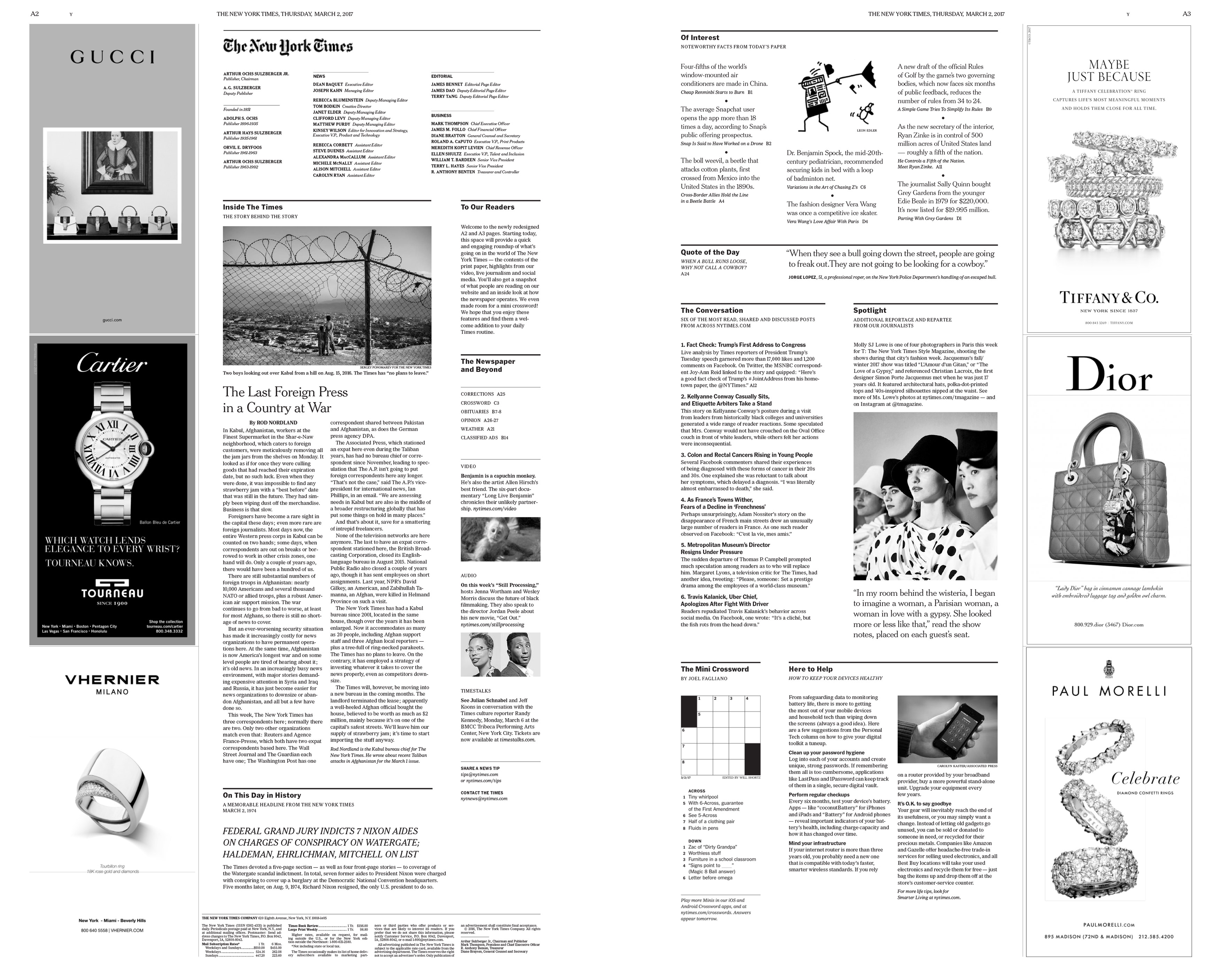
Readers of the print version of the New York Times opened up their papers yesterday to something new: Pages A2 and A3, located directly inside of the front page, have been completely reimagined.
Gone is the corrections section, and the summary of articles within the rest of the paper. In their place is an overview of everything going on in the Times‘ universe, from video content and podcasts to the top stories from the paper’s digital version (on Thursday, it included a fact checking of Trump’s address to Congress, featuring a tweeted endorsement of the story from an MSNBC correspondent). It’s a design overhaul that draws inspiration from the “front of book” concept common to many magazines.
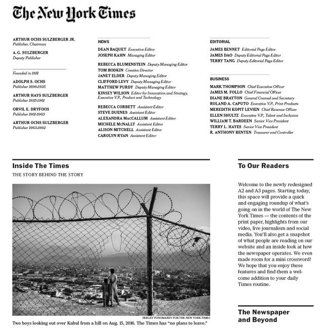
Laid out in clean, spare blocks of text, the new inside pages feature a “Beyond the Newspaper” section that highlights digital and audio content, as well as a list of the most-shared online articles, a mini-crossword, a doodle, and a list of compelling facts from stories inside the paper. One factoid highlighted yesterday? “The average Snapchat user opens the app more than 18 times a day.”
Unlike most print redesigns in the digital era—which typically focus on luring in readers with eye-catching visuals—the design seeks to seamlessly integrate digital and off-the-page coverage into the printed newspaper. By offering a daily guide to Times coverage, the spread leverages magazine design to give readers a window onto the diverse platforms and inner workings that make up the media company today.
“In general there’s been a desire to apply some of the innovative thinking and the advances in digital reporting to the print paper,” says Jake Silverstein, the editor in chief of the New York Times Magazine, who headed up the launch of the new section along with Times masthead editor Tom Jolly. “We didn’t want [print]to be something that remains the same as digital gets more and more creative, visual, innovative, and experimental.”
Silverstein and Jolly were given A2 and A3 to reinvent; these are “prime pieces of real estate in the newspaper,” as Silverstein puts it, though they’re traditionally used as a place to dump articles and sections that didn’t fit in elsewhere. Their team, composed mainly of former magazine editors, turned to a mainstay of magazine layout for inspiration. Called the “front of book” section, the pages let readers know what they can expect to find throughout the rest of the publication, with blurbs from contributors, behind-the-scene snippets, and plugs for online features.
For an editorial team used to working with magazine pages, the broadsheet newspaper spread offered a lot more room for expressively packaging its “Inside the Times” content. Readers unfolding the paper will see the entire section on one spread. It doesn’t need to be read linearly; the tile layout draws readers’ eyes to the various sections across the page. Though blurbs from videos, podcasts, and live events sit above the corresponding online URL, together they are meant to give an overarching view of what’s going on at the Times on any given day, not necessarily draw readers away from print and onto another platform.
Importantly, the new design also opens up the paper to relatively new types of reporting and coverage that doesn’t usually fit within the printed page, such as tweeted fact checks, or interactive media like video and infographics. It also gives a look into the inner operations of a prestigious media organization. For instance, the first redesigned pages, published on Thursday, included an “Inside the Times” piece from Kabul bureau chief Rod Nordland about why the Times has no plans to leave the war-torn city. It’s something the print version of the Times had previously been reticent to do for fear of it being too navel gaze-y.
“It’s a chance to talk about how we do our jobs,” says Silverstein, who notes that the redesigned pages will evolve to give readers an idea of what goes into making a paper—including, for instance, what it’s like to be a White House correspondent right now. During a time when trust in the press is at an all-time low, giving readers an insider’s look at a media company like the Times can convey not only the importance of the free press in a democratic society, but the sheer amount of work that goes into preserving it.
–
[Images: courtesy the New York Times]
This article first appeared in www.fastcodesign.com
Seeking to build and grow your brand using the force of consumer insight, strategic foresight, creative disruption and technology prowess? Talk to us at +9714 3867728 or mail: info@groupisd.com or visit www.groupisd.com