As the creative world strives for inclusivity, it only makes sense for typography to follow suit. In addition to emphasizing ideas with an immediate visual impact, it can also shift perspectives in a non-polarizing method.
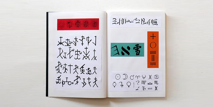
Ariel Brandolini‘s “nON-bINary” use typography to explores all possibilities of design. This ambitious font approaches type as a history of symbols, and each letter reflects a range of hieroglyphic, hieratic, and cuneiform components. With its fragmented curvature, harsh corners, and dramatic shapes, nON-bINary skillfully avoids any association with vapid, overused typefaces.

nON-bINary is a gender neutral font, a non-binary, inclusive and very esoteric typeface…An alchemical process in which primitive and arcane pictograms become tools of modern communication.
More than an alphabet, a system of signs born from an accurate analysis and the result of a refined collage/mix/mashup/mosaic of hieroglyphic, hieratic, cuneiform, Hebrew, uncial, calligraphic, chancery and gothic writing, Chinese ideograms, Latin, Phoenician and Greek alphabet, mason’s marks of the fifteenth and sixteenth centuries, Byzantine, Cretan, Hindu symbols, and evolution of all typographic forms.

The synthesis of this maniacal research is nON-bINary, a font that tries to free the legacies trapped inside each letter, break its cage and reveal its DNA, erase the traces of the centuries, the height, the shape, the variants, the cultural influences. The auctions of the lowercase letters continue with the desire to become capital, and vice versa, each letter contains itself and expresses a new form, always readable, which makes it universal.

nON-bINary is a new perception of alphabetic symbols that is not based on differences but on the study of similarities, not on separation but on unification and resolution.nON-bInARy does not “is”, it “will be” a constantly changing font, a project to discuss, exchange opinions and involve other people to play with its forms, modify them, improve them. Because it is only in constant change that we can improve.
Type design as a genealogy of symbols: an experimentation, a reflection on diversity and integration, but above all an appeal to what makes us unique: human being.WE ARE ONE … AND WE ARE MANY!


. .
This article first appeared in www.printmag.com
Seeking to build and grow your brand using the force of consumer insight, strategic foresight, creative disruption and technology prowess? Talk to us at +971 50 6254340 or engage@groupisd.com or visit www.groupisd.com/story

