
Brutalist UX is a growing trend. It may also be smart design.
In UX, as with nearly every field, when a trend or aesthetic gets too saturated, the next trend tends to whipsaw in the opposite direction. Such is the case with the slowly-emerging successor to today’s UX design: a stripped-down style that harkens back to the early web.
Last year, Co.Design writer Diana Budds reported that Pascal Deville, creative director at the ad agency Freundliche Grüsse, had christened this new aesthetic “Brutalist,” after the architecture movement. Deville catalogs examples of Brutalist design on his website, brutalistwebsites.com, which he started in 2014. Since then, the number of spare, economical, ’90s web-style sites has only continued to grow.
Now, Deville’s site has inspired a new project from UX designer Pierre Buttin. Buttin applied some of the most common design elements from Brutalist Websites to the best-known sites and apps of the day, rendering Twitter, Gmail, Spotify, and Tinder in this Brutalist style.
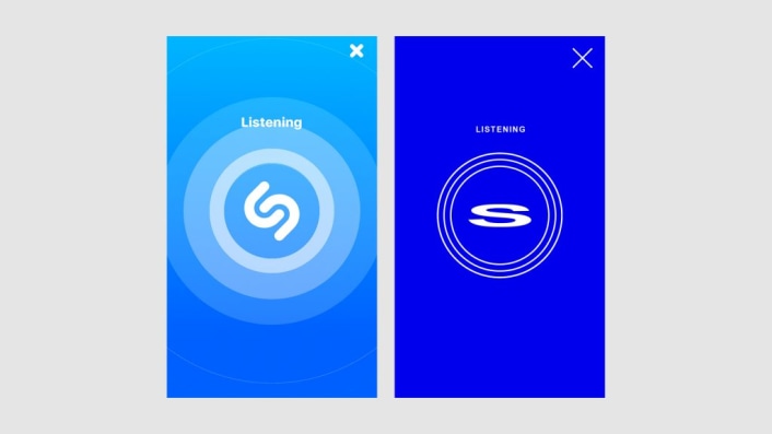
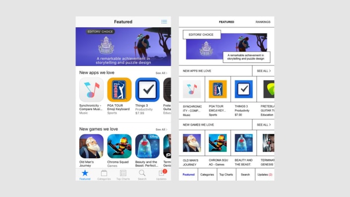
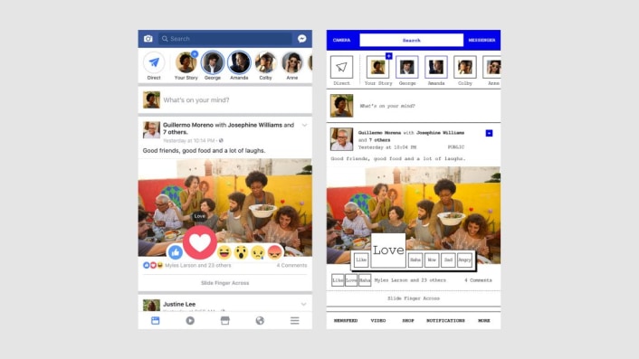
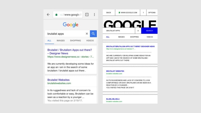
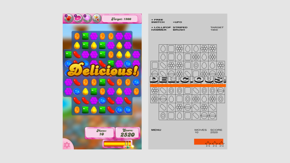
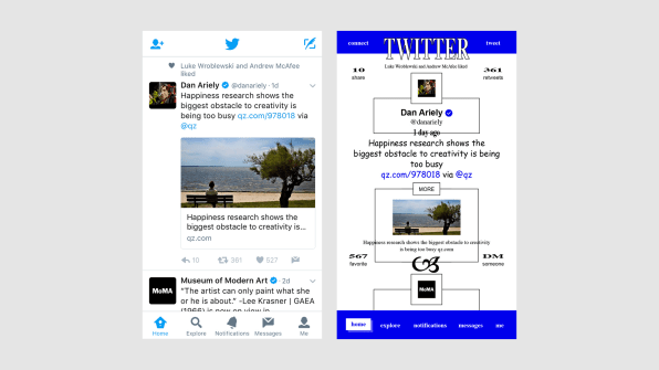
The result is a handful of websites that are still recognizable—many of the colors, logos, and familiar design elements remain. Yet their polish is gone. Traditional bright web colors replace sleek gradients, and many UI elements—rounded-corner icons, shadows, approachable type—are stripped way down.With Tinder, for example, bubbly icons are replaced with the actions they represent—PASS; LIKE—set in white, all-caps type against blocks of color. Twitter’s redesign replaces the bird logo with a large wordmark, with Tweets contained blocks with drop-shadows. With Candy Crush, the candy is reduced to just outlines against a grey background, all of the rounded corners and bright colors removed to reveal basic UI.
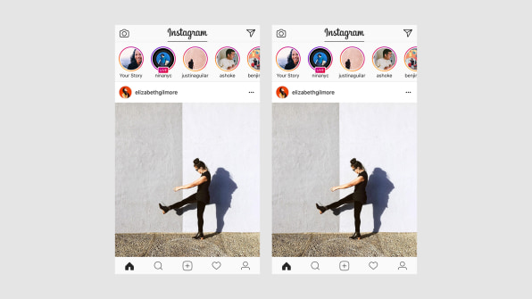
If these redesigns don’t seem all that unreasonable to you, it’s because a more simplified web design is making a comeback–a shrugging-off of too-stylized design and a nostalgic nod to early web design. And not just with the artists and web designers featured on Brutalist Websites. Larger platforms like Bloomberg, Drudge Report, and Adult Swim all sport ’90s motifs. Instagram’s recent redesign—with its neon accents and spare, line-drawn icons—is probably the most high-profile example. In his redesign, Buttin left Instagram as is, writing “I felt there was almost nothing I can do to make it look more brutal.”
That the rugged, raw-code aesthetic of Brutalist Websites has made its way to Instagram, one of the largest social media sites online today, provided most of the impetus for the new project. In his description, Buttin wonders what happens when Brutalist UX scales up to apps with billions of users—does it “make apps more usable, easy-to-use and delightful?… would it generate more growth?”With the project, Buttin is nodding to the growing trend, but he’s also showing that there could be real functional benefits to applying this more basic, no-frills UI style to apps. Lightweight app and web design allows for lower data usage and faster load times, particularly on mobile when a cellular connection or Wi-Fi aren’t always strong.
In that way, the project brings up an intriguing question: if big tech companies are the progenitors of the super-polished design aesthetic so popular today—will they now usher in its opposite? If others go the way of Instagram, perhaps we’ll find out. Until then, enjoy Buttin’s interpretations of the most familiar websites, brutalized.
–
This article first appeared in www.fastcodesign.com
Seeking to build and grow your brand using the force of consumer insight, strategic foresight, creative disruption and technology prowess? Talk to us at +9714 3867728 or mail: info@groupisd.com or visit www.groupisd.com