Graphic designer Kelly Lauren gave each coffee brand a new look, dividing commenters with her design decisions.
The Starbucks logo is so iconic that it’s hard to imagine an image that could represent the brand as effectively as the mermaid. But graphic designer and YouTuber Kelly Lauren has boldly attempted to redesign the logo for the omnipresent coffee behemoth, along with the logos of two other multinational coffee companies: Coffee Bean & Tea Leaf and Folgers.
In a 36-minute-long YouTube video, Los Angeles-based Lauren walks through her reimagining of each of the companies’ brands, creating a new logo, icon, and color scheme for each one. She meticulously explains her design decisions, all of which aim to make the three existing coffee companies’ brands a little closer to her vision of artisanal coffee, while still preserving some elements of the previous branding.
The video is part of a series where Lauren redesigns the logos of major companies, many of which she solicits from her sizable following (she has nearly 96,000 subscribers on YouTube and 14,600 followers on Instagram). She’s also redesigned the logos for Zara, AT&T, and Chipotle, and she posts videos about her life as a designer, giving advice about graphic design, walking through DIY projects, and trying on thrift store clothes.
Here’s how she rethought the branding of coffee giants like Starbucks, The Coffee Bean & Tea Leaf, and Folgers.
STARBUCKS BIDS GOODBYE TO THE MERMAID
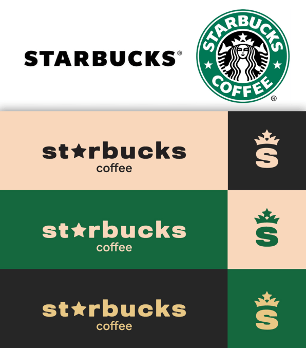
First up, the big kahuna. Lauren takes a radical approach with the Starbucks logo, even though in the video she claims she doesn’t want to take it too far away from the original. “I’m going to give it a facelift, make it look a little bit younger, but stay within the same brand guide so you don’t lose brand recognition,” Lauren says.

The result, however, is very different. Lauren chooses a new typeface, called Titling Gothic, for the word mark, and replaces the “a” in Starbucks with a star. For her redesign of the mermaid, she focuses only on a single element: the woman’s crown. She combines it with a star on top to give it a more complete look. (Lauren also tried to incorporate some of the squiggles in the mermaid’s hair but ultimately decided against it.) She tweaks its classic green color to be a bit warmer and adds a complementary gold, blush, and black colors to complete her rebrand.The logo is effective—but only just. Some might have trouble recognizing it. The current Starbucks logo is so iconic at this point and people are so accustomed to it that a change this dramatic leads to some serious griping in the comments.
A NEW COFFEE BEAN—WITHOUT THE TEA LEAF
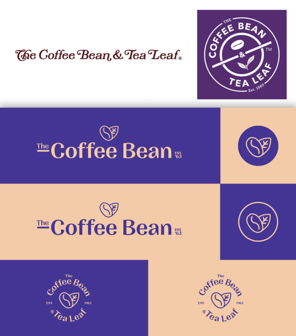
For her second logo, Lauren retains more of the core ethos of the brand. She starts by analyzing The Coffee Bean & Tea Leaf’s current logo, which is in the form of a circle with a representation of a coffee bean and a tea leaf in the center. The logo’s words are at an angle—an effect that seems designed to look like an approval stamp on a bag of coffee. But, as Lauren points out, it “just looks strange.”

Her first design decision is to drop the “& Tea Leaf” entirely, because even though the shops are known for their tea selection, she thinks the name is just too long and it doesn’t add enough to justify its length. For a word mark, she uses a typeface called Nazare, miniaturizes and underlines the “The,” and retains “Est. 1963,” because she likes the retro vibe. While tea doesn’t make the cut for the word mark, she does retain a reference to tea in her new logo: It’s a representation of a coffee bean and tea leaf formed into a heart, an idea that sounds cheesier than it turns out to be. She refines the rather harsh purple that The Coffee Bean usually has, and pairs it with a peach tone for contrast.
Finally, Lauren offers another option, where the company’s name is displayed in a circular emblem, with the heart-shaped bean and leaf in the center—a serious improvement on the coffee chain’s current stamp-like logo. The logo is so good that many of her commenters think that the Coffee Bean & Tea Leaf should adopt it.
A QUAINT BUT MODERN FOLGERS
Lauren’s last redesign take on the classic home coffee brand Folgers, which is the largest seller of ground coffee in the United States and has a logo that looks like it’s right out of the 1970s.
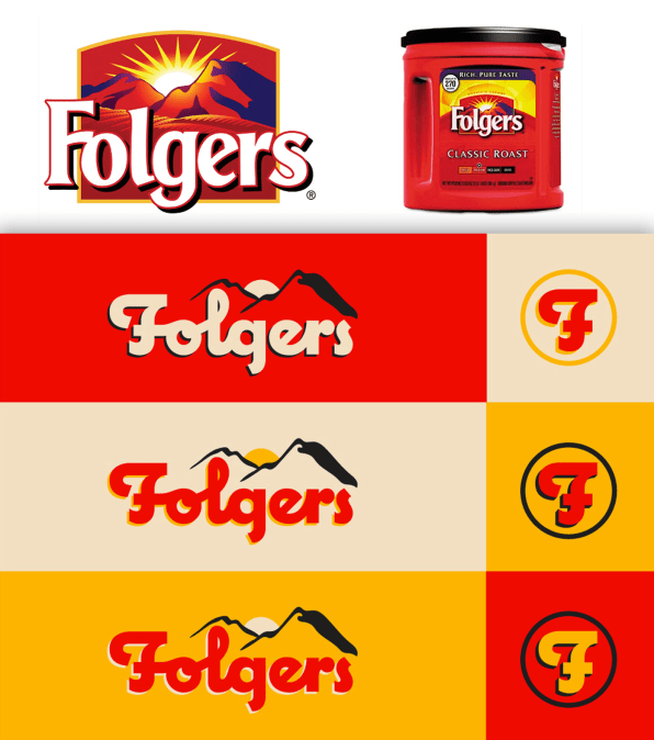
It’s so jarring to Lauren that when she opens a Google Image Search page to pull a copy of the logo into Illustrator, where she’s working, she exclaims, “Holy mother of god!” The logo garishly proclaims “Folgers” against a backdrop of mountains and a rising sun, and that’s definitely not Lauren’s aesthetic. “My goal is to give it a more artisanal, a little bit more indie coffee brand, a little more modern,” she muses. “I want it to feel like small, vintage vibe.”

But she doesn’t want to entirely trash the logo and start from scratch. Instead, Lauren selects a typeface called Coquette for the logo, connects some of the letters together to give it more of a cursive feel, and places the company’s name against a simplified outline of the same mountains in the original logo. She adds a sun between the mountains, and spends a lot of time debating what kind of rays to give the sun before deciding against it entirely.
Lauren then slightly tweaks the iconic Folgers red and adds a yellow color she calls “Velveeta cheese gold.” The final product is still quaint but significantly more modern—and her viewers agree. “I want Folgers to use your logo!! It’s amazing,” writes one commenter.
Have a logo you think Lauren should redesign? Hit her up on Instagram.
–
This article first appeared in www.fastcompany.com
Seeking to build and grow your brand using the force of consumer insight, strategic foresight, creative disruption and technology prowess? Talk to us at +9714 3867728 or mail: info@groupisd.com or visit www.groupisd.com

![[Image: courtesy Kelly Lauren]](https://images.fastcompany.net/image/upload/w_562)