
From its early days as scrappy music startup to the entertainment juggernaut of today, Spotify’s branding has evolved with the times.
Founded in 2006 by Daniel Ek and Martin Lorentzon as a small startup in Stockholm, Spotify’s music service launched in 2008, initially supported by advertising. Its fun—and very green—original wordmark evoked exuberance, much like 1996 to 2013’s Yahoo logo, only with less bouncy letters.
2008 to 2013 [Image: Spotify]
Ordinarily housed in a wash of green, a rectangle or square with “Spotify” seated at the bottom, the shape calls to mind an app button, much like Apple’s original icons for iPhone. Designer and engineer Rasmus Andersson created the wordmark using Pantone 376 green, and was also responsible for both the Mac and Windows Spotify products. The wordmark used slab serif type but with its “o” raised up off the baseline, small arcs above the “o” were reminiscent of the Wi-Fi symbol, sounds emanating from a speaker or headphones, or even visual effects showing the X-Man Banshee’s sonic waves. The bespoke “fy” ligature added another unique visual attribute to the lockup. 
[Photo: courtesy Rasmus Andersson]
SPOTIFY’S LOGO MATURES
Andersson, who called Spotify a music company at its inception, explained how he was responsible for all design components. He made the full spectrum of visual assets and also engineered apps across various platforms, including desktop versions or mobile and for iOS or webOS.
Andersson left Spotify in 2010 to become an engineer at Facebook until 2013. Around that time, Spotify’s wordmark underwent its first of two big changes. No longer occupying a large field of green, “Spotify” was a lone wordmark with the audio-emanating symbol positioned nearby. The fun “fy” ligature remained, and the “i” now had more personality—friendlier, if you will, because of a circular dot. Coincidentally around this same time, Yahoo abandoned its own bouncy wordmark and took a more conservative approach with its brand identity.
SPOTIFY’S LOGO EVOLVES WITH THE TIMES
Come 2013, we were still trapped in Web 2.0, but Web3, aka Web 3.0, was not far off. Web3, coined by David Wood in 2014, forecasted “purely algorithmic things,” and Spotify was at the forefront of that generational shift. Spotify became accessible in the U.S., here and there you’d see people wearing Google Glass, Apple debuted its redesigned iOS 8, and Apple Watch was unveiled in September 2014. That period, from 2013 to 2015, signaled a paradigm shift, and many tech brands attempted to rebrand themselves, maybe moving from tech to music or tech to entertainment.
2013 to 2015 [Image: Spotify]
Spotify was poised to change both its surface and substance, evolving from a music to entertainment brand. Collins led the endeavor, inheriting the existing brand mark, but taking it in new directions. In 2015 at South by Southwest, in Spotify House, a year’s worth of work went public. Collins’s founding partner, Leland Maschmeyer, explained how the “consistent drumbeat through the brand” needed to “communicate in much more diverse ways.” Collins made that happen, with an array of colorful assets, photography, and graphic shapes and gradients that signaled an evocative and big step forward
.
[Images: courtesy Collins]
Hands-on with the approach, invested in the brand and the transformative work, Collins didn’t just take care of the visual elements but, rather, took things one step further by designing a software program nicknamed “the Colorizer” to automate photograph styling, recoloring, and duotone applications. Collins’s director of experience design, Brett Renfer, created the tool. “Spotify has so much content to process that to have software do the heavy lifting was fantastic,” Maschmeyer said. The mark—call it sound waves or sonic vibes—continues to be a part of the brand identity, whether used on its own, accompanying the wordmark, or nestled near a heading on its website.
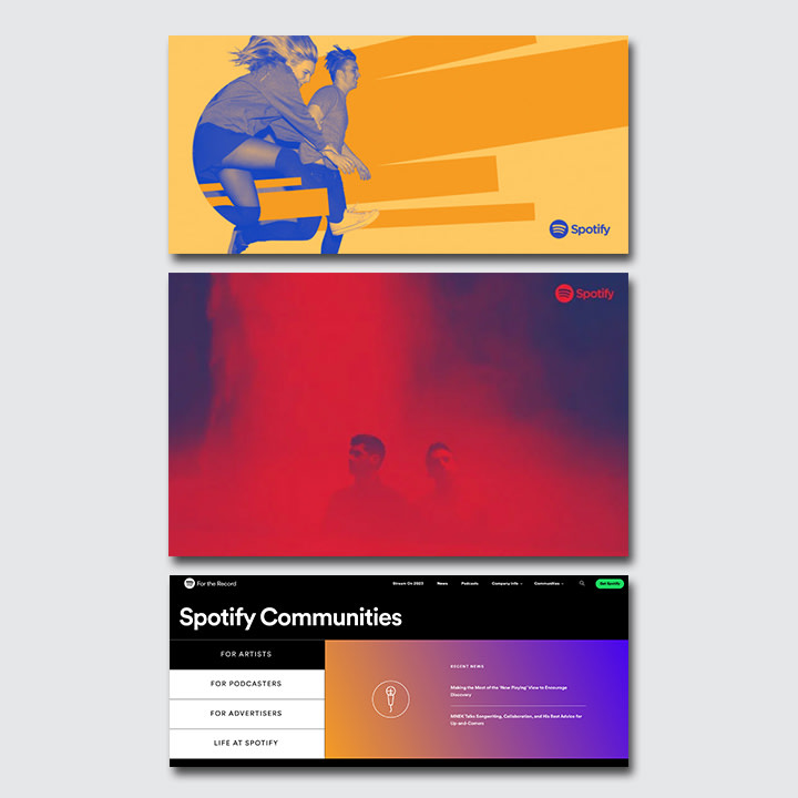
[Images: Spotify]
SPOTIFY’S BRAND GOES FUTURE-FORWARD
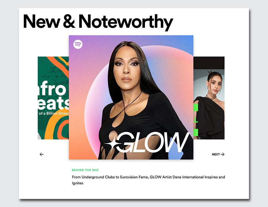
Collins brought an intentional, future-forward approach to the entire design process, delivering on the promise to “make your future so irresistible,” not to mention efficient. Having “the Colorizer” and its automation in place was as helpful then as it is now because the tool accounted for growth. In 2015 Spotify was releasing approximately 20,000 new songs every day, but that number has since doubled, now averaging about 49,000 new songs per day, according to Billboard.
[Image: Spotify]
Today, Spotify delivers a treasure trove of music from every corner of the globe, with an accompanying collection of almost psychedelicphotographs and graphics—an intended look and feel, according to Collins.
But should you call it a music company or an entertainment company or a tech company?
One thing’s for certain: Spotify’s brand and visual culture have stood the test of time, and thanks to the transformative work of Collins, it’s primed for the future.
—
This article first appeared on www.fastcompany.com
Seeking to build and grow your brand using the force of consumer insight, strategic foresight, creative disruption and technology prowess? Talk to us at +971 50 6254340 or engage@groupisd.com or visit www.groupisd.com/story
