
Many of the women taking the field in this summer’s World Cup were inspired as kids by the players of the 1990s–and requested kit designs that would pay tribute to the era’s heroes.
Nike unveils the soccer kits it designed for 14 of the 24 countries that will be participating in the Women’s World Cup in France later this summer, including the United States, Nigeria, France, Chile, and New Zealand.
The designs feature an explosion of colors and patterns. Australia’s team, the Matildas, have away jerseys covered in vibrant brush strokes of yellow and green, reminiscent of graffiti. The graphic was inspired by the lush landscape of Australia, as well as Hosier Lane, a well known street in Melbourne that is famous for walls covered with bright, colorful graffiti.
“It is very specifically ’90s-style graffiti,” says Cassie Looker, senior product line manager for the global football division, who was responsible for leading the team at Nike headquarters that designed these kits. “Many of the players on the Australian team were born in the ’90s, and this jersey is designed to highlight the street art and culture of the era they were born in.”
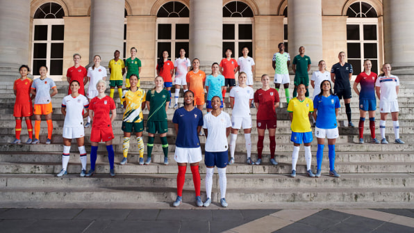
Each team gets two sets of jerseys, shorts, socks, and boots, one for home games and the other for away games. (In practice, having two options means that teams can pick the kit that contrasts with their opponents, so viewers can better distinguish players.) It might seem like a tall order to capture the entire flavor of a country in the limited real estate of a few pieces of fabric, but Looker says that you can do a lot with a soccer kit. “There’s more to work with than you might think,” Looker says. “It’s actually a great storytelling vehicle where you can play with color and graphics.”

For instance, the English team, known as the Lionnesses, have a far more classic look than their Aussie counterparts. Their away shirts are deep red, and have a faint floral pattern on them. Taking a closer look, you see the poppy, primrose, and roses on the print, reflecting the flora native to the United Kingdom. The Chinese team is called the Steel Roses. Their away jerseys are gray and feature a traditional Chinese painting of a phoenix, to empower the team to recapture the spirit of the early 2000s, when it won seven consecutive Asian trophies.
Looker says that groups of Nike employees worked with the women’s team from each country–or federation, to use World Cup parlance–to determine how best to translate the spirit of the country, and the particular team, into the garments. “This means meeting with supporters, considering the landscape of the countries, and incorporating art and music,” says Looker. “But most importantly, it’s about having something that is very special and empowering to the athletes themselves. So we sit down with each team to ask them what they want, and also get a sense of how they operate as a team.”
PAYING TRIBUTE TO THE PLAYERS WHO CAME BEFORE
Take the American team, for example. This year marks the 20th anniversary of the U.S. women’s soccer team winning the World Cup. Many women on the team today actually watched the 1999 games as preteens, and credit that victory for inspiring them to get into soccer. They also say that was the year that soccer was propelled from the fringes of American sports to the mainstream. Alex Morgan, who is on this year’s team, was only 10 years old at the time, but she remembers that day clearly.
“That team was something incredible,” she says, in a Nike statement. “I wanted to be them when I grew up.”
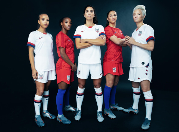
She got her wish. This year, Morgan and her teammates go into the World Cup as the defending champions. They wanted to pay homage to–and channel–the 1999 team through their home kits. The outfits looks downright retro, with all-white shorts and jerseys that feature cuffs that have red and blue stripes on them. There are also three stars on them, to symbolize the three times the American women’s soccer team has won the championship: 1991, 1999, and 2015.
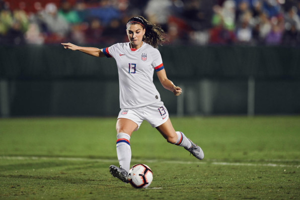
Each team has also picked a phrase, which is emblazoned on the inner back part of the jersey. The U.S. women’s team picked “Climb Again” for their home jerseys to inspire the players to reach for victory again this year.
Looker points out that the home kit has a red Nike swoosh on it that is outlined in blue, which is a design element that the brand often included in the 1990s. She believes fans will appreciate all of the nostalgia that is contained in these kits. Stadium versions of these kits are available for fans to purchase, although they have slightly looser fits. “These moments of soccer history are forever imprinted on the minds of consumers,” she says. “I don’t think anyone can think of Mia Hamm without thinking of her in that ’99 kit.”
The U.S. team’s away kit is totally different. It features a bright red, with an abstract impression of an American flag, along with a representation of all 50 states, and is coupled with blue socks. It looks entirely modern, especially compared to the home kits. “It’s kind of a way for everyone in the United States [to]be with them as they head into France, saying, “Hey, we have your back,”” Looker says.
THE DESIGN CHALLENGE OF RED, WHITE, AND BLUE
One thing that the Nike team must think about is how to make sure that kits from countries that have similar color schemes in their flags look different from one another. There are many federations, for instance, with red, white, and blue flags.
“I think it’s a great design challenge,” says Looker. “I think we’re at our best when we’re solving problems. Here is where we lean into variations in colors and textures.”
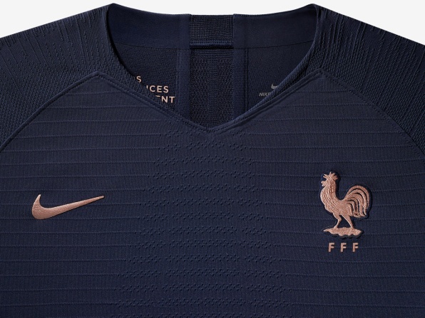
The French team, for instance, has a blue jersey for its home kit, rather than a red one, like the American’s. (Their nickname is Les Bleues, which means The Blues.) And while the American team picked a bright blue color, the French team’s is a darker, navy blue. For its crest and swoosh, it has a contrasting rose gold color.
For its home jersey, France has a fun hexagonal pattern that looks just like polka dots from a distance. It’s a bit of patriotism since France is shaped a little like a hexagon, but in a very fashion-forward way. “For France, we thought about sophistication,” says Looker. “When people think of France, they think of fashion and haute couture. So, the French kit is still red, white, and blue, but it couldn’t be more different (from the American kit).”
USING DATA TO CREATE “THE GOLDILOCKS OF JERSEYS”
While Nike’s design team spent a lot of time working on the aesthetics of each kit, Looker says that they spent an equal amount of effort on the technology inside the garments, which are made with recycled polyester that comes from water bottles. Nike brought in many of the soccer players to be scanned in a body-mapping lab in Beaverton, Oregon, to learn more about how the female body moves while playing soccer. While the kits are not tailored to each individual players, the Nike designers used all of these insights to create kits that would be used across all 14 federations.
Looker says Nike learned that women experienced a lot of sweating and friction on the waist band of their shorts. In the past women’s soccer shorts have had a drawstring, but this year, Nike has done away with it, replacing the drawstring with a lightweight elastic waist band that is highly breathable, to encourage ventilation there. Nike also identified that female soccer players are different from elite athletes in other sports because their quads, glutes, and hamstrings are often more muscular. Nike has adjusted the fit of the shorts to create to ensure they are not too tight in these areas. “Their lower body is their power source,” says Looker. “That’s where all their dynamism is coming from.”
But through talking to these female soccer players, they also discovered that they all wanted garments that were modest. Interestingly, this was consistent regardless of what part of the world the athletes were from. This is different from the men’s teams, who all showed preferences for slimmer, tighter-fitting garments. As a result, Nike has made all of the women’s kits with high crewneck necklines, rather than a V-neck. As for the shorts, the team kept iterating to make sure they were long enough to provide coverage, but not so loose that they created friction.
“It’s kind of like the Goldilocks of jerseys and shorts: Not too long, not too short,” says Looker. “The women consistently wanted to make sure they were covered and looked professional. In the past, a lot of female athletes had to make adjustments to their garments to make it fit the way they wanted to, so this was an opportunity for us to really sit down with them and make them to their specifications.”
There will be some players on the pitch who require even more modesty for religious reasons. Looker says that women will have access to other garments that Nike creates, including the pro hijab, if they need further coverage.
–
This article first appeared in www.fastcompany.com
Seeking to build and grow your brand using the force of consumer insight, strategic foresight, creative disruption and technology prowess? Talk to us at +9714 3867728 or mail: info@groupisd.com or visit www.groupisd.com