“A bold, striking, visual slap in the face is a pretty good place to begin,” says creative director Andy Reynolds.
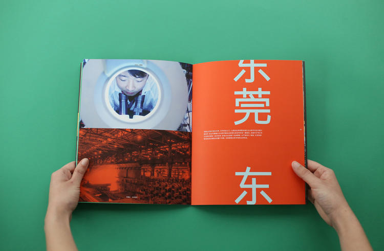
Dongguan is an industrial city located at the mouth of China’s Pearl River Delta, about 50 miles north of Hong Kong, that’s earned an unsavory reputation as a “sin city” for its high organized crime and prostitution rates. The commercial hub also makes appearances in the news for its strikes over sweatshop labor(suppliers for Nike and Adidas have factories in Dongguan).
Now, the city and developers want to overhaul its image—and, hopefully, stage a turnaround.
The idea to revamp Dongguan didn’t come overnight. In the early 2000s, China’sNational Development and Reform Commission identified it as a major growth region and, likely in an effort to attract more legal business, sought to transform it into a true global city filled with arts, culture, and entertainment for residents and tourists.
One of the new projects that emerged from this city shake-up is MYHills, a sprawling 26-acre (that’s about the size of 20 football fields) mixed-use development composed of a residential tower, three office towers, a shopping mall, hotel, and various other entertainment amenities, like a movie theater and ice skating rink. Because of the MYHills’s size, it’s a city-shaping project and its branding and presence could impact the urban fabric beyond the development’s perimeter.
To come up with a brand for MYHills, the developers enlisted the Hong Kong office of the global design consultancy and creative agency Brand Union.
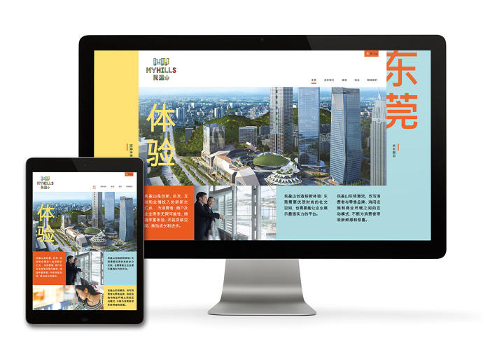
“Our client is extremely proud of their home city, and reinforced its many unique attributes and ambitious future plans for change,” says Andy Reynolds, creative director at Brand Union HK. “With this in mind, we created a positioning that reflected both the city’s ambition and the developments progressive design aesthetic: ‘Building the future.'”
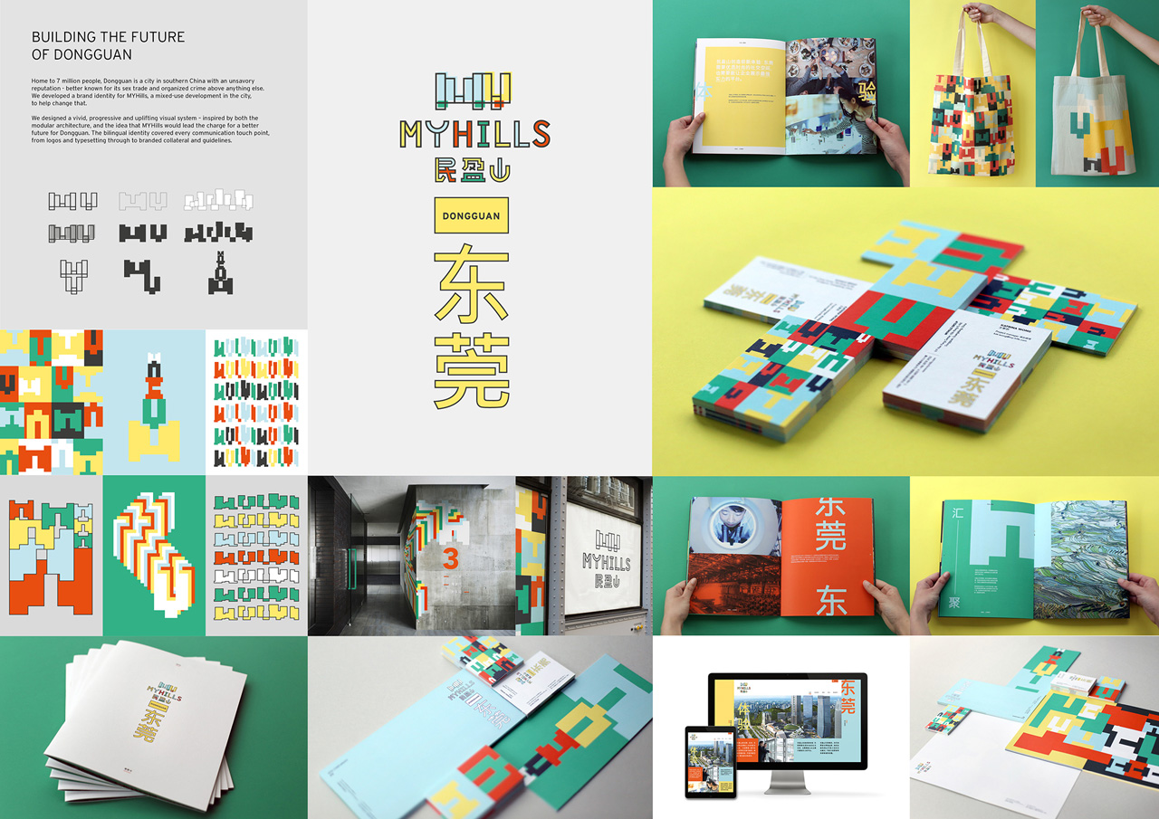
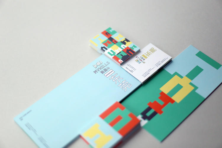
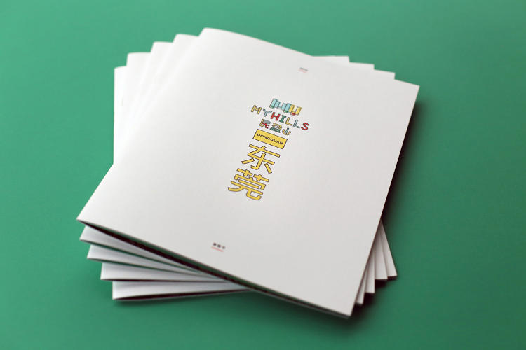
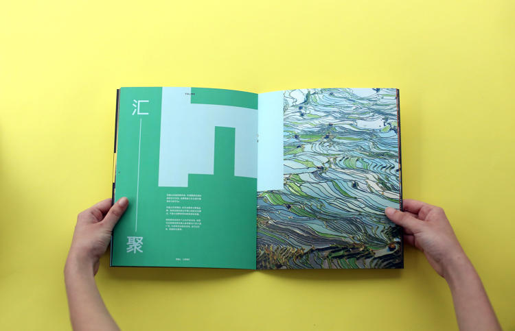
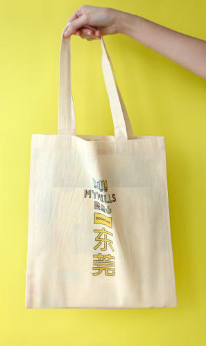
The scope of the project included environmental graphics, printed material, signage, a website, and merchandise. Because of the diverse applications, Reynolds and his team had to make sure that the system could work at any scale and in any format. From an aesthetic and symbolic perspective, they wanted it to embody optimism for the city’s next chapter.
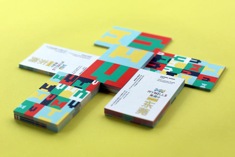
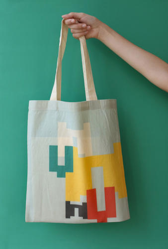
“We knew the brand would need to live across various platforms and environments, and we also knew we wanted it to really stand out,” Reynolds says. “So early in the conceptual stage, we toyed with a pattern approach that would both resonate with the architecture and positioning whilst giving us a vibrant and flexible asset to use across the various channels. Color was a key factor for us in this project. We wanted a bold and unique palette that, when used correctly, could become a recall code for the destination.”
To that end, they riffed on the development’s modular architecture—the structures are designed so that the development can grow over time and so additions blend with the existing buildings as opposed to looking like an afterthought—and created a blocky, pixelated abstraction of the letters “MY” that resemble building silhouettes. “The patterns and flexible logo allude to a destination that is constantly evolving,” Reynolds says.
One of the most eye catching elements of the system are the bright colors—green, yellow, and red—which are inspired by Dongguan‘s agricultural past. “We wanted to inject some energy and vibrancy into the urban sprawl by embracing vivid and clashing hues,” Reynolds says. In addition to the digital and print collateral, Brand Union also proposed a playground done up in the patterns and shapes they used for the identity system (though it remains to be seen if it will be built).
While the identity system succeeds from a functional standpoint and definitely embodies Dongguan‘s ambition to rid itself of its sordid reputation, graphic design and a single development—as vast as it is—isn’t a panacea.
Place branding is a challenging endeavor, and in many other cases it hasn’t worked. Take for example Rhode Island’s botched “Cooler & Warmer” rebrandingthis spring, which ended in scandal and ridicule. At the same time some instances, like renaming and rezoning whole neighborhoods, has brought success from a real estate standpoint.
“In the context of Dongguan, graphic design on its own can’t stop prostitution or pollution of the environment,” Reynolds says. “But you have to start somewhere—and a bold, striking, visual slap in the face is a pretty good place to begin and signifies a new beginning.”
