
Not all cities have a budget for design, but Atlanta’s department of urban planning is showing why they should.
![[Image: courtesy Matchstic]](https://assets.fastcompany.com/image/upload/w_394,h_221,c_fit,f_auto,q_auto:best,fl_lossy/wp-cms/uploads/sites/4/2017/08/2-history-of-transit-branding-iotd-1-1024x576.jpg)
![[Image: courtesy Matchstic]](https://assets.fastcompany.com/image/upload/w_394,h_221,c_fit,f_auto,q_auto:best,fl_lossy/wp-cms/uploads/sites/4/2017/08/4-history-of-transit-branding-iotd-1-1024x576.jpg)
![[Image: courtesy Matchstic]](https://assets.fastcompany.com/image/upload/w_394,h_221,c_fit,f_auto,q_auto:best,fl_lossy/wp-cms/uploads/sites/4/2017/08/5-history-of-transit-branding-iotd-1-1024x576.jpg)
![[Image: courtesy Matchstic]](https://assets.fastcompany.com/image/upload/w_394,h_221,c_fit,f_auto,q_auto:best,fl_lossy/wp-cms/uploads/sites/4/2017/08/6-history-of-transit-branding-iotd-1-1024x576.jpg)
![[Image: courtesy Matchstic]](https://assets.fastcompany.com/image/upload/w_394,h_221,c_fit,f_auto,q_auto:best,fl_lossy/wp-cms/uploads/sites/4/2017/08/7-history-of-transit-branding-iotd-1-1024x576.jpg)
![[Image: courtesy Matchstic]](https://assets.fastcompany.com/image/upload/w_394,h_221,c_fit,f_auto,q_auto:best,fl_lossy/wp-cms/uploads/sites/4/2017/08/8-history-of-transit-branding-iotd-1-1024x576.jpg)
![[Image: courtesy Matchstic]](https://assets.fastcompany.com/image/upload/w_394,h_221,c_fit,f_auto,q_auto:best,fl_lossy/wp-cms/uploads/sites/4/2017/08/9-history-of-transit-branding-iotd-1-1024x576.jpg)
![[Image: courtesy Matchstic]](https://assets.fastcompany.com/image/upload/w_394,h_221,c_fit,f_auto,q_auto:best,fl_lossy/wp-cms/uploads/sites/4/2017/08/10-history-of-transit-branding-iotd-1-1024x576.jpg)
![[Image: courtesy Matchstic]](https://assets.fastcompany.com/image/upload/w_394,h_221,c_fit,f_auto,q_auto:best,fl_lossy/wp-cms/uploads/sites/4/2017/08/11-history-of-transit-branding-iotd-1024x576.jpg)
![[Image: courtesy Matchstic]](https://assets.fastcompany.com/image/upload/w_394,h_221,c_fit,f_auto,q_auto:best,fl_lossy/wp-cms/uploads/sites/4/2017/08/12-history-of-transit-branding-iotd-1024x576.jpg)
![[Image: courtesy Matchstic]](https://assets.fastcompany.com/image/upload/w_394,h_221,c_fit,f_auto,q_auto:best,fl_lossy/wp-cms/uploads/sites/4/2017/08/13-history-of-transit-branding-iotd-1024x576.jpg)
![[Image: courtesy Matchstic]](https://assets.fastcompany.com/image/upload/w_394,h_221,c_fit,f_auto,q_auto:best,fl_lossy/wp-cms/uploads/sites/4/2017/08/14-history-of-transit-branding-iotd-1024x576.jpg)
![[Image: courtesy Matchstic]](https://assets.fastcompany.com/image/upload/w_394,h_221,c_fit,f_auto,q_auto:best,fl_lossy/wp-cms/uploads/sites/4/2017/08/16-how-ikea-plans-to-cut-its-food-waste-in-half-1024x576.jpg)
![[Image: courtesy Matchstic]](https://assets.fastcompany.com/image/upload/w_394,h_221,c_fit,f_auto,q_auto:best,fl_lossy/wp-cms/uploads/sites/4/2017/08/17-how-ikea-plans-to-cut-its-food-waste-in-half-1024x576.jpg)
![[Image: courtesy Matchstic]](https://assets.fastcompany.com/image/upload/w_394,h_221,c_fit,f_auto,q_auto:best,fl_lossy/wp-cms/uploads/sites/4/2017/08/19-how-ikea-plans-to-cut-its-food-waste-in-half-1024x576.jpg)
![[Image: courtesy Matchstic]](https://assets.fastcompany.com/image/upload/w_394,h_221,c_fit,f_auto,q_auto:best,fl_lossy/wp-cms/uploads/sites/4/2017/08/20-how-ikea-plans-to-cut-its-food-waste-in-half-1024x576.jpg)
![[Image: courtesy Matchstic]](https://assets.fastcompany.com/image/upload/w_394,h_221,c_fit,f_auto,q_auto:best,fl_lossy/wp-cms/uploads/sites/4/2017/08/21-how-ikea-plans-to-cut-its-food-waste-in-half-1024x576.jpg)
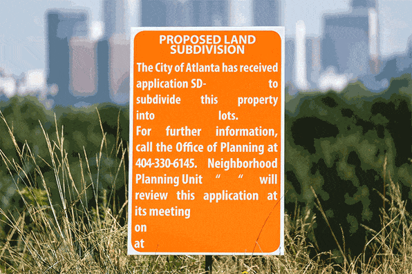
You’ve definitely seen Public Notice signs slapped up around your city or town, but you’d be forgiven if you’ve never really looked at them. Often found taped to signposts or pasted on the sides of buildings, these text-heavy, government-issued signs convey important information about planning or zoning–to announce when a tree will be removed, for example, or a public hearing on a property. They tend to do it verbosely, and without a lot of style. As creative director Blake Howard puts it, they’re like the spam mail of city way-finding—most people just glaze over them.
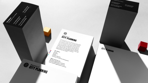
In Atlanta, where Howard’s branding firm Matchstic is based, that recently changed. Earlier this year, the firm was approached by Commissioner Tim Keane of the Atlanta Department of City Planning, which handles public notices, to reassess the visual language of the department itself. Matchstic gave the department its new name (before, it was the “Department of Planning and Community Development”) and a new look, including clean typography, colorful applications, and more modernized seal. One of the first applications of the rebrand, which launches today? A series of sharply designed Public Notice signs.
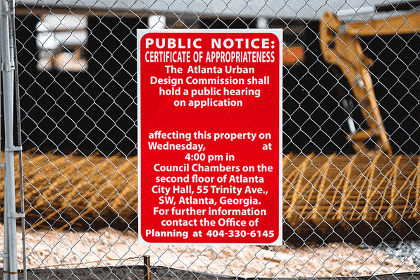
When it came to rebranding the department itself, the most important factors were simplicity and clarity. Matchstic treated it as it would any other branding project. “In Atlanta, the Department of Planning isn’t exactly known for being customer-oriented,” says Howard. “It’s like the equivalent of the DMV at times. We wanted to make it customer-focused and intuitive, and overhaul the visual branding to re-assert the department’s priorities.”They summed up the approach with a phrase that drove all of the visual messaging: “To Be Clear Is To Be Kind.” In other words, says Howard, “If we want to be kind to the public we serve, we need to be clear.”
For signage, that meant establishing typographic hierarchy. Public notices are written in legalese, for the simple reason that they are notifying the public to the degree of the law. Much of that language couldn’t be altered, but Howard and his team broke up the text so it’s easier to read, putting the most important information up front and in large type.For example, if the notice is alerting citizens that a tree will be removed, that statement is in bold and centered so that if nothing else, that message gets conveyed. The details are in smaller type below and to the side. An elongated, bolded “T” for tree—very much in the Swiss Style—categorizes the signs by topic so you can read each at a glance. Others have a “B” for bike share station or “V” for variance.
It’s an exceedingly simple approach, but a brilliant example of how design can cut through bureaucratic systems to convey information clearly to the public.
Having an outside designer work with government departments to overhaul their visual communications system is not a new idea. In the ’70s, Nixon of all people provided support for some of the most prominent designers of the day to create identity systems for federal government agencies.
Communicating laws, rights, and services to citizens is a vital duty of the government, and design can help with that. Yet government budgets can be restrictive, and often design isn’t considered a first priority. Howard says Commissioner Keane is the reason Atlanta’s planning department is so progressive when it comes to design. When he approached Matchstic with the job, Keane made it clear that he understood the value in good public perception and clear communication.“I think that other departments or government groups could realize the value of considering the department as a brand,” says Howard. “Like consumer-facing entities, there is value in having a good reputation. The benefit to working with outside designers is that you get that a fresh perspective, and a desire for it to be more intuitive and human-focused.”
–
This article first appeared in www.fastcodesign.com
Seeking to build and grow your brand using the force of consumer insight, strategic foresight, creative disruption and technology prowess? Talk to us at +9714 3867728 or mail: info@groupisd.com or visit www.groupisd.com