
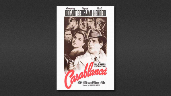
Gold’s design for Casablanca was his second assignment, fresh out of Pratt.
Yesterday was a sad day for design and film: The legendary movie poster designer Bill Gold–who made iconic images for Casablanca, A Clockwork Orange, Alien, and more than 1,000 other motion pictures–died at age 97. Today, in an industry where every single poster looks exactly the same, he will be sorely missed.
It’s almost impossible to pick a short list of Gold’s best artwork. He worked relentlessly for seven decades with some of the best filmmakers in history: Hitchcock, Kubrick, Lumet, Truffaut, Kazan, Altman, Pakula, Curtiz, Forman, Hawks, Eastwood, and Scott, to name just a few. Like Saul Bass, another legendary designer with a strong link to the film world, his work has influenced many. Unlike Bass, however, his style wasn’t so distinctive and well defined. Gold’s work adapted to the subject matter of the films and the times, albeit always maintaining a masterful understanding of composition, illustration, and photography. Here’s a look at some of his jewels.
Just out of his illustration and design studies at the Pratt Institute in New York, Gold started to work at Warner Bros. New York at age 21. His first poster design was for Yankee Doodle Dandy, in 1942. His second assignment was for one of the biggest movies in the history of biggest movies: His design for Casablanca (1942), with its red lettering and sepia tone illustration of Rick, Ilsa, Renault, Ugarte, Laszlo, Signor Ferrari, and Major Strasser, is perhaps the most reproduced poster in the history of cinema–and one of the most iconic.
.jpg)
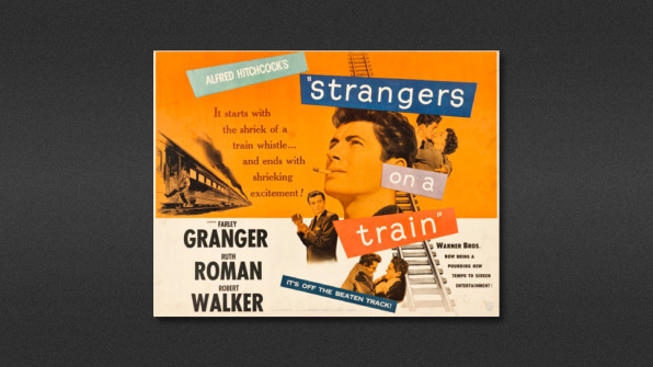
Gold made posters for some of Hitchcock’s earliest American movies, like Strangers on a Train (1951, above) and Dial M for Murder (1954).
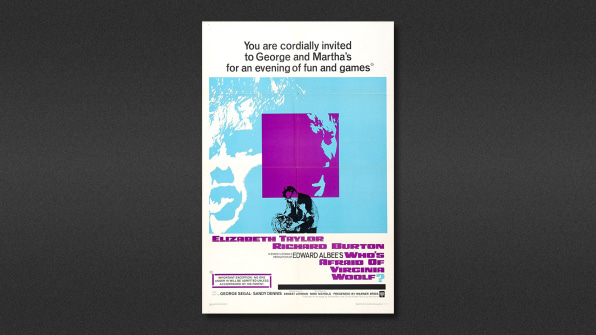
For Mike Nichols’s Who’s Afraid of Virginia Woolf? (1966), Gold played with monotone photographs for the first time, using three inks–a dramatic change from his usage of full color illustrations earlier in the ’60s and the two previous decades.
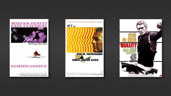
The use of this technique of high contrast color against a white background continued with other iconic movie posters, like Bonnie and Clyde (1967), Cool Hand Luke (1968) and Bullitt (1969).
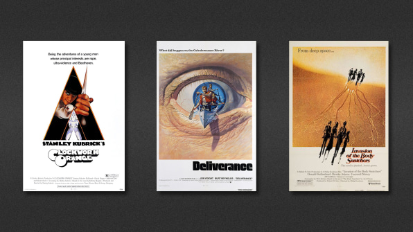
The ’70s brought illustrations for some really disturbing jewels, like AClockwork Orange (1971), Deliverance (1972), and Invasion of the Body Snatchers (1978).
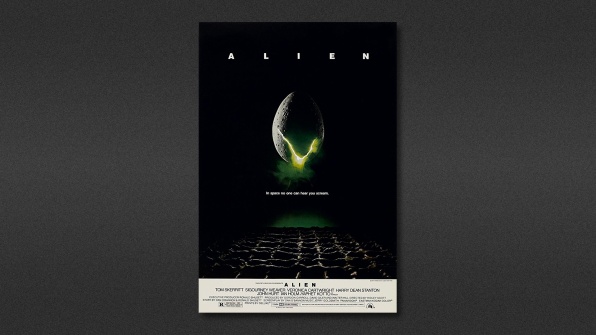
Another disturbing poster for another disturbing horror movie: Alien(1979). The ’70s was probably Gold’s golden era–and the most prolific.
#/media/File:Gorky_Park_-_1983_-_poster.jpg)
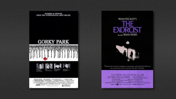
Gorky Park (1983) echoes his work on The Exorcist, another classic silhouetted illustration done exactly a decade before, but way more sophisticated.
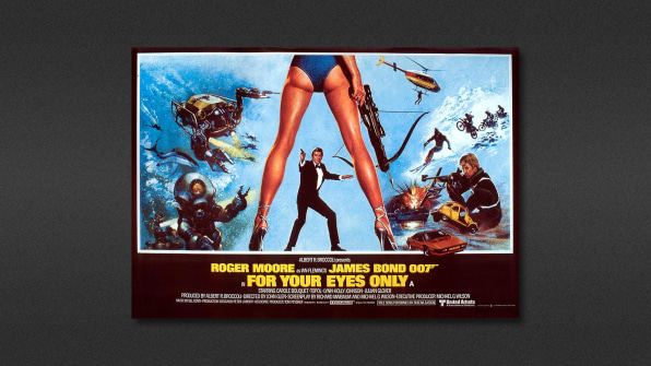
The ’80s brought Gold into the world of James Bond–and cheesecake–with For Your Eyes Only (1981), with Roger Moore, and Never Say Never Again (1983), with Sean Connery.
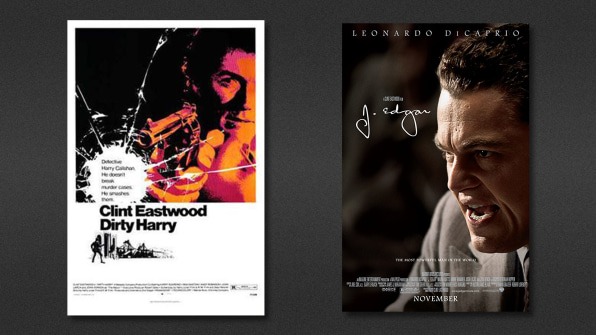
In the ’90s, Gold’s production slowed down. His latest poster was for Clint Eastwood’s J. Edgar in 2011, which he created when he was retired. He had a long work history with Eastwood, making the posters for such iconic movies as the Dirty Harry series in 1971. According to It’s Nice That, Eastwood presented him with The Hollywood Reporter‘s lifetime achievement award in 1994. “I don’t know what it is that first causes a person to become interested in a film,” Eastwood said at the time, “whether it’s the cast, or whether it’s the title, or whether it’s that first image. I believe it is a combination of all of these. That’s the creative part of poster work… that image and what it does and how it affects an audience.”
Indeed. Posters aren’t just used to attract audiences to a movie. They can become the embodiment of all its qualities–a powerful graphic statement with a magnetic power. And Bill Gold was a master at summarizing those qualities, adapting his style to the movie’s spirit while making images that were irresistible to audiences everywhere.
–
This article first appeared in www.fastcodesign.com
Seeking to build and grow your brand using the force of consumer insight, strategic foresight, creative disruption and technology prowess? Talk to us at +9714 3867728 or mail: info@groupisd.com or visit www.groupisd.com