
DATA-INFORMED DESIGN, NOT DATA-DRIVEN DESIGN, IS KEY FOR DELIVERING TOP-NOTCH PRODUCTS, ARGUES ROBERT HOEKMAN JR.
Executives live by the idea that data will help them understand, and predict, and plan. Data will help them see how decisions map to outcomes, and how outcomes can be influenced by this change or that.
For designers, data may seem like a non-issue. They’re for someone else to worry about. Our jobs are to care about people and design and to stand on a tightrope between the two. The executives are right.
Numbers demonstrate truth. They give us evidence to form arguments. They help us spot the giant gap between what we think we’ve put on to those screens and what we’ve actually put on those screens. They help us know whether or not our intention is translating into results.

We need data to ward off bad ideas, to influence decisions, to show people, one way or the other, that it doesn’t matter what we think or say or believe, there is evidence to either prove or deny all of that.
Big Brother is an ugly idea and always has been. But to improve a product, we need numbers to know how people are acting. What decisions they’re making while using the product. Where they get stuck. Where they leap ahead with false understanding or misinformation.
As I explained in The Field Guide to UX Strategy, there’s an upside to being Big Brother.
WHAT TO TRACK
I add a list of success metrics to every strategy document I create. Hopefully, you do too. Start there. Every trackable number can either be increased or decreased:
- We can increase the percentage of people who complete a signup form.
- We can decrease the percentage of people who abandon the form halfway through, during that weird step where we ask for their phone number for no apparent reason.
- We can increase the percentage of people who share a page through social
- We can decrease the percentage of people who offer negative feedback in the optional survey you send out later on.
Focus on the core metrics, and don’t add any new ones that won’t help you make decisions.
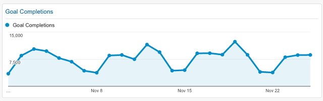
Google Analytics
(Note my repeated use of the word “percentage.” The number of people doesn’t matter so much as the percentage of the whole audience. It doesn’t mean anything when 42,589 people stop using the product after three days. It means something when 42,589 people make up 37% of the audience.)
You have Google Analytics, Kissmetrics, Crazy Egg, Optimizely, and many other tools to pick up for this purpose. Each has their own benefits, their distinct focuses.
Google Analytics excels in presenting exhaustive aggregated data in any segment and dimension possible, but also has the steepest learning curve. Kissmetrics specializes in event tracking and distilling data into quick dashboards and reports, but might lack power if you prefer “driving manual”. Crazy Egg is great for tracking click locations on a screen, and Optimizely is fantastic for A/B testing.
Do the research and choose which will serve you best. Each one will help you see when the numbers go up, and when they go down.
ANALYZING THE RIGHT NUMBERS
This is not to say it’s that simple. Metrics only hold meaning in context of other metrics.
When traffic’s all you want, page views are how you measure it. But what good is a page view if it fails to lead to loyalty? Sure, you get your ad dollar, but you have to keep earning it every single day with a constant stream of new tactics. You become the Sisyphus of content creation and marketing.
A number alone is a number without meaning.
To make meaning, you pit one metric against the other. You triangulate.
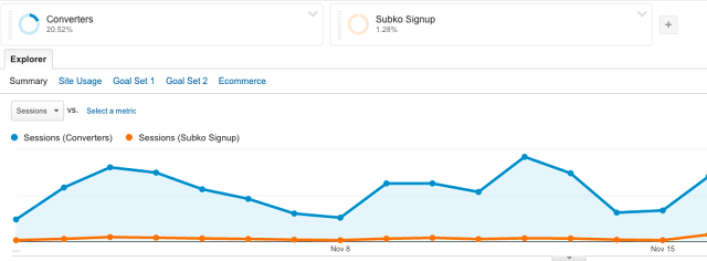
Google Analytics
When your percentage of signups increases, something else happens as a result.
Maybe you’re grabbing more conversions but getting less qualified conversions—the kind who are more likely to leave tomorrow. Maybe you’re getting more people past that sticky abandonment point, but you’re getting less applicable information from them during registration and now you have to find another way to coax it out of them or else they don’t spend as much money.
If all you want is more traffic, a week-long marketing campaign full of link-bait and prizes will get you that much. For the traffic to help you keep your doors open, it has to turn into something more purposeful.
Numbers don’t stand alone. Look at them together, over time, as a unit, as a complete data set that form a large picture of how people really behave when they discover your site, become regular users, leave after two minutes, visit infrequently, tell their friends, never return, or become die-hard loyalists.
WHEN TO REVISE
I used to work for a big software company that liked to update its homepage on a regular basis for no real reason (which is to say it was run by the marketing department). When they did, they’d gather in a room together and watch a real-time graph roll by showing how various aspects of the page were performing as compared to the version they’d just replaced.
When the numbers dropped—and this happened a lot—they would panic and roll the changes back. The homepage, as you might guess, didn’t get updated as often as they would have liked.
This is the wrong way to use data as validation for revision. One of my favorite stories to tell is about a time I worked with Automattic on the WordPress.com homepage, suggesting they revise the layout to reduce the number of conversion points and to strengthen them instead.
They launched an A/B test which ran for a week. The first day was dicey. The numbers went a little up, then a little down. At the end of the week, the new customer conversion rate increased to 25%. This is significantly higher than it is for most other sites, even the great ones. If Automattic had reverted the design changes based on the dodgy performance of the first day, they’d have never seen the effect they earned a week later and kept for months afterward.
- When you can, run A/B tests to validate design decisions rather than an all-at-once update.
- After you roll out a design change, let the dust settle for a minute. See what happens to the numbers over at least the next 7 days. Not every negative effect demands reactionary change.
Conversion funnels, for example, are made up of multiple points. The “Sign Up” button. The part where you ask for the user’s email address. The part where you have them create a username and password. The part where they check their email to confirm registration (not great, but common). Any other step you cram into the process.
A decrease in one metric is not a sign of total disaster. For example, a combination of decreased time on page, decreased bounce rate, and neutral conversions might signal that the new design is starting to help people to find relevant content faster. It means retention may go up. It means subscriptions may increase. It means revenue may rise.
Design Manager Alastair Simpson tells a relevant story of the value of patience and context. When he ran a design experiment at Atlassian, his design team released a new onboarding experiment. At first, they saw an initial 12% decrease in engagement and 0% increase in conversion.
Sounds like a failure, right? But instead of accepting the data at face value, the team verified the results against user research and learned their decisions were mostly correct. They iterated a few tweaks, and when they released again, saw a 22% increase in conversions at the same engagement level. Remember that the goal is data-informed design. Not data-driven design.
EVIDENCE VERSUS POLITICS
In my book Experience Required, I emphasized that forming good arguments is the foundation of any great designer.
Data helps you there, too. Metrics help you point to truth. It doesn’t matter what you think is happening. The numbers will tell you how users really behave.
Sort of.
They tell you when people spend a long time on a page, but not why. They tell you when people bounce from the site, but not where they went and what drove them away. They tell you when people just stop coming back, but not what you did wrong.
Combine these numbers with your instincts. With user conversations. With forum posts and customer complaints and blog posts and reviews and anything else that hints at the why behind the what. Data can help you form good arguments, but only when its triangulated against qualitative research and your own brain cells. Intelligence is the best thing you can bring to a knife fight.
When you go to the knife fight, bring it all—the data, the intelligence, the narrative.

Executives, most of the time, are receptive to arguments that speak to their primary concerns, which are other numbers (revenue, audience size, monthly churn, etc). When you can point at digits and the explanations that lead to them, executive stakeholders start to recognize themselves in you.
You’ll be the one who knows design is a problem-solving exercise, a planning exercise, a profession of results. Like I explained in the free Field Guide to UX Strategy, anything else is art or mindless decoration.
You’ve become the designer who maps decisions to outcomes. The designer who’s researched, presented, implemented, and tested a viable UX strategy to impact the bottom line. The designer who matters.
For more practical UX advice, check out the free Field Guide to UX Strategy. The guide explains how to define, plan, and execute design strategies. It’s based on Robert’s 15+ years of experience with Intuit, Rackspace, Automattic, and others.
[Top Photo: Kelvin Murray/Getty Images]