
An icon that came to represent Twitter’s dark side is giving way to one designed not to turn anyone off, without looking like something you’d want to stick with.
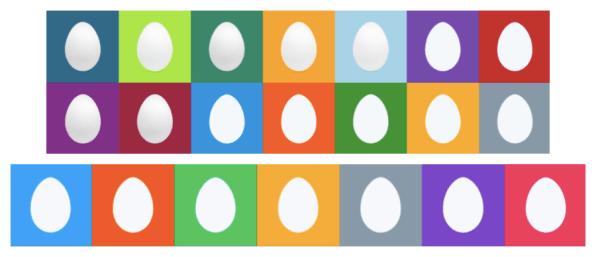
Once upon a time, the designers responsible for Twitter’s look and feel reveled in the service’s association with birds. For instance, they not only stuck their winged mascot–known at the time as “Larry the Bird”–into the interface itself, but gave him a field of clouds along the top edge to soar through. And when they unveiled a major redesign in 2010, they provided every new user with a default profile picture that depicted fresh beginnings in a decidedly Twitter-esque way: as an egg.
The idea was that “eventually you’d crack out of an egg and become an amazing Twitter user,” says senior manager of product design Bryan Haggerty, who worked on the project and recalls toying with the idea of even showing the hatching in progress.
A lot has changed since the Twitter egg debuted almost seven years ago. For one thing, the company’s design philosophy has evolved. Quirky is out; straightforward is in. Nowadays, “the playfulness of Twitter is in the content our users are creating, versus how much the brand steps forward in the UI,” says product designer Jen Cotton.
More significantly, the egg has taken on cultural associations that nobody could have anticipated in 2010. Rather than suggesting the promise of new life, it’s become universal shorthand for Twitter’s least desirable accounts: trolls (and bots) engaged in various forms of harassment and spam, created by people so eager to wreak anonymous havoc that they can’t be bothered to upload a portrait image.
Advice for real life often works equally well here on Twitter. For example: never argue with an egg.
— Ken Armstrong (@kenarmstrong1) March 19, 2017
The egg’s unsavory reputation has been hard on Twitter’s image. It also hasn’t done any favors for users who stuck with the default avatar out of innocence rather than malevolence. Some members have grown emotionally attached to their eggs or want to maintain a low profile; others simply haven’t gotten around to changing them, or have had trouble figuring out how to do so. (Uploading a profile photo is enough of a stumbling block for newbies that Twitter removed the step from the initial sign-up procedure last year.)
“These regular users would be using a troll’s clothing in some ways, not realizing that they probably should be changing that,” says Haggerty.

Starting today, however, the egg is history. Twitter is dumping the tarnished icon for a new default profile picture–a blobby silhouette of a person’s head and shoulders, intentionally designed to represent a human without being concrete about gender, race, or any other characteristic. Everyone who’s been an egg until now, whatever their rationale, will automatically switch over.
Now, if Twitter ditched the egg in isolation, critics might reasonably take the move as an unserious response to the serious problem behind the visual. Troublemakers, after all, can hide behind the new human silhouette just as freely as they’ve used the egg as a cloak of anonymity. But the timing of the new image isn’t random. Twitter chose to roll it out only after taking multiple steps in recent months to deal with its abuse issue. The company has implemented technology to make it harder for suspended users to open new accounts, and to prevent abusive tweets from spreading virally. It also lets members hide tweets sent by people who are using the default profile picture–an option that will remain useful even though that default is no longer an egg.
“Our safety team has done a lot of really meaningful work in this space,” says Cotton. The new default profile picture “is one effort that design can play a part in.”
Dear Non-troll Twitter egg users
Get a picture. Any picture.
Not having one makes you look suspicious and you'll get blocked a lot.
— 5'7 Black Male (@absurdistwords) March 27, 2017
Unlike the egg, which was originally meant to be eye-catching and appealing–it even came with a variety of candy-colored backgrounds!–the new avatar aims to be an anodyne placeholder that users will recognize as representing themselves, but quickly want to eliminate by uploading a personal image. “We put words to design to: generic, universal, serious, inclusive, unbranded, and temporary,” says product designer Jeremy Reiss. “An empty state, essentially, is what we wanted it to be,” adds Haggerty.
Designing something to look generic and temporary, it turned out, was surprisingly tricky–especially given that Twitter wanted to be generic and temporary in a way that would make sense to almost anybody. Though the amount of real estate the default picture consumes is tiny, the design team spent about a month figuring out how best to use it.
HOW DO YOU REPRESENT NOTHINGNESS?
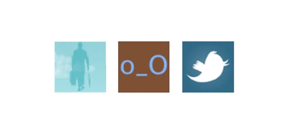
In its early years, Twitter cycled through a variety of images as the default profile picture. At first, it showed a clip-art drawing of a man with a briefcase–a decision that’s less mysterious if you remember that even the beloved Twitter Fail Whale originated as an existing drawing licensed from artist Yiying Lu. Briefcase guy eventually gave way to a googley-eyed emoticon-like face, who was displaced by Larry the Bird himself. And then the egg.

None of these past works of design proved instructive when the egg-replacement project kicked off. The Twitter design team considered a variety of ways to convey the idea of a default image, says Reiss: “We looked at what other services did, what people expect.” A silhouette of a person was one obvious early contender, but so were tiny drawings of landscapes and patterns that didn’t depict anything in particular.
After pondering its options, the team came back to the silhouetted head as the most logical choice: Twitter, after all, is about people. And then the real work began.
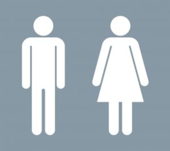 The folks responsible for the redesign spent time pondering precedents such as the “man” and “woman” symbols used on restroom signs, which mostly served to show the pitfalls of grinding human beings down to iconic representation. The male symbol looked like the default; the female one, decked out in a billowing dress that made her shoulders seem narrower than they actually were, came off as “other.”
Twitter isn’t the only social network to wrestle with these sorts of issues: Facebook’s Caitlin Winner has written about her redesign of the company’s “friends” icon, which previously depicted a helmet-haired female lurking behind a male with a pronounced cowlick. But Twitter’s challenge was all the more thorny because the network doesn’t require members to disclose their gender. Rather than creating an avatar that was recognizably female or male, the company needed one that could represent absolutely anyone who might sign up for the service.
Instead of defaulting to the perfectly spherical head of a restroom-signage figure, the designers began playing with other approaches. They gravitated toward a gumdrop-like shape and found it had Rorschach Test-like qualities. “The second you start playing with head shape, you start thinking, ‘Oh, this might not just be a single gender,’” says Cotton. “Is that a man with a beard? Is that a woman with a bob?” Rounding off the shoulders, they found, also helped them create a symbol for “human being” that wasn’t freighted with any specific characteristics.

Color themes were another matter of debate. Instead of the egg’s expressive backgrounds, the design team wanted something utilitarian. It also couldn’t be interpreted as indicating a particular race. (Even emoji with screaming-yellow skin can seemingly depict a caucasian person.) The scheme the company settled on–a dark gray figure on a light gray background–had the bonus virtue of being easily discernible by users with impaired vision, accessibility being a current Twitter initiative.
VAGUE, MUNDANE, AND NOTICEABLE
The gumdrop-headed human passed one test when a variety of Twitter employees outside the design department split almost 50/50 on whether it was male or female. Popped into mockups of the app in place of the egg, it was even more effective. “The eggs were all these vibrant colors, and you didn’t pick up that something was missing,” says Haggerty. “When we put [the new image] in there, it really highlighted the absence: ‘Oh, this person doesn’t have a profile pic.’ Or ‘Oh, I probably should put my picture on here. I don’t look like I’m actually on this platform.’”
When Twitter showed me the final design of the new portrait picture, it occurred to me that the symbol’s head–an oval that’s pointier on the top than the bottom–could be construed as evoking the egg that it’s replacing. When I asked Haggerty, Reiss, and Cotton about that, they told me in startled unison that any resemblance was purely coincidental. Like I said, it’s a Rorschach Test.
The amount of care that Twitter’s designers put into finessing the new default picture may seem extreme, but they did so in hopes that they could build something to last. “We want to put this out there, and we also don’t want to have to come back and change it in a year or two years,” says Haggerty. “We want it to have longevity.”
Which is not to say that they want it to be anywhere near as recognizable and pervasive an element of the service as the egg has been. In fact, as part of the new image’s arrival, Twitter is launching a campaign to encourage members to get rid of it. “We’ll be prompting people who do have eggs to upload a picture of themselves, to show their best selves,” Cotton explains. In other words: The less we see of this new profile picture, the bigger a success it will be.
–
This article first appeared in www.fastcodesign.com
Seeking to build and grow your brand using the force of consumer insight, strategic foresight, creative disruption and technology prowess? Talk to us at +9714 3867728 or mail: info@groupisd.com or visit www.groupisd.com


