
FENG SHUI IS ALL ABOUT CREATING A HARMONIOUS HOUSEHOLD. HERE’S HOW TO MAKE YOUR APP FEEL EVERY BIT AS HOMEY.
“Oh jeez” is what I typically hear from coworkers any time I suggest feng shui for the humble office of our startup Zugata in Palo Alto. They all think it’s silly, superstitious nonsense. Little do they know, feng shui principles can be used to design nearly anything, whether an office or an app.
Feng shui is an ancient Chinese art that promotes energy circulation for the sake of creating a harmonious environment. This energy (also known as chi) is believed to create balance and peace within the home, ultimately leading to a better, happier life.
Like my coworkers, many people think feng shui is a laughable superstition—including me, at one point. I used to scoff and roll my eyes whenever family members recited “do’s and don’ts,” but then my attitude started to shift a few years ago. While hunting for a new home, I began to develop a better understanding of feng shui.
I started to notice that the principles really do enhance a home. Then it dawned on me that they also translate into delightful UX for apps.
The goal is ultimately the same: creating frictionless and pleasant experiences to increase energy and happiness. In UX, chi is user engagement and retention. Here’s how to bring in more chi into your product design.
1. ATTEND TO YOUR ENTRYWAY
In feng shui, an entryway is known as the “mouth of chi.” It’s where energy comes in to nourish your home.
To attract positive chi, your front door should be appealing and well-maintained. That means no squeaky doors, no chipped paint, no rusty doorknobs, and no dead plants hanging around.
In UX design, the front door is where your users sign up and log in. It’s how they enter your product, so it should be inviting and make users eager to discover what’s beyond the signup button. To entice people (and attract chi into your product), you could add:
- Colorful illustrations
- Captivating copy
- Inspiring photography
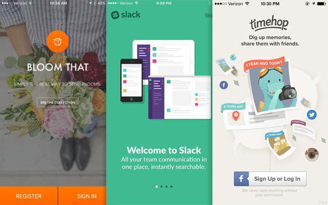
Colorful illustration from TimeHop, Welcoming copy from Slack, Lovely Photography from Honest
People shouldn’t stumble, trip, and run around to access your product, so make it easy to walk in and get started. To make it easy, you could:
- Reduce the number of form fields
- Reduce the number of clicks
Many designers underestimate the importance of the onboarding process—but this is where chi enters before it can circulate and nourish. Imagine that your sign up and onboarding process are the magical gate at Disneyland. All the embellishments, from the arches and flowers to the flags and colors, are carefully coordinated to entice visitors.
2. REMOVE THE CLUTTER
In feng shui, once chi crosses through your entryway, it should flow through and refresh your home. But many times, chi is interrupted by its archenemy—clutter. Clutter negatively affects the energy because it adds barriers.
All the clutter by your doorway, in your hallways, in your closet, and under your bed should be removed. Anything you aren’t using should be donated or thrown away. Unnecessary items burden your life. Less is better. Not only is this a feng shui principle, it’s also a motto of inspiring German designer Dieter Rams: “Less, but better.” To get rid of the clutter in your product:
- Keep it simple. Focus on what’s most important to help with discoverability
- Use whitespace to lead the eye toward important messages
- Remove unused features and elements
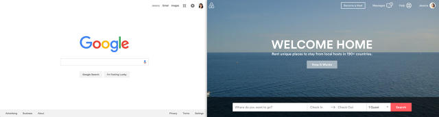
Clean and simple clutterless screens from Google.com, Airbnb
Reducing clutter helps you focus on the heart of your product. It creates something that’s intuitive to understand and frictionless to experience.
3. SOFTEN THE EDGES
Like clutter, anything sharp or heavy that’s pointing toward you (like metal cabinets or boxy furniture) is a negative source of energy.
In feng shui, this energy is called sha chi, also known as poison arrows. It gives off an aggressive, “attacking” feel in the home. Some people add plants or hang crystals to deflect the harsh energy, or drape textiles over the object to soften its edges.
Softening the edges around the home creates a peaceful environment where positive chi can flow seamlessly.
Let’s look at industrial design. If your smartphone had sharp corners, it could pierce your hand. Sharp surfaces on your car would affect its aerodynamics—you’d burn more gas because the air would face more resistance. Details like these are small, but make a big difference.
In UX design, sharp corners make your product feel less usable and approachable. To soften up the edges of your digital product, you could:
- Round the corners of your panels, fields, and buttons
- Round the corners of your icons
- Increase the blur applied to your shadows.
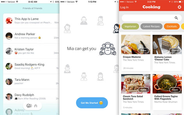
Rounded panels from Peach; Pill-shaped buttons from Operator; and Rounded fields & soft shadows from NYT Cooking
Softening edges helps with flow; it’s easier for eyes to slide from element to element and explore the screen. Look at the examples above. Smoothness makes the products feel approachable.
4. STIMULATE MOVEMENT
In feng shui, once chi has a clear path to enter the home, it’s important to stimulate movement that will carry it through the whole house.
Without this energy and momentum, chi becomes stale and people feel sluggish and unmotivated. Adding objects like fountains or burning incense can gently nudge chi into other parts of the home.
In design, we stimulate movement by adding micro-interactions (see the free Web Design Book of Trends 2016 for more info). These interactions may be small, but they play a huge role in making a product come to life. To stimulate chi, you could add:
- Graceful screen transitions
- Subtle animations to elements
- Subtle hover effects to buttons and fields
Movement and motion have become more prominent in app design since Google launched Material Design in 2014. This design language endorses motion as a key design principle. Material Design evangelizes that “motion provides meaning” and “objects are presented to the user without breaking the continuity of experience even as they transform and reorganize.”
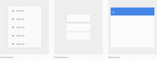
Google Responsive Interactions
The subtle motions in Google Material design encourage people to navigate freely throughout the product; motion also adds some playful character.
5. ADD GENTLE SOUNDS
Not only are fountains used to stimulate movement in feng shui, they also add gentle sounds to your home. Sounds like water fountains, wind chimes, bells, and bamboo tubes break up stagnant chi in the home, creating a soothing and pleasant energy.
In design, sound is another element that tends to be an afterthought, but it can make a dull experience a lot more lively. It also provides users with feedback, acknowledging that they just interacted with the product. Because the product is communicating back to the user, it creates a more human experience.
We see this elegantly executed in Apple iOS. Subtle audio effects like lock sounds, keyboard clicks, text tones, and more help animate the operating system.
CONCLUSION
As designers, our fundamental goal is to delight our users and make them feel at home within the product we build. No matter who they are, their age, where they’re from, what they do or how educated they are, users are simply people at the end of the day. And all people love the feeling of home. By making our products inviting, uncluttered, gentle, spirited, and delightful, product and UX designers can create a “home” with flourishing chi that increases engagement and improves retention.
Treat your product as your home and the home to many.
[Top Photo: stacyss via Shutterstock]