
The class was so popular it filled up in less than a minute.
Earlier this year, two professors from the University of Washington released the Bullshit Syllabus, a guide to avoiding bullshit when it comes to the use of data in technology and science.
Now, after turning the syllabus into a one-credit lecture class during the spring, the professors Carl T. Bergstrom and Jevin West have posted the lectures on YouTube so anyone can improve their data bullshit detector for free.
The class has several lectures relevant to designers. Take what they call the “Dataviz Duck.” That’s a graphic where the designer’s prerogative is to catch your attention and persuade you of something in a way that’s often misleading. Data viz scholar Edward Tufte calls a graphic where style gets in the way of substance a “duck”–a term borrowed from architecture and named after a reviled, duck-shaped building where its ridiculous shape has no bearing on anything, really, at all. In his lecture, Bergstrom points to examples from the newspaper USA Today and President Obama as purveyors of dataviz ducks with graphs that use human bodies, the wheels of cars, and even stacks of books as ways of conveying numerical information. The lesson? Make sure your graphic isn’t so decorative that it doesn’t convey data irresponsibly. Every element of its design should help make information clearer, not obfuscate the data by making it look pretty.
Bergstrom also discusses the dataviz “Glass Slipper.” It’s named for the Grimm version of Cinderella, where her evil stepsisters cut off their toes to jam their feet into the glass slipper so they can marry the prince. The analogy works for data visualization as well, where designers take certain types of visualizations like the periodic table, subway maps, Venn diagrams, and a phylogeny, which explains how species are related, and try to use them for data that just doesn’t fit. A “periodic table” of data science? A “subway map” of Microsoft’s investments? These are all glass slippers.
Besides data viz, the class also covers common problems with big data, correlation, publication bias, and fake news, with a focus on how to recognize when data has been used spuriously. In the last lecture, the professors offer four rules for calling out bullshit when you do see it (attention: everyone on Twitter)–be right, be charitable, be clear, and admit fault.
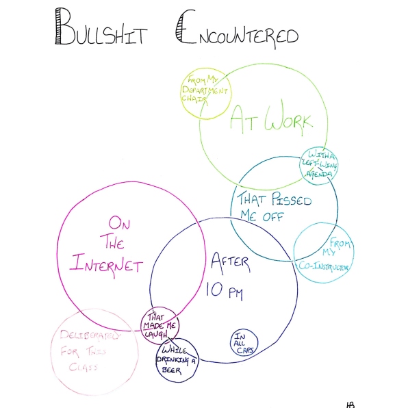
West says that the 160-seat spring class was entirely full within a minute, with students from 40 different majors attending. The primary assignment for the class was for students to create a “bullshit inventory”: a list of all the bullshit they encounter in a single week, from bullshit they spot to bullshit they create themselves. The professors will be teaching a full, three-unit class in the fall as well.
Their bullshit gospel is spreading. West says that they’ve gotten requests from more than 40 different schools, including Carnegie Mellon, Stanford, and Oxford, about teaching the class. University of Alaska Anchorage, University of North Carolina Greensboro, and Penn State plan to teach a version of the class next year.
The demand for the class shows an appetite for learning how to properly use data as part of a formal education, across disciplines. Because data is one of technology’s backbones, recognizing when it is used poorly and when it’s used properly isn’t just a useful skill–it’s vital for everyone, whether you’re a designer or not.
–
This article first appeared in www.fastcodesign.com
Seeking to build and grow your brand using the force of consumer insight, strategic foresight, creative disruption and technology prowess? Talk to us at +9714 3867728 or mail: info@groupisd.com or visit www.groupisd.com

