Just ask Her interface designer Geoff McFetridge, who shuns research in the name of “inventing new images.”
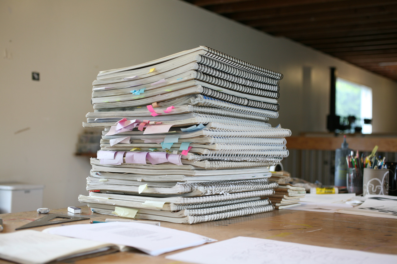
In Geoff Mcfetridge‘s Los Angeles studio, there’s a two-foot-tall stack of Strathmore sketchbooks that catalogue every idea from every professional project he’s ever worked on. “I have them stacked up chronologically so that I can say ‘three months ago is a book and a half ago’ and I can go backwards in time,” says Mcfetridge, who starts off each new project with the discarded ideas of old ones. “There’s that kind of picking-up-where-I-left-off feeling with creativity … a kind of quick warmup to go into an inventive space.”
This cyclical, self-referential creative process has remained unchanged over Mcfetridge‘s two-decade-long career. He describes it as a sort of linchpin for the diverse projects he takes on under his design studio Champion Graphics, which include fine art paintings, branding projects, public murals, animations, and graphics for film; one of his most high-profile recent projects was designing interfaces for Spike Jonze’s Her.
Currently, he’s putting together a painting show for V1 Gallery in Copenhagenand designing two large-scale murals, one for the L.A. Metro and another for the Ottawa subway system. A sunny cobalt-and-aqua tile wall he designed just went up at the swimming pool at the Standard Hotel in L.A. And earlier this month, he was awarded the coveted Cooper Hewitt National Design Award in communications design.
However diverse his portfolio, Mcfetridge‘s designs are unmistakably his: across all mediums, his style is graphic, simple, lively, and often tinged with humor. He starts off every project with a drawing—the seed of which is derived from an earlier sketch plucked from his mountain of sketchbooks. Preferring to avoid outside influences, McFetridge doesn’t do research for his projects. “For me, it’s more about this belief that I’m inventing new images,” he says.
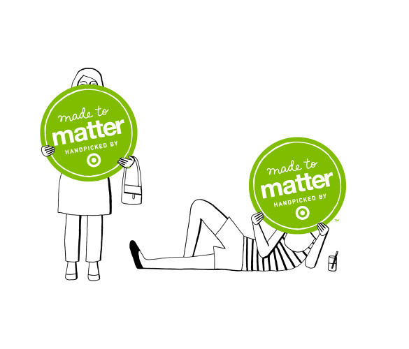
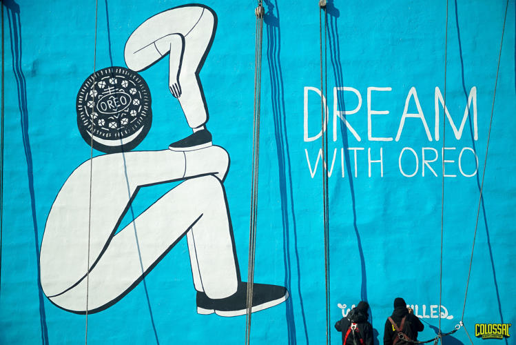
But when it comes to choosing which projects to undertake, the consistency falls away. McFetridge has always worked for himself, and says his rigid creative process pushes him to find variety elsewhere—with new mediums, clients in fields that interest him, and with collaborators who share similar values. Without an agent or any representation, McFetridge‘s clients for a long time were ones with whom he had a personal connection. Nowadays he’s more sought after, but it’s still important for him to know they have something in common. He’ll often initially try to figure out what in his work resonates with his clients personally then take it from there. Though after taking on big corporate clients—Target, Oreo, and Patagonia are all on his client list—that level of connection isn’t always possible.
The New York Times
When McFetridge graduated from CalArts in the mid-1990s with a master’s in graphic design, he had already been freelancing for skateboarding brands for several years. In 1995, he landed a full-time job as an art director for the Beastie Boys magazine Grand Royal (an off-shoot of their record label of the same name) but continued to take on outside work. Instead of working in the magazine’s offices, he opted to rent a rotting storefront across the street that he shared with a friend. As collaborative as his work for clients can be—he’ll offers clients anywhere from 40 to 100 options for an initial draft of a project, then they’ll collectively cull down from there—his design practice has always been defined by a self-imposed autonomy.
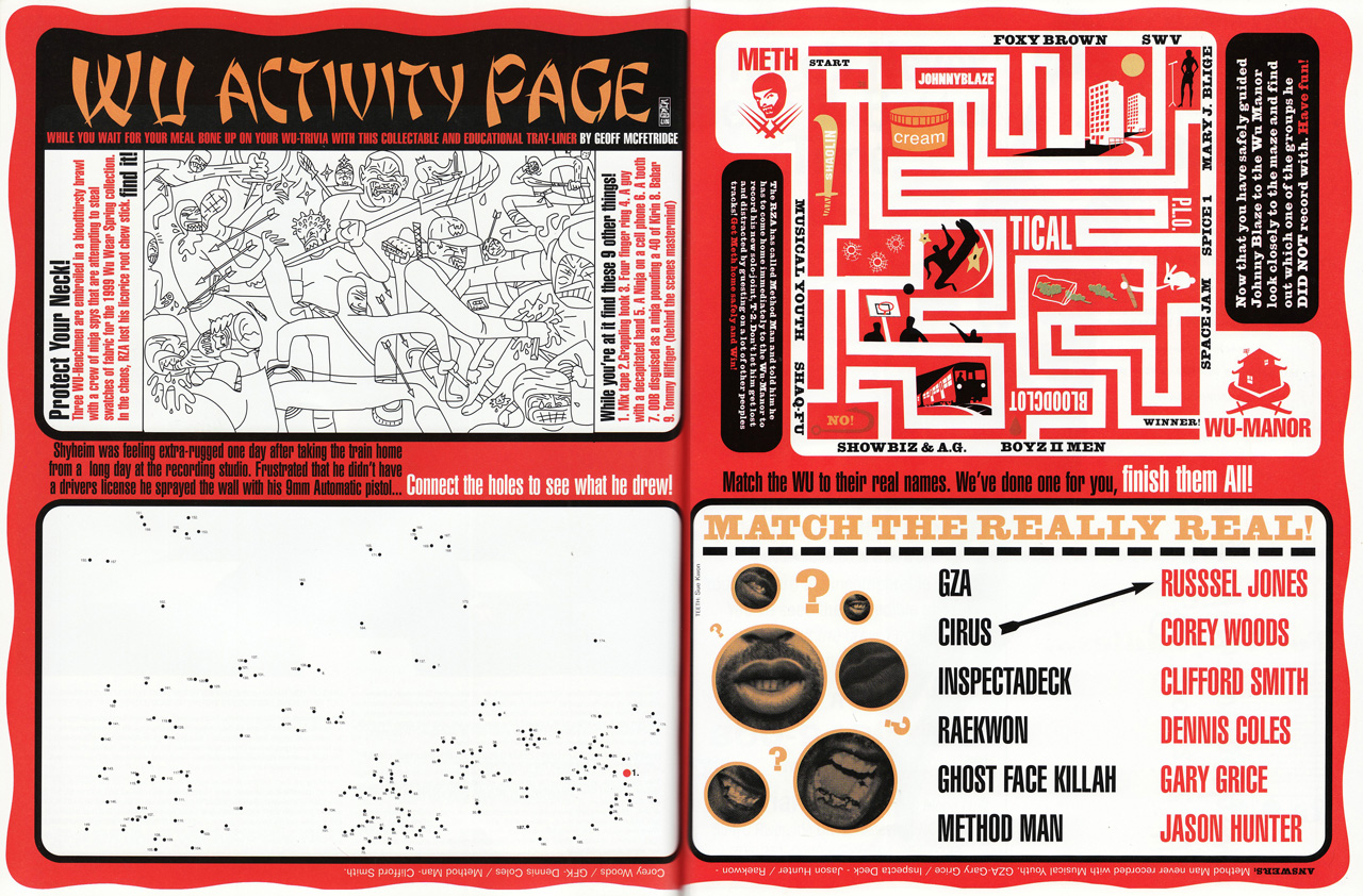
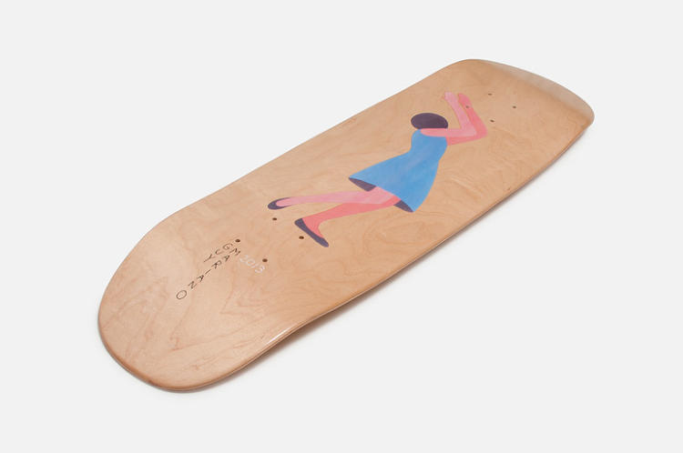
Grand Royal-GM-GR-WU
Around the time he was working at Grand Royal, he started designing graphics for Sofia Coppola’s short-lived, (very ’90s) fashion line Milk Fed which led him to a job designing title sequences for her 1999 film The Virgin Suicides. Coppola introduced him to her boyfriend at the time, Spike Jonze, and the two became fast friends. McFetridge has designed the title sequences and marketing graphics for Jonze’s films ever since.
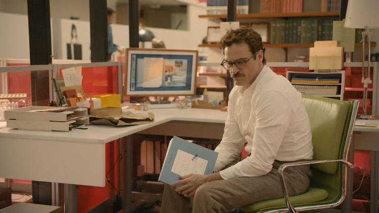
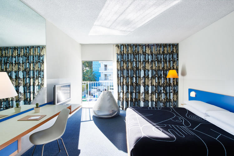
Around 2012, Jonze asked McFetridge to design the interfaces in his film Her, which follows the near-future love story between a man and his operating system. For a graphic designer working in film, it was a dream brief: the futuristic L.A. of the movie needed futuristic signage, and the interface he was tasked with inventing would be an actual character in the film.
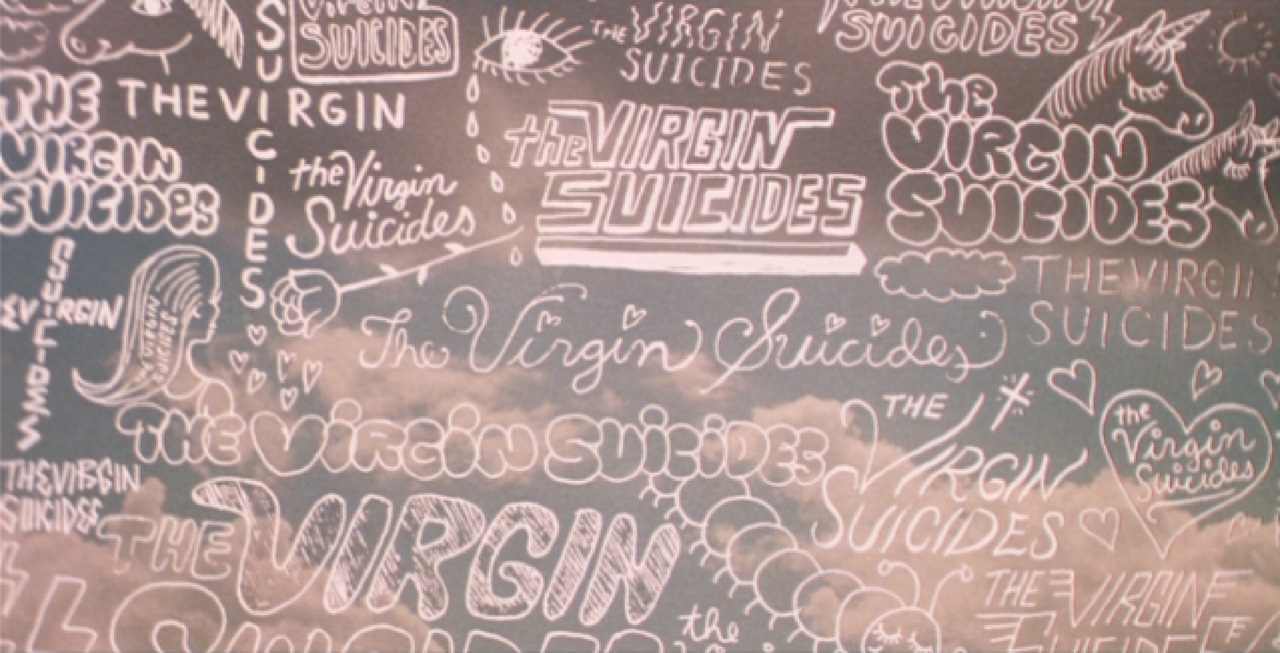
The Virgin Suicides
For this project—arguably his most mainstream to date— McFetridge says that his rule against research came in handy, even as he had no experience in interface design. “My notion of what the future looks like was automatically irrelevant,” he says. So he worked with what he knew: “My starting point was just, ‘What if they sort of look like a painting, but a painting that’s useful and will take you somewhere?’ They didn’t actually have to function, so I had a lot of freedom that a traditional interface designer wouldn’t have.”
The result looks nothing like the flashy interfaces, full of holographs and indecipherable rows of numbers, from movies like Minority Report—and everything like McFetridge‘s typical bright, engaging, and witty work.
For him, it all boils down to the creative process. “So much of my work is about engaging people,” he says. “When you look at my work there’s a sort of entry point, an image, and when you view the image you can see the kind of decisions I made to create something. I feel like the creative process is very visible, it’s just structurally there, like a wireframe to create a thought.”
All Images: courtesy Geoff Mcfetridge
1 Comment
This content creates a new hope and inspiration with in me. Thanks for sharing article like this. The way you have stated everything above is quite awesome. Keep blogging like this.