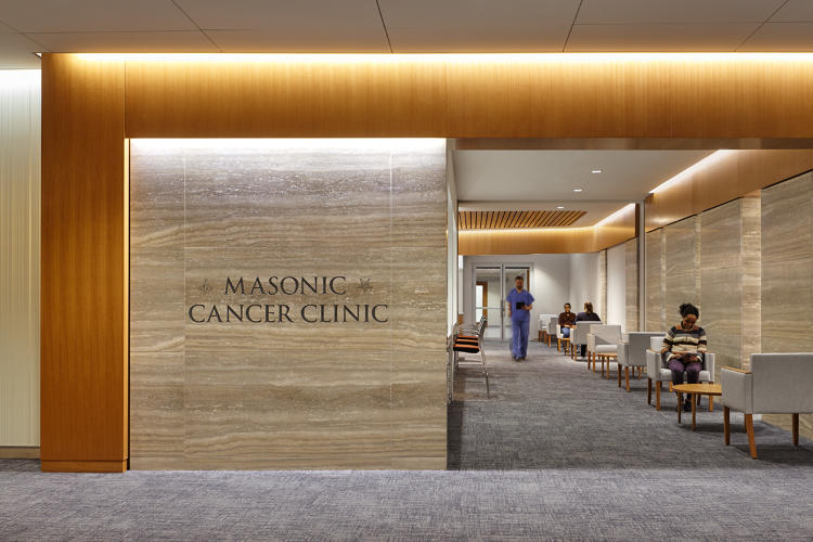
To overhaul patient experience for a Minnesota clinic, CannonDesign cherry picked the best ideas from retail, offices, and even airlines.
It’s not often that an architect gets to reimagine the future of health care. But presented with the rare opportunity to build an entire health center from the ground up at a new clinic and surgery center in Minneapolis, the University of Minnesota Health, or M Health, decided to completely upend how it thinks about patient experience and up the ante against its competition—and it enlisted CannonDesign to help.
“If you look at M Health, you have a ‘small’ competitor due south called the Mayo Clinic,” Michael Pukszta, leader of CannonDesign‘s health care practice, says. “When you look at who you’re going up against—what is recognized as the finest clinic—the task is pretty large. It’s like a new computer company going up against Apple.”

So when the firm—a finalist in the 2015 Innovation by Design awards—set out to revamp how patients interacted with the health center, it looked to other industries, from consumer tech to the airline industry, to inform its design.
HOW AIRLINES FIXED THEIR BIGGEST CUSTOMER-SERVICE PROBLEM
When Pukszta and his team were thinking about the scale of changes they wanted to make, they looked to one of the biggest user experience turnarounds of the last decade: airline check-in.
In the past, checking in meant standing in line, talking to a customer-service person, and receiving a paper ticket. Now, you can check into an airport before you arrive, obtain an e-ticket on your smartphone, and—aside from security checkpoints—board a plane without having to talk to a single person. Travelers also have the option of using automated kiosks to check-in, change or upgrade seats, and handle baggage needs. It was about reaching the final point—the airplane—the fastest, most efficient way.
Pukszta saw a parallel with the user experience of health care, which requires a lot of paperwork and involves many steps before reaching the end “destination”—a doctor. “It’s how do we get patients to the value point quickest?” he says.
This insight led the designers to excise anything that slowed down the patient journey in the clinic, which largely revolved around paperwork. Now instead of stopping at a reception desk to check in, waiting to get called up to receive the right paperwork, filling out the forms, returning to the desk to submit them, and then waiting again to be admitted, patients fill everything out online before arrival.
“Check in is much shorter,” Mary Johnson, Chief Operating Officer of the University of Minnesota Physicians and project lead for the new center, says. “It’s about clarification, versus information gathering.”

M Health conducted focus groups with people who weren’t currently patients to figure out what common health care experiences were frustrating and what might alleviate the pain points. Subjects were also asked to think about experiences outside of health care that they liked, and what exactly kept them coming back—an important business strategy for health care providers who want to retain a strong patient base.
Time—and efficiency—were common threads. And unsurprisingly, Apple frequently came up as an inspiration. In fact, the computer company’s retail temples have already influenced health care design elsewhere. “They mostly wanted convenience and for things to go more smoothly,” Johnson says. “People have busy lives these days and they love the idea of doing things ahead of time.”
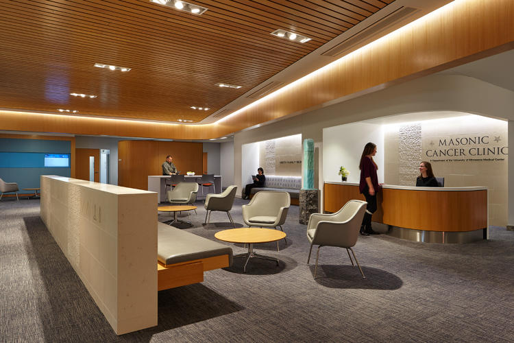
Before an appointment at the Clinics & Surgery Center patients fill out all their intake paperwork online. When they step into the center, there’s no formal reception desk. “Concierges” with tablets and mobile devices greet them and check them in—an experience similar to that of checking into the Apple store.
Initially, M Health was skeptical of the system, and concerned it could pose undue burden on certain patient groups that might not be technically fluent or have access to the Internet. The focus group interviews allayed their concern. “The assumption about socioeconomics, age, and smart devices were completely blown away,” Johnson says. “Most people have them.”
BETTER SPACE PLANNING, BORROWED FROM OFFICE DESIGN
It wasn’t just patient experience that inspired the health center’s design, though. Budget played a supporting role. Based on CannonDesign‘s calculations, it would have cost upwards of $60–70 million more to build a new center with the same spatial breakdown of the old center, with private offices and exam rooms for each physician.
“How do we put the same amount of eggs in a smaller basket?,” Pukszta asks. “Can we see more patient volume, but in 50% less space?”
The challenge led them to look at contemporary office planning. Workspace design has steadily evolved from cloistered private offices to open-plan arrangements and shared desks, a strategy that’s spatially (and financially) much more efficient. M Health’s former location had a private office and exam room for each doctor, leading to a lot of wasted space if a doctor wasn’t seeing patients—a relatively frequent occurrence, since many doctors also teach.
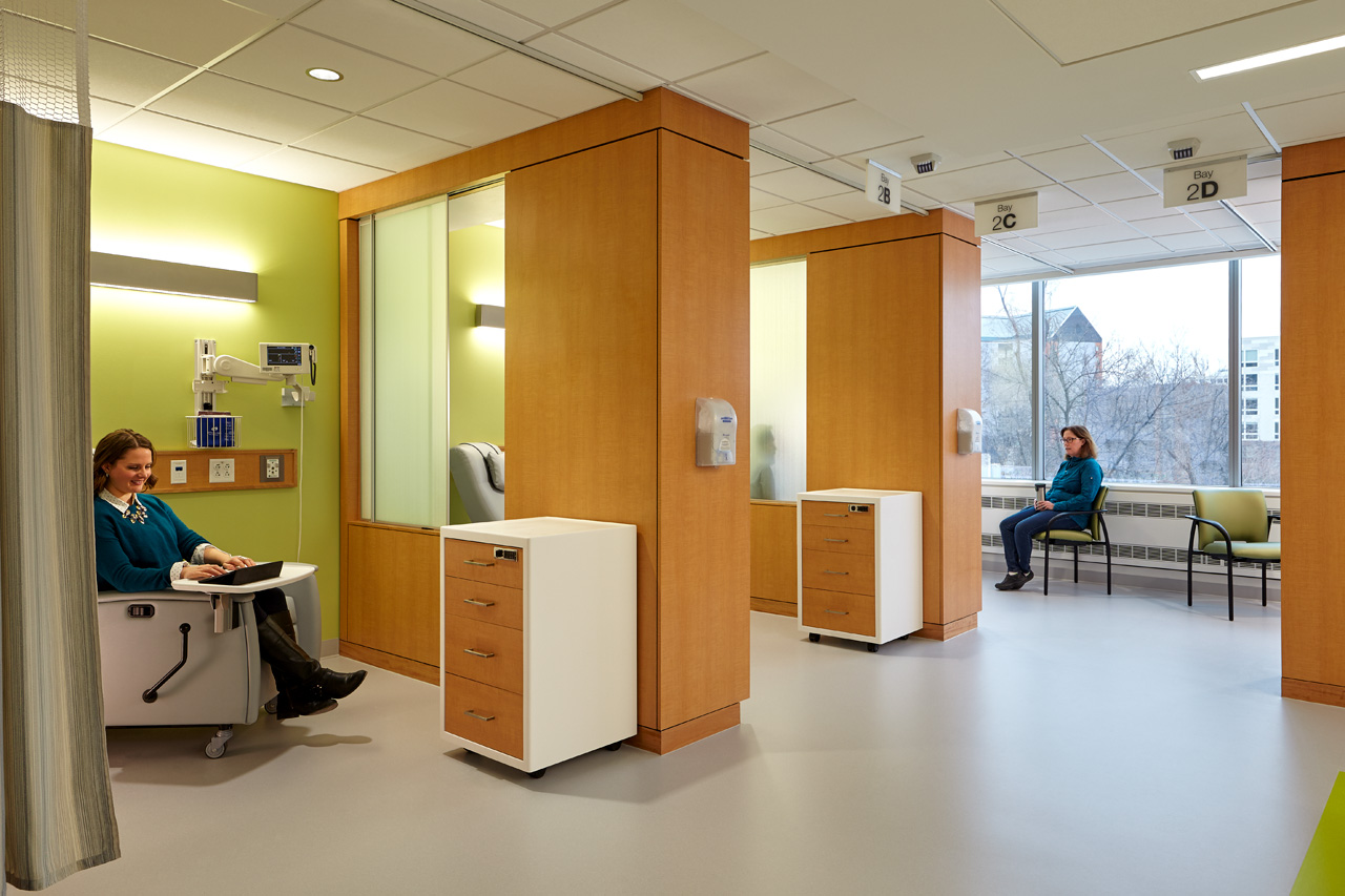
Instead of basing the number of rooms upon the number of physicians, the designers focused on creating space for patients. It wasn’t about building more to accommodate more; it was about making sure every space was continually in use to maximize its utility. To that end, they looked for a technical solution to manage the flow of people. They came up with a system called CareConnect. M Health places a location-tracking badge on everyone in the clinic: patients, doctors, nurses, maintenance staff, and so on. A series of sensors built into the ceiling records the location of each badge every three seconds.
Tracking the location of each patient lets M Health accomplish a number of things. Ironically, it helps with privacy: instead of calling someone’s name out in a waiting area, a provider can walk right up to them. The system can also tell just how long someone has been waiting. If they’ve spent more than 15 minutes in the waiting area, or 10 minutes in an exam room, an alert goes off. By tracking their location once a patient is admitted, M Health knows which exam rooms are free and which are in use. Once a visit is wrapped up and a patient leaves an exam room, it signals the maintenance team that it’s ready to be cleaned for the next patient. This allows for a near constant cycle of use for each space.
“We’ve had so many patients say is that it really works,” Johnson says. “Most hospitals use this type of system to track assets like IV poles and wheelchairs so you can find the instruments faster. What is interesting is using it on people.”
There have been some hiccups with the technology. When it was first installed, the servers couldn’t handle the load—so the hospital had to rebuild some of the hardware to be able to process the amount of information CareConnect gathers.
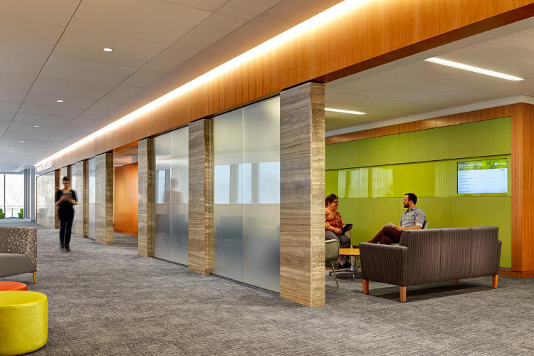
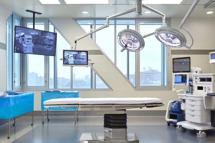
The design team was also careful to treat semi-private and public space with sensitivity in the treatment areas—like the chemotherapy infusion center, where frosted glass panels separate the bays and slide open if the patient desires. “Research suggests that when you put people in a cancer treatment together, their experience and hope for the next treatment improves because it’s a support network,” Pukszta says. “It’s designed for privacy when patients need it, but also so they can ‘collaborate’ when they want.”
THE STARBUCKS-IFICATION OF STAFF SPACES
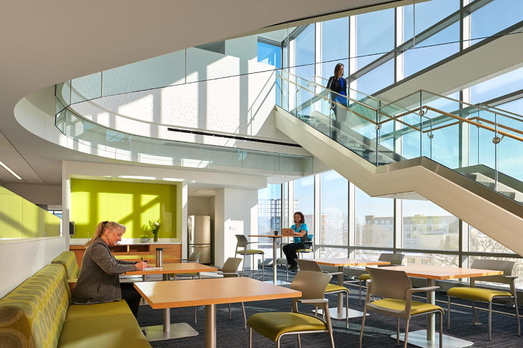
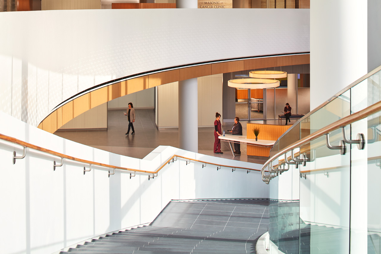
Another tactic borrowed from office design? The construction of social spaces designed for serendipitous, spontaneous interactions. Instead of peppering staff lounges throughout the clinic as was the practice in the old building, CannonDesign dedicated the back half of the building to a rich, multi-level social space for employees.
“If we’re going to create a new center around the ultimate patient experience, let’s also create the most incredible staff space,” Pukszta says. The staff enters in the back of the building to a multi-story open atrium that acts as a hub. The area is flooded with natural light and there are communal tables as well as one-person tables for a little more privacy and comfortable seating throughout. “It’s like a four-story Starbucks with a place to get coffee, places to sit, and places to collaborate.”
FUTURE-PROOFING THE DESIGN
While present-day best practices influenced a lot of M Health’s design, it is also forward looking. “One of the design principles we asked for was flexibility, knowing that things are going to change exponentially but buildings don’t,” Johnson says. She wanted to avoid the need for heavy-duty renovations in the future, so each of the clinics is modular. If one department suddenly needs more capacity, it could easily flow in to an adjacent clinic since the spaces are more or less the same standardized design.
“We will be able to use this building for a long time based on the design elements and changes we anticipate,” Johnson says.
The overall design of the space is 25% smaller than M Health’s old facility and the number of exam rooms dropped from 450 to 250, but thanks to the marriage of technology and creative space planning, the organization expects to be able to accommodate 40% more patient volume. Considering that profit margins are small for the health care industry—about two to three percent—the strategies have positioned the clinic so that it will be able to deliver better care for more patients for years to come.