
NYC Gets A Major Rebrand (And Its First Official Pictograms)
New York City is full of iconography. There’s Massimo Vignelli‘s iconic 1972 subway system signage that guides people around the city. There are map icons that mark bathrooms, parking, where to buy coffee, and where not to smoke.
Yet until now, there’s never been a cohesive system, employed across all government agencies, for New York City pictograms.
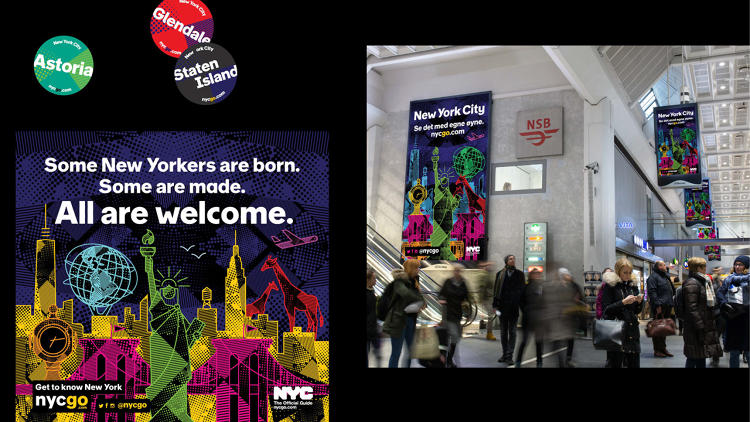
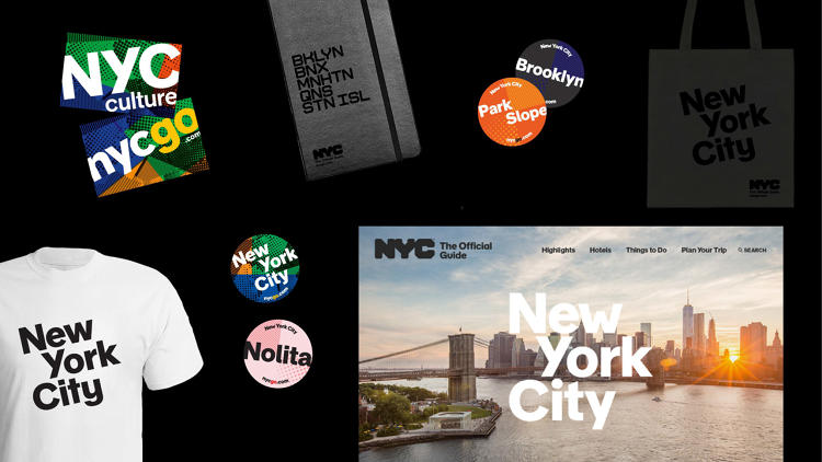
“We recognized that having an icon concept was powerful tool for the city, especially in speaking to foreign audiences,” says Emily Lessard, Creative Director of NYC & Company, the marketing organization for the city of New York. Yesterday, the city launched the city’s first official iconography as part of a major branding refresh, which also included a redesigned website and two new typefaces. The new brand includes 250 icons that will be used across all government agencies—many of which were even designed by the agencies themselves.
Most of the rebrand evolved from the official NYC logo, designed Wolff Olins in 2007. One of the two new typefaces, City Block, was derived from the geometry of the logo. The other, NYC Sans, takes its inspiration instead from Vignelli’s 1972 MTA branding. Lessard worked with type designer Nick Sherman, who worked on the MTA wayfinding signage, to develop a new typeface with 114 characters. The font embraces diversity—there are four different “Y” and “M” letterforms—as a way of celebrating the variety and strangeness of the city.
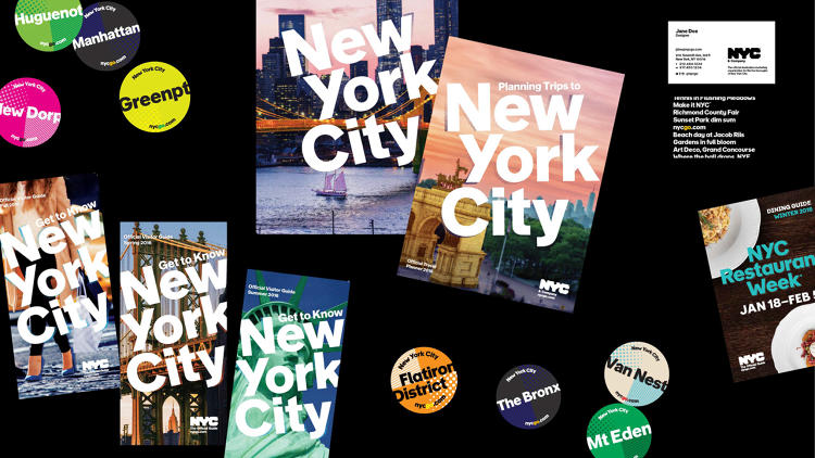
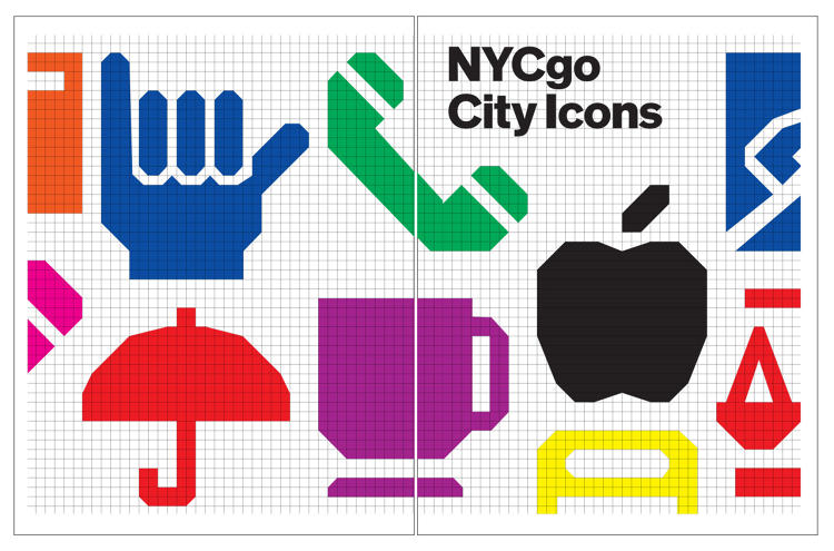
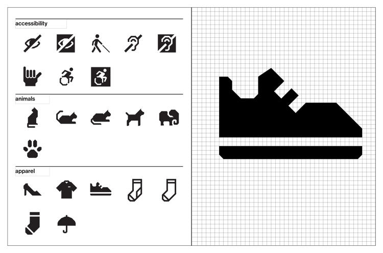
Lessard and her team also used the grid from the NYC logo to develop the icons. “That created a lot of exciting graphic rules that, while the grid is pretty complex, made it easy to quickly design your own logos.” Her team sent out a requests for symbols to city government agencies—and got 423 back. They whittled it down to 250, designing 207 on their own and farming out the rest to the creative teams of various government agencies, from the Department of Health to the Department of Parks & Recreation.
“The thing that stood out the most from the other agencies was their inspired ways of drawing,” says Lessard, noting that each designer had his or her own way of interpreting requests for representations of healthcare, home services, or city hall. “They brought their own inside knowledge of the agencies into the icons, which is something no one on my team or an outside designer could ever bring to the table.”
The font embraces diversity—there are four different “Y” and “M” letterforms—as a way of celebrating the variety and strangeness of the city.
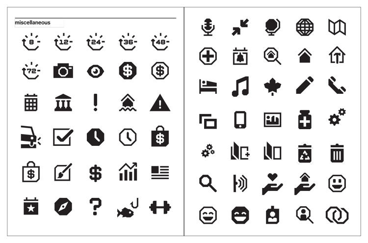
There’s also the “miscellaneous” section, which includes everything from geometric emoji to shopping bags. At the beginning of the project, Lessard had asked her team to test the grid system by designing an elephant, a sneaker, and a question mark—and in the end, they ended up keeping all three. Lessard says the more unusual icons came from either her own requests or strong suggestions from agencies, and she sees them as representing the diversity of the city. Even several different types of cats made the cut, a nod to the city’s resident bodega cats.
Her team created a web font that will make it easy for any government agency to use the symbols, even if they don’t have a creative team or designer on staff. It will also offer the city a consistent visual language—crucial for a city as huge and overwhelming as New York, or disparate and unwieldy as its city government.
Plus, now you’ll have a way to find all the best bodega cats.
All Images: via NYCgo
This article first appeared in www.fastcodesign.com
