
Slide presentations usually suck—but a good designer can turn that around. Here are four tips for selling your ideas.
PowerPoints are awful. Long and uninteresting, they are the corporate drone of visual media—synonymous with endless meetings, academic conferences, and corporate retreats.
For graphic designers, however, slide-based presentations like PowerPoint are synonymous with “client decks,” and they’re necessary for pitching a design to a client or potential client. These are not your typical boardroom slide show presentations. They can be impeccably designed and visually engaging because, if done right, they’ll persuade the client to go the direction the designer wants. Presentations can be a designer’s best tool for selling an idea.
Admittedly, it’s not graphic designers’ favorite part of the job, but there is a lot that others can learn from how they do it. We asked five designers from four top studios and agencies for tips on creating slide-based presentations—whether on PowerPoint, Keynote, or some other program.

[Image: Noma Bar]
DEVELOP A STORYBOARD
It’s easy to lose sight of the bigger picture while perfecting individual slides, but the most important aspect of any presentation is the overarching narrative.
“Effective presentations often structurally echo other effective storytelling modes like movies, novels, plays, and games,” says Mike Tyson, a design director in branding agency Siegel+Gale‘s New York office. You’ll have a built-in audience, their (hopefully) undivided attention, and a stage for your ideas. Don’t waste it by making your presentation dull.

[Image: Vivi Feng/Siegel + Gale]
Like with any mode of storytelling, pacing plays a big role—several of the designers I spoke to recommended first laying everything out on a storyboard. “It’s always good to start with the overarching problem or opportunity to set the stage, and you want to start big and then funnel down into the nitty-gritty,” says Simon Endres, creative director at New York design firm Red Antler.
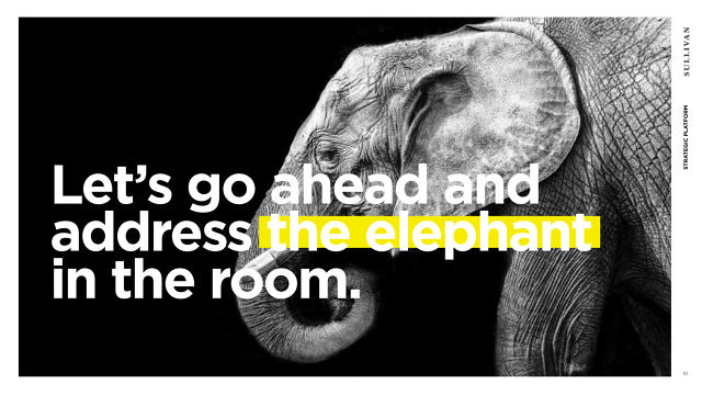
The creative directors at New York branding agency Sullivan advise to keep slides simple to create a conversation[Image: Sullivan]
Once that’s established, plan to mix the more detailed, informative slides in with simple, dramatic moments—like using a single image for one slide, for example—to keep your audience engaged. If you are presenting multiple options for something, you might build up to them with slides that reveal your creative process, then dedicate a few slides to explaining the result. Here’s a tip from Tyson: If there’s one option that you like better than the rest, drop in a couple more slides for that one.
Essentially, presentations are another form of storytelling, even if they are most commonly associated with bureaucratic boardrooms. Meg Beckum, a creative director at the brand engagement firm Sullivan, compares them to a song. “There’s a certain rhythm, cadence, scale, and pacing,” she says. “You have to keep the audience engaged and on their toes.”

For his presentations, illustrator Noma Bar creates frame-by-frame animations that activate when he clicks on his keyboard[Image: Noma Bar]
TELL A VISUAL STORY, NOT A TEXT-BASED STORY
Establishing a story is important, but remember that this should be a visual one. Save the text for your verbal presentation notes; your slide presentation is a visual aid. It’s best used as a way to punctuate your points and show off visual assets.
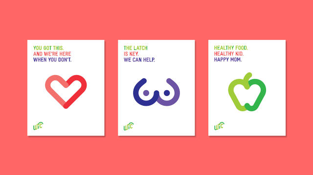
A slide from Sullivan’s deck for the National WIC Association.[Image: Sullivan]
In that vein, Beckum recommends keeping all presentations very light on text. “Don’t treat a presentation like a brochure,” she says. “For the most part people aren’t reading the slides. You want to start a conversation and have a dialogue.”
Instead, use the slides to visually complement your copy and drive the points home. Keep it simple—sometimes an image or an infographic is all that’s needed. But pay attention to details. Give the header or footer a splash of color, or match your font to your message.
That way, if public speaking happens not to be your strong suit, your visuals will be there to back you up. Take the method of Israeli illustrator and designer Noma Bar, whose work has appeared in the Economist, the BBC, and on Don DeLillo’s book covers, among other places. When Bar started presenting his work, he would create digital presentations by putting together frame-by-frame animations that come together into an animation when clicked through quickly. A nervous presenter, he turned his habit of fidgeting into a useful tick.
“That helped me hide behind the laptop and let my images do the job,” he says. “I felt that my power was in my images and not my words.”
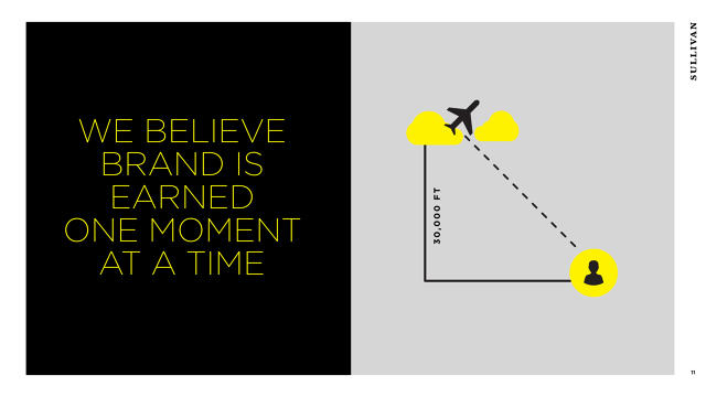
Sullivan creative director Richard Smith recommends paying close attention to typography, as it can relay as much about a story as any other visual elements[Image: Sullivan]
KEEP IT SIMPLE—AND ORGANIZED
All of the designers I spoke with agreed that visual presentations are most powerful when they are simple. That means not stuffing too much information into one presentation, but it also means organizing the information you do need to convey.
Tyson gives a few tried-and-true pointers that work for any circumstance: avoid graphic tropes; use iconography intentionally and orderly; and create an underlying, invisible grid to align information.

[Image: Vivi Feng/Siegel + Gale]
DON’T DO DEFAULTS—KEEP IT ORIGINAL EVERY TIME
While some rules apply across the board, it’s also important that presentations are tailored specifically for the project and the audience. “No defaulting to the default,” says Richard Smith, a creative director at Sullivan and Beckum’s colleague. Make it fresh by starting from a blank slate every time.
Tyson also recommends familiarity with your audience. As an identity designer, he says, “If I’m presenting to a visually literate audience who has some understanding of design, I often like to reveal the identity system piece by piece, explaining the intention for each element of the system, building to a kind of climax where I then reveal how all these elements work in harmony to create the overall expression of the brand.”

[Image: Vivi Feng/Siegel + Gale]
But if he’s presenting to someone not as well-versed in design: “I try to create a concise and powerful reveal from the beginning. They don’t care if the typeface has tabular lining features or why the photography is all shot at right angles to the subject. They want to know that it works and looks good.”
Above all, he says, be prepared and everything else will come naturally. “When the day itself comes, shed all that effort and anxiety. Assure yourself that you’re prepared, then think about something else.”
This article first appeared in www.fastcodesign.com
Seeking to build and grow your brand using the force of consumer insight, strategic foresight, creative disruption and technology prowess? Talk to us at +9714 3867728 or mail: info@groupisd.com or visit www.groupisd.com