
Good UX for journalists is just as important as good UX for their readers.
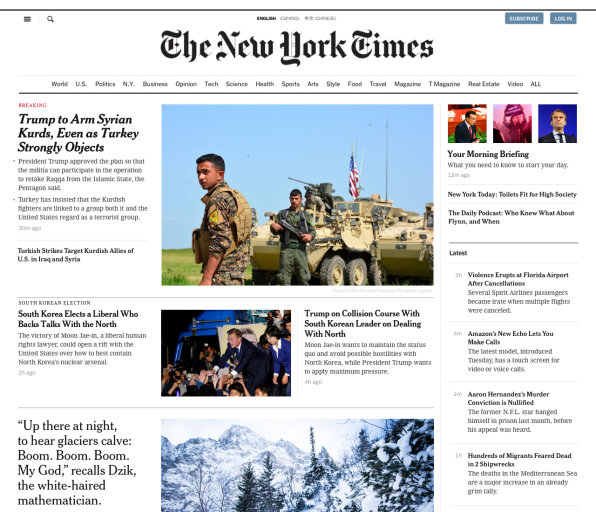
On Tuesday afternoon, the New York Times rolled out a test version of its redesigned home page to 1% of its 2 million digital subscribers. It is the paper’s biggest design change since 2014, but to the readers who get an early look, it might not appear so significant. That’s because its biggest changes are under the hood.
Randomly selected test readers will notice a few important but subtle alterations: The home page layout will be arranged in blocks of content customized for the different sections, so that breaking news, for instance, might feature bullet points underneath the headline, while feature stories might prominently display a pull quote. As a whole, the home page will have more visual assets, and will be optimized for scrolling and getting an overview of the day’s news at a glance.
The most noteworthy elements of the redesign, however, are behind the scenes. It has more to do with user experience for writers and editors than with readers, and reflects the paper’s overall aim to become less of a print behemoth and much more digitally native. The system the Times is testing has consolidated half a dozen different platforms into a single, responsive layout that scales across desktop, tablet, and mobile devices. The ongoing redesign will automate aspects of the publication’s workflow, cut back on editorial manpower, and give journalists and editors more direct control over how stories appear on the page. It also lays the groundwork for more tailored reading experiences for digital subscribers down the road.
It may not be as splashy as a full consumer-facing redesign, but for the Times—a publication whose digital-only subscriptions have more than doubled since 2014—good UX for the writers and editors who publish its journalism is simply good business.
ONE DESIGN ACROSS ALL DEVICES
When the Times last did a big wave of redesigns three years ago, the concept of responsive design was still relatively new. Like most publications at the time, the Times was focused on creating a tailored system for each individual platform. In effect, each surface—iPad, iPhone, desktop—had its own layout and its own code stack.
“We were still in a period of new device invention, and getting accustomed to the new inventions in desktops, portable laptops, phones and tablets,” says Kinsey Wilson, the former executive vice president for product and technology, who last week moved into an advisor role. “We were uncertain of which ones were going to settle into the routines of our lives.”
As it turns out, people read across several different devices every day. Yet publishing on six systems for six separate platforms was hugely inefficient. The Times home page editors had to make sure the same story was in the correct format for both the mobile home page and a desktop home page. If the company wanted to add a new feature or a new section to the digital publication, the developers had to add it to each of the platforms individually. For a reader, one problem with this old system was that their activity on one device wouldn’t necessarily be reflected on another. For example, a story viewed on mobile would turn gray to indicate that they had read it–but it wouldn’t be gray if they looked at the Times on their desktop.
With the new back-end, all of those separate systems have been consolidated into one system that can scale to a tablet, phone, or computer screen, giving readers the same experience no matter which device they are on.
GIVING JOURNALISTS MORE CONTROL
Later this year, the paper will also be getting a more modernized content management system (or CMS) called Oak. It’s an update to the Times‘ original CMS that has been adapted to allow the paper to publish from the same source to both digital and print.
The new authoring tool operates on a card-based system that intelligently displays the right version of each story for the appropriate context, allowing reporters and editors to take over several of the duties that dedicated home-screen editors perform currently.
With the old design, a reporter would put her story into the CMS and the story editors and copy editors would get it ready to publish, but a team of home-screen editors would add in the formatting details and determine the line up on the page. With the new system, the idea is for the card to contain any and all formatting and context details needed to display the story correctly on the home screen so that it’s no longer necessary for a team of editors to do so manually. For example, if a reporter puts all of the information needed for the story in a card, the system can automatically make sure the right photo is used as the promotional image for the story, for instance, or that bullet points that summarize the story in the preview card are used for breaking news.
“Essentially, what we’re trying to create is a system that we’re calling ‘What you see is what you mean,’” says Wilson. A preview setting will show reporters and editors what the story will look like on a variety of screens. When the system first first rolls out, there will still be a considerable amount of editorial oversight to make sure the stories are ordered as they should be on the home screen and the story layout is correct. But in the future, the system will allow much of that dedicated home-page work to be automated.
This falls in line with a new overall company strategy—manifested recently in a round of buyouts—that seeks to shift the ratio of reporters to editors. The new strategy reduces the number of editors through which a story must pass, and thus the number of editors the Times employs, in service of hiring more on-the-ground reporters. It will also enable the Times to follow through on several points it outlined in its 2020 report, such as giving more reporters access to visual assets, building a system that allows for more experimentation with digitally native journalistic forms (like the Times’ popular daily briefings), and highlighting new sections.
The idea behind the new CMS, Wilson says, is that it will ultimately result in better reportage. “The biggest gains from this are speed and efficiency,” he says. “The other is quality. If you can bring the composition of this information closer to the source—closer to the reporters and editors who know this story best—it’s going to better reflect our journalism.”
A READER-CENTRIC REDESIGN
In a more general sense, the move to update the Times‘ antiquated digital systems will let the paper add features and update the design in the future. With a single, responsive system, the paper can build out more customizable elements that focus on the reader rather than the device it is being displayed on.
For example, the system can potentially surface new stories at a faster rate for readers who visit the site several times a day to get their news, versus a person who only visits a couple of times a week. Wilson also mentions the possibility of predicting what a reader will want to see on the home screen based on her reading history. Meanwhile, the layout design ensures that readers will get a balanced view of all of the sections’ reportage and the latest breaking news.
“Over time, it will be much better in tune to what your needs are at any given moment,” says Wilson. “That’s not to say that you aren’t going to get the news judgement of New York Times, or that you’re going to be seeing a different report than everyone else sees. But we can be smarter about surfacing.”
After the Times launches the test version to around 20,000 of its readers today, it will assess the feedback and tweak the design if necessary. If all goes well, the new home page design and the modernized CMS should be deployed in the next several months.
–
[Screenshot: courtesy The New York Times]
This article first appeared in www.fastcodesign.com
Seeking to build and grow your brand using the force of consumer insight, strategic foresight, creative disruption and technology prowess? Talk to us at +9714 3867728 or mail: info@groupisd.com or visit www.groupisd.com