
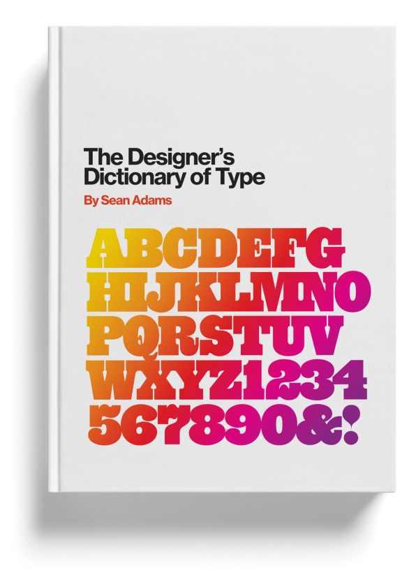
Editor’s note: In Sean Adams’s new book, The Designer’s Dictionary of Type, he examines 48 of the most important typefaces, their history, and how they can be put to work. While plenty of these typefaces are modern, Adams also covers the history of classic typefaces and their eponymous creators, who have otherwise been largely lost to history.
Typefaces create pictures of words. Like images, each typeface communicates an idea, emotion, and point of view. Helvetica might speak to neutrality and information; Garamond can read as literary and classic; Bodoni feels sophisticated, urbane, and crisp. The choice of typeface communicates a subtle message to the viewer. The typeface choice, like a moving and powerful photograph, is the difference between a good idea expressed adequately and a good idea expressed persuasively.There are as many approaches to typeface choice as there are design processes. Some designers, such as Massimo Vignelli, work with a small handful of typefaces for their entire career. Other designers may be more promiscuous with type, switching typefaces on every project. Neither of these is wrong. Vignelli adhered to strict modernist principles of simplicity and reduction. Herb Lubalin designed his own typefaces, preferring variety, flourish, and drama. These examples are extremes; many designers operate closer to the center of the spectrum.
My new book, The Designer’s Dictionary of Type, is not a comprehensive analysis and history of every typeface. Such an undertaking would require several volumes, each one thousands of pages thick. Instead, it aims to illustrate the multiple ways in which a designer might apply a typeface, as well as the many variations of each one. With experience, a designer will be able to look at a version of Caslon and determine whether it is well-crafted and refined, or a cheap knock-off from a free download.
CASLON
William Caslon designed Caslon c. 1725, basing the typeface on 17th-century Dutch type drawings. Caslon is a further evolution of Bembo, with letterforms aligned less with handmade calligraphic forms. The strokes have even contrast between the thick and thin weights and simpler curves.
Throughout the 18th century, Caslon was the dominant typeface for text and book publishing. The first printed version of the United States Declaration of Independence was typeset in Caslon. The typeface fell out of favor during the 19th century but became the “go-to” typeface for much of the 20th century. A maxim from mid-century art directors expresses its popularity: “You can’t go wrong with Caslon.”
Caslon 223 and 224–designed by Ed Benguiat of Lubalin, Smith, Carnase–have exaggerated weight differences and curves. They were popular in the 1960s and 1970s as a display typeface, based loosely on William Caslon’s original version.
GARAMOND
Claude Garamond is credited with the first version of Garamond, designed c. 1532. There is dispute over the actual provenance, as some claim present-day Garamond is based on the work of Jean Jannon’s designs 60 years after Garamond’s forms. The evolution of the typeface was based more on economic issues than aesthetic: the thinner strokes and larger counters using less ink and drying faster during the printing process.
Garamond is a classic typeface that communicates authority and academia. Employed historically as a book typeface, Garamond reads as “literature” without appearing overly decorative. As a common typeface, Garamond is unobtrusive. It doesn’t call attention to itself, allowing the images or written content to be most prominent.

BODONI
By the late 18th century, printing technologies, new ink formulas, and better paper provided the ability to print more delicate forms. Giambattista Bodoni designed Bodoni as a more geometric form, with straighter lines and more extreme variations between thick and thin parts of the letters. The forms follow the tenets of rationalism, a movement popular in the 17th and 18th centuries.Bodoni has the classical forms of an old style serif typeface, but the sharper edges and straight lines give a more modern and fresh impression. Bodoni was a favorite of Massimo Vignelli, who limited his typographic options. He stated, “Out of thousands of typefaces, all we need are a few basic ones, and trash the rest.”
COOPER BLACK
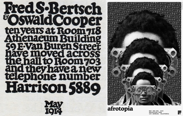
Cooper Black has a close association with the 1970s; however, Oswald Cooper actually created the typeface in 1921. Cooper designed the Black weight after releasing a larger Cooper Old Style family of fonts. The forms are based on old style serif typefaces but are “fat” and soft. This type of letterform gained popularity between 1910 and 1920. Other designers worked with similar forms, such as Frederic Goudy and his typefaces Goudy Heavy Face and Pabst Extra Bold. In the 1960s and 1970s, designers looking for alternatives to cold Swiss modernism and Helvetica looked back and revived Cooper Black. Its soft forms worked exceptionally well with phototypesetting, which allowed for extremely tight kerning. Both the counterculture movement and low-end DIY design adopted Cooper Black. By the end of the 1970s, the typeface was ubiquitous, but it again fell out of fashion as the New Wave movement gained momentum.
BASKERVILLE
John Baskerville lived and worked during the Age of Enlightenment, a philosophical movement that embraced reason and rejected the dogma of the Roman Catholic Church. His typeface Baskerville incorporated the ideals of the Enlightenment, making it one of the first transitional typefaces. John Baskerville’s goal was to improve on William Caslon’s work. The result is a typeface free of calligraphic imitation, with circular curves and vertical strokes. The italic version was closely related to the roman version. This was a milestone, as previous italics often had little connection to their roman counterparts.
Baskerville endeavored to print higher-quality books than the mass-produced volumes of lesser quality. He worked with high-end and well-maintained presses, high-quality ink, and smooth paper. The typeface Baskerville was perfectly suited for use with these superior methods