
The app is getting a significant update. Here’s what the company’s head of product has to say about what prompted the changes.
First it was supposed to be 6:15. Then the time jumped to 6:28. Soon, the kids grow restless. The spouse points out that ordering in was a bad idea all along. It’s 6:45 and the Pad Thai still hasn’t arrived. What time was it supposed to get here? The new estimate is saying 6:53, but I swear I set the table almost 40 minutes ago.
Anyone who has used Uber Eats on a busy night knows how it can feel like the interface is gaslighting you. Crystal-clear delivery estimates change with no record. Restaurants can cancel your order with no explanation. To complain, you’ve got to dig through the the app’s esoteric help section.
Today, Uber is rolling out a major update to its app in select cities–which will go worldwide in the coming weeks. The goal is for Uber to be more transparent, offer the user more agency, and to humanize the experience, according to Andy Szybalski, the Global Head of Product Design at Uber Eats. And from our first look, it’s an all-around improved experience (though it’s not afraid to tell a fib to make you feel better, either).
The design stems from a year-long study led by Uber Eats, in which the design team talked to users across nine countries. Perhaps the most cutting criticism was one that Szybalski shares front and center on a slideshow he’s created for our chat. “After I order, it’s a black hole until I get my food at my door,” the user said. Indeed, Uber (as the ride-sharing company) displays your driver on a map all the way from a trip they’re finishing to the one you get next. Uber (as the food delivery company) pretty much says when your order has been placed and when it’s on its way. As Szybalski explains, this fear of the unknown can have a real impact on the company’s bottom line.
“We want to understand when people aren’t using Uber Eats because they don’t have confidence we can fulfill their needs,” says Szybalski–who points out that if a user doesn’t trust Uber Eats to satisfy their hunger in any given moment, Uber hands over a sale to “Hot Pockets” or “a Cliff bar on the bottom of someone’s bag.” What he doesn’t say is that DoorDash and Postmates are eager to eat Uber Eats’s lunch, too, in the multi-billion-dollar food delivery industry.
Placing an order looks more like Domino’s
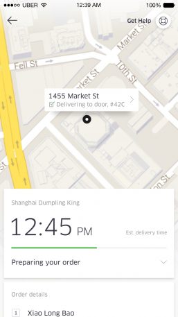
The first major change in Uber Eats’ design appears as soon as you make an order. Before, you’d place an order, confirm receipt, and get a notification when the order was picked up. Now, you’re notified of every step–from the order, to your food being prepared, to a car driving to the restaurant to pick up your order, to the car driving to drop it off.
The move is meant to clarify who the customer is waiting on–a slow restaurant, or a slow courier. “There’s a balance between simplicity and transparency we’re always trying to strike. In the case of food delivery, people intuitively understand the difficulties that arise when you’re trying to get hot food from a restaurant in the real world and drive it from point a to b,” says Szybalski. “By acknowledging some of that complexity, and being transparent about it, we can increase people’s confidence a lot.”
Of course, Uber has been known to present data “transparently” when it’s really fibbing. Years ago, the company showed users phantom cars on the road as a way of protecting its drivers from targeting from protesters; the practice may have helped evade the police, too. Similarly, Uber Eats’s notification that a restaurant is making your order is actually invented. Uber simply doesn’t know your food is truly being prepped–there’s no mechanism for the restaurant to confirm that to the platform, Szybalski confirms.
Instead, Szybalski argues that this white lie is in service of the user. “We obviously want to strive for as much accuracy as possible…the information we give our eaters is our best representation of what’s going on that we can possibly give them,” he says. “But one of the support tickets that we used to see a lot is…just, ‘Is my order being made? Is it taking too long? Is it forgotten? We wanted to make sure people know your order hasn’t been forgotten.”
Designing for the gap between machine learning and people
The other big update is the delivery estimate. Before it was a time, presented front and center in a big, readable font. But it would change moment to moment, to the point that the user might feel a little bit crazy. Szybalski admits that this was a bad presentation of Uber Eats’s machine learning algorithm, which didn’t work well for users.
Right now, Uber deploys software that analyzes and predicts the speed of every single restaurant in its database. Based upon more than four dozen factors, these estimates change in real time, moment to moment. That’s why it updated its best estimates periodically on the app. But as Szybalski confirms to me, that made a lot of people feel gaslit when things went wrong.
“I think that’s a perfect illustration of that gap between how the machine learning model sees the world and how humans see the world,” says Szybalski. “The machine learning model is updating it with the most updated estimates, [but]people will assume the worst. If they see the ETA starting to slip, even by a minute or two, you think, ‘Oh my god! Is this going to keep slipping forever?’” Of course, sometimes it does!
Now Uber Eats has decided to keep the real-time updates, but underneath, it’s added an estimated time of arrival that’s set when you order and will never change. It’s a baseline for the user’s expectations. It won’t speed deliveries up, but it does help users prep for the worst while hoping for the best.
Other updates are just in messaging. Now when a restaurant cancels an order, Uber has deployed some kinder copywriting that apologizes, assures you weren’t charged, and links you to other places to order from. And from this cancelation screen, there’s a three-dot “kabob” menu in the upper right hand corner where you can request help–in email or a call. For the most part, the help menus weren’t updated, but Szybalski says they’ve become more readily accessible through the app (a point I couldn’t test without beta access).
In any case, the new Uber Eats does seem to address some of the platform’s worst practices. Brass tacks: Users will have a better expectation of when their food is arriving, and more signals that the human beings really are working on cooking and delivering the meal at all times. Though it is a bit ironic that in its quest for transparency, Uber Eats is willing to tell a small fib for user comfort (a practice companies like Facebook share, too).
The question is: Do you want an interface to tell you a white lie, if it ultimately makes you calmer during that 45-minute wait for your dinner? In most cases, the answer is yes. That is, until something does go wrong, and you’re blindsided–stomach growling for decent Pad Thai–because of it.
–
This article first appeared in www.fastcompany.com
Seeking to build and grow your brand using the force of consumer insight, strategic foresight, creative disruption and technology prowess? Talk to us at +9714 3867728 or mail: info@groupisd.com or visit www.groupisd.com