
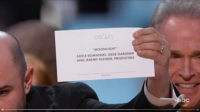
The Academy has over 6,000 members, but not a single graphic designer, apparently.
Anyone who watched the Academy Awards live could tell something was wrong. Warren Beatty looked at the card, which supposedly held the winner for Best Picture. And then he looked again. He could clearly tell something was amiss, but he couldn’t put his finger on what.
Then he showed it to Faye Dunaway who took the fall on his behalf. She announced La La Land for Best Picture. As we know now, she was reading the Best Actress card, which had both Emma Stone and La La Land listed.
The winner was actually Moonlight—printed on a card hiding somewhere backstage.
UPDATE: Read our follow-up post, which fixes the design, here.
Of course, this was an operational SNAFU. The most important moment of the night was ruined because Beatty was given the wrong card. But it could have been easily avoided by good design, argues Redditor ShinyTile. And it’s true.
The winning cards at the Academy Awards are layer upon layer of bad typographic design. For one, the Oscars logo is the biggest thing on the card. Which would only make sense if the announcer were blindfolded, stuck in a trunk, and dropped onto one of many stages at many award shows, and he didn’t know which one until he opened the envelope.
HERE’S EVERYTHING WE LOVED (AND HATED) ABOUT THOSE MEMORABLE OSCARS
Right below “The Oscars,” the winner is listed centered and in quotes. This decision makes some sense. Positionally, to make a word center-aligned makes it obvious and important—like the title of a book. But why isn’t this winner big or in any way bolded? Why isn’t the type presented to be more important through its weight or size than all the names listed below it—even just for pure legibility under the stage lights?
Finally, the card’s category label is in fine print. Best Picture or Best Actress is barely visible—tiny, italicized, and of a finer weight. Of course, that doesn’t matter when everything goes right. But the role of design isn’t to be a solution for when things so often go right, but for when things so often go wrong—which is, as it happens, exactly what happened last night.
“Just make “Best Picture” and “Moonlight” in huge text. That’s it,” writes ShinyTile. Exactly. It’s really that simple.
Featured Image: Eddy Chen/ABC/Getty Images
This article first appeared in www.fastcodesign.com.
Seeking to build and grow your brand using the force of consumer insight, strategic foresight, creative disruption and technology prowess? Talk to us at +9714 3867728 or mail: info@groupisd.com or visit www.groupisd.com