
The typeface is “perfect if you want to make your message loud and clear in a poster,” says its creator.
Over the past few weeks, teen environmental activist Greta Thunberg has been heavily featured in the news for her commitment to raising awareness about the perils of climate change. While her voice has been heard around the world for more than a year, this month’s Climate Strike saw activists echo Thunberg’s hand-drawn message (and even her likeness) on thousands of protest signs around the world. Now, a team of creatives has even converted her handwritten lettering into a downloadable typeface.
Move over, Helvetica; enter: Greta Grotesk.
This font, based on the 16-year-old’s bold lettering—which became iconic through a sign she brought to the solo climate strike she initiated in 2018—is an all-caps typeface with a limited set of numerals and special characters. It was designed by former creative director and SVA instructor Tal Shub, along with a team of collaborators from his climate-focused design company Uno. The group was inspired by Greta’s activism and wanted to celebrate it in the form of a typeface.
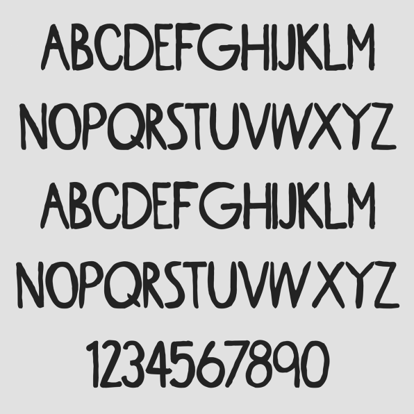
“From the very first moment of seeing her sign, I was really impressed by the bold design and clarity of the message,” says Shub. “It seemed only right to make the letters from the powerful words that initiated this movement to be available to everyone.”The process of creating “Greta Grotesk” started with finding photos of Greta’s signs online; in the end, two distinct posters were used to create the typeface. After extracting the letters from these images, the team traced the alphabet and converted them into vector format, according to Shub. The letters had to be standardized in terms of size, proportions, and line weight to create a harmonious character set. While the team ran into a few challenges during the development phase, Shub says it wasn’t too different from creating any other typeface.
“A pretty common approach to drawing a new typeface is first defining the lowercase n, i and o characters because they provide the straight, round and dot shapes that can then be extrapolated into other letterforms,” the designer says. “So much of what we did was just that—finding common forms and borrowing parts from the limited characters Greta had drawn. We repurposed elements from letters that had multiple options—for example, there was a total of six uppercase K letters and six uppercase T letters.” The team ended up using Greta’s original “M” to create a “W,” which wasn’t represented in her signs, and used her uppercase “O” to create a “Q.” Beyond adapting the lettering, Shub and his team only added a few punctuation symbols and numerals to the set.
Greta Grotesk is available online as a free download, and provides a nice respite from the straightforward fonts we’re used to.
“Our intention wasn’t to create the most beautiful font out there, but to stay true to the imperfect, yet bold letters,” Shub says. “Greta Grotesk is what you’d call a ‘decorative font,’ meaning you shouldn’t set your next corporate document in it—but it’s perfect if you want to make your message loud and clear in a poster.”
–
This article first appeared in www.fastcompany.com
Seeking to build and grow your brand using the force of consumer insight, strategic foresight, creative disruption and technology prowess? Talk to us at +9714 3867728 or mail: info@groupisd.com or visit www.groupisd.com