
Here’s how the company confronted its own shortcomings on inclusive design–and systemically redesigned its app for everyone.
Last year, Long Cheng sat down with a group of engineers as they studied people using Pinterest. For Cheng, lead designer at the company, this sort of user testing was commonplace. But that day, something was different. The testers weren’t thirtysomething moms, or whatever stereotypical demographic pops in your head when you picture one of Pinterest’s 200 million users. They were people with a range of visual impairments, from macular degeneration to complete blindness. And Cheng wanted to see how well they could use the app.
To his dismay, many couldn’t even get past the sign-up screen. People literally couldn’t even create an account. While iOS and Android each have an accessibility feature–called Voice Over and Talk Back, respectively–which read aloud the buttons and options on the screen for visually impaired users to navigate, Pinterest had failed to properly label its own user interface for this feature to even work properly. Similarly, when people did eventually get into the app, recipes read aloud would be missing steps or ingredients. People found themselves trapped inside pins, unsure how to escape. Even for partially sighted people, Pinterest design, with its minuscule type, was a challenge to discern.
“It was definitely personal for me, and me specifically. Because I’ve been a designer here for five years, and it’s a product I really love to work on, and I want everyone to be able to use it,” says Cheng. “For the group of engineers and designers sitting there, we felt like we weren’t doing enough. We wanted to do more.”
Blind people using Pinterest–the app for visual inspiration–may sound like an oxymoron. But in fact, Pinterest, like all mainstream apps, has a contingent of blind users (though the company admits to not tracking them). Many use Pinterest simply to bookmark stories on the web they’d like to read later. And those who don’t use the service might like to, if they were better welcomed.
“We asked one user, would you use Pinterest? You can’t see what’s on the screen!” Long recounts. “She said, ‘of course I would.’” Visually impaired or not, we all want tasty recipes, better haircuts, and fashion advice. And Pinterest is loaded with billions of pins full of this stuff.
Over the past year, Pinterest has committed to practicing inclusive design, and making its product more accessible to everyone. With a team of a dozen designers and engineers, Cheng developed a multi-part approach to redesigning Pinterest as a product that could be more accessible to everyone, leading to a fully redesigned app and desktop experience that’s been slowly rolling out for months.
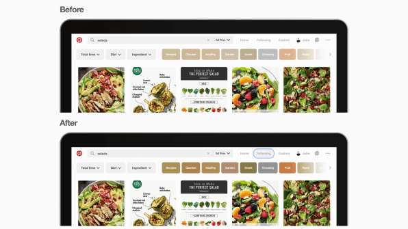
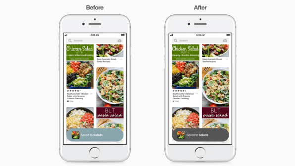
The first and most obvious step was adding all of the proper code and labeling to make sure that features like Voice Over could actually read every component on the screen. Along the same lines, the company added focus indicators–relatively standard outlines around buttons and menus that are active–that make Pinterest easier to use for people who can’t use a mouse or trackpad.
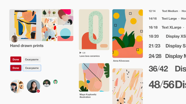
This was table stakes, of course. Other aspects of the redesign would have to be more core to the user experience. In particular, the company wanted to heighten the contrast of the UI across the entire app so that it was more legible. To do so, Cheng’s team developed a whole new color palette, full of bright jewel tones that could frame text and help it pop. This multicolor spectrum couldn’t be further from the robin’s egg blues so beloved by startups.
“So often as designers, we have to buy into the idea that maybe an accessible design isn’t as pretty or beautiful,” says Cheng. But he believes that with commitment, good designers can find a way to champion aesthetics and accessibility at the same time, even when it comes to high-contrast user interfaces. “For us to overhaul our color palette to accessible colors, there were definitely challenges! But in the end, we figured out the right way, and it was okay.”
With respect to the colorblind , Pinterest has eliminated any instance where color was once used to convey action or meaning; in the new Pinterest, it’s only there for increased legibility and visual flair. Meanwhile, the company introduced the option to increase the size of text across the app within the settings–focusing on size and boldness to denote information hierarchy, rather than tweaking words in various shades of gray, which can be low contrast and difficult to see.
Internally, Pinterest culminated its work by launching an inclusivity pop-up lab for its own employees to try to navigate the app with nothing but a keyboard, or wear items like visual-impairment goggles while trying to read the screen. “We tried to help [ourselves]understand all the different disabilities people might have when they use Pinterest,” says Cheng. “How do we start any product development with that in mind from phase zero?”
What Cheng wants to instill is a mind-set. Two years ago, Pinterest realized it needed to consider the international market when it came to design. And now, its designers always think about decisions on a global scale. Likewise, he wants to see designers thinking inclusively from the get-go. The company has also built automated testing for accessibility into all of its app updates moving forward.
Inclusive design is a process, not a destination. And with that in mind, we’re likely to see more and more companies go through a similar reckoning as Pinterest has in the last year. Maybe they won’t get everything right on the first pass, but so long as they actively involve their edge users in the design process going forward, Pinterest will only become a more usable product for more people.
If that’s not enough to sell you on inclusive design, it’s worth recognizing that one day, we’ll all be an edge case. And so inclusive design practices are often an investment in our own lives as much as they are a way of helping others. Think of it as health insurance, or a social security for user experience. “Something I always think about with this work we do is, we’re designing for our future self,” says Cheng. “Whatever we’re doing will actually benefit all of us in the future–even if you don’t have low vision now.”
–
This article first appeared in www.fastcompany.com
Seeking to build and grow your brand using the force of consumer insight, strategic foresight, creative disruption and technology prowess? Talk to us at +9714 3867728 or mail: info@groupisd.com or visit www.groupisd.com