
It’s called “Crimes New Roman.”
Harry Potter, the beloved children’s books by J.K. Rowling, is now a bona fide franchise, with books, theme parks, and countless movies. The latest? The Crimes of Grindelwald, a sequel to the spin-off Fantastic Beasts and Where to Find Them. It’s playing in movie theaters now.
While The Crimes of Grindelwald is set in the Harry Potter world, Harry isn’t actually in it. So the central design challenge became: How do you both communicate the connection to the original story and establish that it’s a different series entirely?
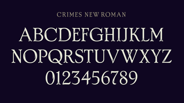
Warner Bros. looked to the branding experts at Pentagram for help, tapping the agency to create the logo for the movie as well as a typeface that could be used on all the film’s promotional materials, from social media and trailers to product packaging, as well as for the titles within the film itself. “Warner Bros. likes to have a proprietary typeface so they can have something ownable and recognizable that suits the brand,” says Emily Oberman, the Pentagram partner who led the project. “It is also a handy way to help all the various agencies and companies that work with the film to stay on brand.”
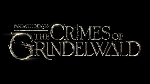
Along with the typeface, cleverly called “Crimes New Roman,” Oberman and her team created a logo for the film that shimmers like polished silver, its carved letters evocative of magic, intrigue, and the epic quests that remain at the heart of today’s fantasy stories. It was inspired by the Deathly Hallows, a group of objects that make the wizard who owns them invincible, which play a role in the new film as well as in the original Harry Potter series. An “I” in the title becomes the Elder Wand, the most powerful wand in existence. An “A” becomes a triangular symbol for the invisibility cloak, which hides the wearer from the world. And the “G” in Grindelwald symbolizes the round resurrection stone, which can conjure the spirits of the dead. Each of the three letters have flames erupting from them, a nod to a fire-related plot point in the new movie. The rest of the letterforms are from Crimes New Roman, meant to evoke the carved wood of wands.
Oberman didn’t just create the identity for Grindelwald–she and her team also helped establish the naming convention for the sequel. Oberman describes how she looked through scores of naming conventions, like how the Jason Bourne series always includes the character’s name in its sequels (like The Bourne Identity or The BourneUltimatum), or how the original Harry Potter series’s movies are always titled Harry Potter and the XYZ. Ultimately, she landed on a hierarchy where the final movie logo has “Fantastic Beasts” nestled above the full title. “For me the thrill is being involved in it in a way that’s not just doing the graphic design, but being able to work with Warner Bros. and [J.K. Rowling’s agency] the Blair Partnership to help figure out the structure,” Oberman says.
While that means that Oberman helped determine the logo’s hierarchy, she didn’t actually name the movie (though she did come up with fake names in her quest for a naming convention). That was all J.K. Rowling.
–
This article first appeared in www.fastcompany.com
Seeking to build and grow your brand using the force of consumer insight, strategic foresight, creative disruption and technology prowess? Talk to us at +9714 3867728 or mail: info@groupisd.com or visit www.groupisd.com