
Close your eyes, and I bet you can describe the distinct sensation of pouring soda out of a fresh two-liter bottle. When you pour your first glass, it’s this sturdy but unwieldy torpedo in your hands, glugging and fizzing its way into your glass. Somewhere around two or three glasses, you find the right balance. But as you pour your last glass, and the bottle begins to empty, its structure begins to collapse, and pouring the last few ounces is as tricky as the first.
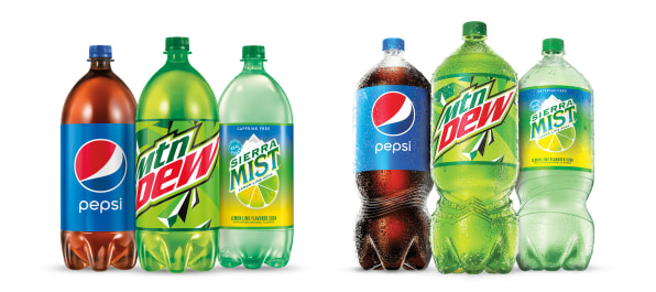
First designed in 1970 by PepsiCo and improved into the 1990s, the two-liter bottle is an imperfect mainstay of the soft drink industry. But today, after 30 years of being unchanged, the two-liter is getting a complete makeover. PepsiCo is beginning the rollout of a curvier new bottle that’s easier to grip and balance in your hand, while consuming slightly less plastic in the process. The update will come to all its major soft drink brands.
“You think, as a designer, how difficult is it to redesign a bottle?” muses Mauro Porcini, SVP and chief design officer at PepsiCo. “The reality is, when you need to redesign a bottle with this scale . . . and this impact on the world and business, it is probably one of the most difficult projects I ever faced in my career.”Porcini isn’t exaggerating about the scale. The two-liter bottle is still wildly popular; in fact the company sells the same amount in volume in both the 12 oz. can and two-liter formats. The redesign first began in 2018 as PepsiCo decided it was time to acknowledge consumer pain points.
The original two-liter had a circumference of 13.4 inches, while PepsiCo says the average hand is between 7 inches and 8.6 inches when grasping. Just glancing at that gulf demonstrates why two-liters are so difficult to manage. The company’s first goal was to improve these ergonomics. “How you hold it, pour it, how to make the experience better from a usability and ergonomic standpoint,” says Porcini. “That’s the key anchor: We wanted to make the product more useful.”
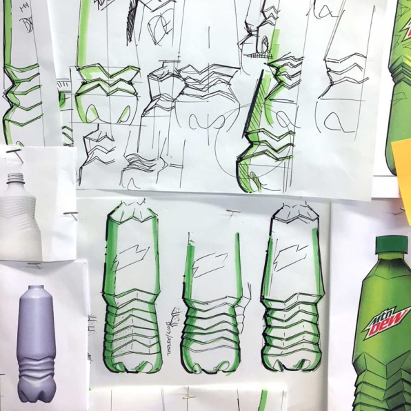
The design team, coordinating with the business team, analysts, and R&D, began to dream up alternatives. That meant sketching thousands of designs, and rapidly prototyping hundreds of designs with 3D printing. It’s a process that’s far more complicated than just coming up with a new silhouette. Because these bottles need to be durable while also consuming as little plastic as possible, the plastic thickness varies through the entire bottle, reinforced where it’s necessary and removed where it’s not. And because they hold liquid that’s pressurized, they are managing forces ballooning their way from the inside out.
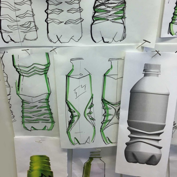
“You may design something really cool in a 3D-printed prototype,” says Porcini, “but you put the actual liquid inside, and you lose all the details because of the pressure.”
PepsiCo’s final shape is a mix of old and new. Up top, it looks like the two-liter you know. Then about two-thirds of the way down, it curves in to 10.4 inches, which is technically 25% slimmer than the standard two-liter but feels to me like even more. Then the foot of the bottle tapers in again, impressively balancing a design that appears top heavy.
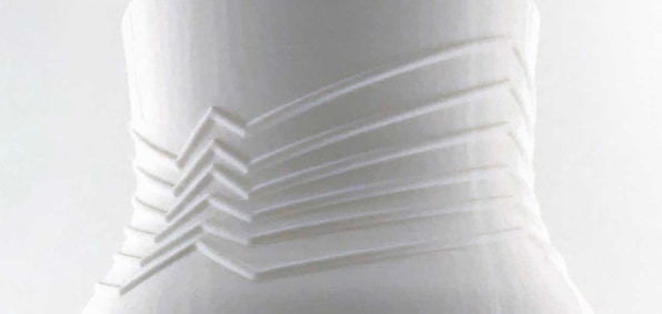
The shape itself is a technical accomplishment because, while it doesn’t use less plastic than the old bottle, it also doesn’t use more. As Porcini explains, the challenge is managing the right amount of plastic throughout the bottle, which varies from 0.008 to 0.012 inches thick, to minimize waste. The very top of the bottle, near the cap, has to be thicker to support the structure. Around the label, they can thin it out. But then in that gripping area, the plastic needs to get thicker again to support both the structure of the curve and the pressure of your hand. PepsiCo needed this grip area to be as thin as possible to make the bottle easier to grab without making its plastic footprint even worse. What they came up with was external detailing—extra ridges of plastic that reinforce the plastic in this gripping area, like scaffolding.
These ridges are also a means of brand expression, as each different soda bottle features its own unique grip shapes. Classic Pepsi looks like a wave, while Mountain Dew is almost like a jagged lightning bolt.The result will make you rethink how you pour a two-liter. I crack open a Pepsi bottle that the company sent, and squeeze it to pour. I realize that I’m squeezing too hard, overexerting myself with the two-liter muscle memory of yore. I actually bend the bottle inward a bit. But when I allow the bottle to tip in my hand, it pours with plenty of support and an intuitive balance. Emily Silver, vice president of innovation and capabilities for PepsiCo Beverages North America, says that consumer testing has shown 90% of people find this new bottle easier to hold and pour—and most can do so one-handed. “We feel like we have a winner,” she says.
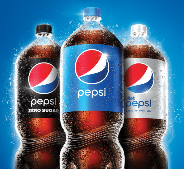
As for the bottle’s overall store presence, that was a concern, too. “We wanted to stand proud on a shelf,” says Porcini. “[It was about] creating something memorable, own-able, so if you think of Pepsi, you think about that special shape.” While the new bottle is technically a bit thinner and taller than the old bottle, these differences are so slight that they don’t allow more actual product to squeeze onto store shelves. However, designers did move the label up on the bottle, which accommodates the fact that many shelves have a small safety rail that blocks the branding.
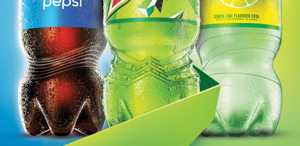
And in perhaps the most impactful update of this whole redesign, the new label is actually 24% smaller than the old one, which means slightly less plastic is used in each bottle as a result.
When I ask why PepsiCo didn’t address the entire two-liter redesign focusing on sustainability rather than ergonomics, I receive a few different answers. Silver points to PepsiCo’s wider stated environmental goals, mentioning that this is in line with them, and that PepsiCo is investing in recycling infrastructure to recapture more viable plastic. Porcini points to PepsiCo’s wide portfolio of brands, like Soda Stream, which leverages reusable bottles and allows people to carbonate the water from their own tap.
But ultimately, Porcini concludes on a point that he brings up often during conversations, that good design is not just about realizing an idyllic concept or idea in a studio, but implementing new products in a way that responds to both the desires of consumers and the viability of a business. “There’s an [environmental]effort, but it’s an effort that’s a journey. We need to take the consumer with us. If we fail in delivering something that’s engaging and functional for consumers, at the end of the day, we will fail also on our sustainability goals.”
This article first appeared in www.fastcompany.com