
A new tome from Taschen explores why National Geographic‘s approach to information design has changed little since the 1800s.
The fact that National Geographic continues to be a collector’s item when other print magazines are struggling—there’s even a popular eBay guide for selling them—is testament as much to its artwork as to its articles. The publication’s photography department is often praised for its iconic images, but a magazine so focused on history and science can’t rely only on photos for visual storytelling. For the topics not easily captured by photography, information design sweeps in—a National Geographic tradition that has an oft-overlooked, though no less influential, history.
As deputy creative director Kaitlin Yarnall writes in the preface to the new book National Geographic Infographics, the magazine’s art department is most often deployed to cover subjects that can’t be photographed: “Things too small (atoms!), too big (black holes!), too complex (migration patterns!), too old (Roman ruins!), too conceptual (dark energy!), or too numeric (trade flows!) to be photographed are our specialty.”
For a magazine whose mission is to explore and explain our world, mastering the map, chart, cutaway, and illustrated timeline has been a priority from the beginning. As I explored in an article on the history of the cutaway earlier this week, information graphics allow us to peer into places that can’t otherwise be seen and satisfy our curiosity about the inner workings of opaque objects, subjects, and stories.
As the book points out, information graphics have been a part of the magazine since it was first published in 1888, when it was still the journal for the National Geographic Society—a 200-member organization mostly comprised of wealthy adventurers who got together and shared stories of their expeditions.
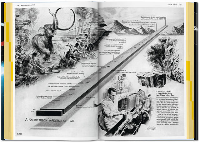
It was Alexander Graham Bell, along with his son-in-law Gilbert Grosvenor, who transformed the academic journal into a general interest magazine, which benefited from the addition of photography and maps. For instance, in some of the earliest issues of the magazine you could find an illustrated 3D reconstruction of a 1474 map by the Italian mathematician Paolo dal Pozzo Toscanelli, illustrated by hand—as appears in the April 1893 issue.
Surprisingly, that map doesn’t differ too radically from some of the illustrated infographics and maps found in the magazine today—hand-drawn images still populate its pages. “One kind of image-making that the magazine has not abandoned is the hand-drawn graphic illustration,” notes the British/American graphic designer Nigel Holmes, a long-time contributor to the magazine, in his introduction. He continues:
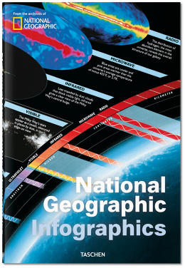
This is not some kind of nostalgic throwback to the days when it was the only possible way to make information visible. One National Geographic artist in particular, Fernando Baptista, is today carrying on a tradition from long ago, but in a very modern way. His amazing models of buildings and animals, and his hand-drawn art win major prizes in international competitions, as well they should. He is just one reason that National Geographic is so respected. Perhaps it’s even the main reason in the field of information design. He uses the power of the computer to mold his own drawing and model-making into extraordinary images.
Holmes also makes an interesting distinction between data visualization and information graphics—a distinction he uses to explain why National Geographic has been slower to embrace the former. Data visualization refers to graphics that take a large data set—census data, or data from scientific findings—and compresses it into an understandable image by virtue of a computer. Information graphics is much broader, and, particularly with regards to National Geographic, illustrates a scientific concept so that the general public can understand it; in other words, explaining science visually, and typically without synthesizing large data sets. “The idea of editing that data is a kind of heresy, which is only just beginning to be grudgingly accepted in scientific and academic circles,” Holmes writes.
Still, National Geographic infographics are celebrated precisely because they are a type of editing—a trusted back-and-forth among the experts, reporters, photo editors, and the art department, to ensure graphics are accurate and understandable. Holmes’s shying away from data viz appears to be a reticence to simplify the complex scientific issues often explored in the magazine’s pages, though he does admit the two fields will likely eventually be indistinguishable. In its over 100-year history, National Geographic has continuously made detailed, widely trusted infographics that help communicate topics like science, history, and the environment to its readers. Even if the science in those earlier copies is now outdated, they’re still prized for their art and their insight.
Click and buy the book here.
[All Images: courtesy Taschen]
This article first appeared in www.fastcodesign.com
Seeking to build and grow your brand using the force of consumer insight, strategic foresight, creative disruption and technology prowess? Talk to us at +9714 3867728 or mail: info@groupisd.com or visit www.groupisd.com