
The Vivid And Daring Visual Identities Of Airlines During The Jet Age
WE TALK TO MATTHIAS C. HÜHNE ABOUT HIS NEW BOOK AIRLINE VISUAL IDENTITY: 1945-1975 AND WHY AIRLINE BRANDING USED TO BE SO MUCH BETTER THAN IT IS TODAY.
When Continental announced its sudden merger with United Airlines back in 2010, they unveiled the very vanilla visual identity that’s still in use today. The uninspired new logo—which simply stuck the United Airlines name onto Continental’s blue “whiffle ball” logo—replaced the iconic “tulip” logo designed by legend Saul Bass in 1973. It also joined the ranks of countless other airline identities that are playing it safe with competent but bland visual identities—awfully similar as a result.
In his new book, Airline Visual Identity: 1845-1975, Matthais C. Hühne looks back at a period when airlines were more playful and adventurous with their branding. A massive, 400-page collection of the advertisements, logos and liveries, the book is a heartbreaking visual reminder that airline travel was actually fun and exciting, and the branding behind it was, too.
Hühne has been collecting airline posters since six years ago, when he came across an original Air France poster from the 1950s in a gallery in Paris. “I was just so impressed by the originals that were created with such attention to detail, in part due to the method of printing they used,” he says. He narrowed the focus for the book down to the years between 1945 and 1975, a crucial period for both airline travel and for graphic design.
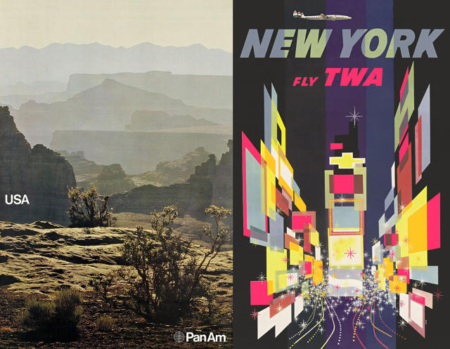
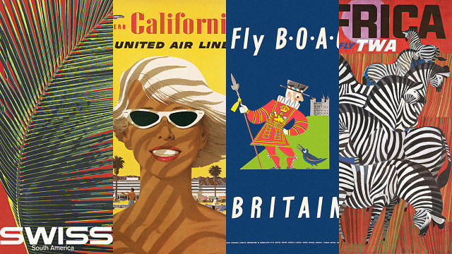
The airline industry, then considered one of the most progressive, exciting industries, tapped big names like Bass, who also designed the original Continental logo, and Massimo Vignelli, who designed the American Airlines logo. The focus of the advertisements were on destinations rather than airline accommodations, as shown by theiconic Pan Am posters designed by Chermayeff & Geismar & Haviv and David Klein’s colorful and energetic TWA posters.
When asked why airline visual identities today don’t live up to their pasts, Hühne points to the deregulation of the airline industry in the 1970s. Now that airlines are allowed to compete over price, their advertisements are largely about their affordability, or the superiority of their amenities, than the act of jet setting off to exotic locales. “Before deregulation, airlines had to apply for rate changes. They had to do much more advertising, focused on things other than price,” he says. “For example, the destinations in the advertising look much more exciting. And they had to focus on the beauty of the aircraft.”
Luckily for us, Hühne’s book captures the optimism and excitement of the golden age of air travel that was embodied in their commercial artwork. For a selection of images from the book, click through the gallery above. To purchase your own copy, go here.
[All Images: courtesy Callisto Publishers]