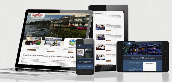
With the majority of retail Web traffic coming from mobile devices, it is unsurprising that a user-friendly mobile Web presence is now a necessity.
According to comScore, 66 percent of all time spent on retail sites takes place on a mobile device. This means that companies must be fully aware of how well their Web sites work on both desktop and mobile.
Mobile device users also have higher expectations than ever before.
Approximately 85 percent of users expect pages to load as fast as desktop or even faster (mobiForge). If your site is slow, that user will simply move on.
UX is another essential factor, as every visitor to a retail site is a potential customer.
Your Web site is a way to generate revenue for your business and, as such, should be treated as a top priority. There is no one right approach, but a focus on what users want from an individual Web site is a good place to start.
Different ways to cater for mobile users
There are three main types of mobile site design methods that can be used. Each method has their own individual advantages and disadvantages which should be carefully considered.
- Responsive: Responsive Web design works by sending the same Web site code to every device and then rearranging the content client side, which allows the same Webpage to be displayed on any device.
While RWD is increasingly popular, there are costs associated with implementing it. The opportunity cost of having a unique mobile experience is one of the greatest costs incurred.
- Adaptive: Adaptive Web design (AWD), or content adaptation uses device detection technology, to determine the device requesting the webpage.
A specific Web experience is sent to a device depending on whether it is a tablet or smartphone.
In this way, Web developers can customize specific content according to the visitor’s needs, and design lighter versions of their site which will load faster.
Developers can also add specific elements which take advantage of the different features of smartphones and tablets.
- RESS: Responsive Web design with server-side components, also known as RESS, is another technique that combines responsive design with server-side device detection technology.
This allows the features of RWD to be further optimized to fit specific devices. Specifically, image optimization based on a knowledge of the device.
So why choose adaptive over responsive?
While both methods have their own unique benefits, it is becoming more important than ever that businesses offer a tailored mobile site to suit the specific needs of any user’s device.
Going with AWD means you can effectively segment your traffic based on the visitors’ device and while this requires more work, the benefits can most certainly outweigh the costs.
In terms of mobile commerce, AWD allows the ordering and payment process to be streamlined for mobile devices. This is crucial for online customers, who will already be extra cautious when entering their credit card details into any Web site. This is why AWD is favoured by many online retailers, hotels and airlines, since it allows them to optimize the payment system.
AWD means that Web developers can choose to remove heavier content for their mobile-optimized sites resulting in drastically improved load times.
One of the greatest advantages of AWD over RWD is the ability to segment mobile traffic and deliver device specific experiences.
A mobile-specific Web site can also offer features tailored for smartphone users, such as tap-to-call or tap-to-SMS buttons that allow visitors to quickly contact the business directly from their mobile devices.
Companies can also include a Find Us feature which uses the GPS capabilities of smartphones and tablets.
Who uses AWD?
While RWD is gaining traction today, many major companies realize the limitations of simply reflowing the same content on every device, and the benefits of offering a unique experience for each device category.
Some of the highly recognizable brands that have used AWD to create an outstanding Web presence are:
- Maplin: This well-known United Kingdom-based electronics retailer designed its Web site to cater to those visiting from mobile. It reduced the desktop homepage weight, drastically improving load times.
Maplin also rearranged the hierarchy of product categories to ensure that the Web content remains relevant for mobile users.
- IKEA: World-renowned home furnishings retailer IKEA has used AWD in a unique way. It has streamlined product browsing and placed emphasis on the Shopping Lists section on mobile.
By doing this, IKEA has turned the mobile site into a companion for when you are shopping in the actual store.
- Adidas: Sports apparel retailer adidas managed to retain consistency between its mobile and desktop sites.
AWD allowed it to do this by using lighter images and a more mobile-friendly shopping process, while keeping the overall content of the Web site the same as the desktop counterpart.
Other major brands that chose adaptive over responsive include Amazon.com, Walmart.com and Etsy.com. Even Google itself uses adaptive Web design.
It is a common myth that Google prioritizes RWD sites. Google expressly states that it supports AWD and separate mobile sites as long as there are canonical links to desktop content.
MANY BUSINESSES have succeeded in implementing AWD to give users a unique, customized and seamless experience which is, at the same time, optimized to drive sales and conversions from mobile sources.
This also allows them to address page weight and load time issues that are particularly important for mobile visitors.
It is vital to understand the key differences between AWD and RWD.
Optimizing specifically for mobile may be exactly what your business needs to maximize sales driven by mobile sources.
With this in mind, when it comes to important aspects of online shopping such as product browsing and placing orders, RWD does not have the same flexibility as AWD.

