
The Nest WiFi Pro, Pixel 7 phone, and Pixel watch use color and material to stand out.
Wi-Fi routers have two interrelated problems. In order to work well, they need to be out in the open and unobstructed. But few of them are left out to be seen because most of them are butt-ugly.
“People stick them into cabinets,” says Google industrial design head Isabelle Olsson.
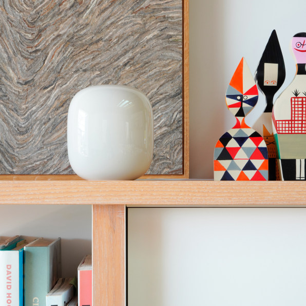
The company, which is just releasing its latest line of Made By Google hardware products, thinks it may have designed a solution. Its new Nest WiFi Pro router is modeled after fine glassware and ceramics, with a glossy and seamless finish, making it look more like a small sculpture than a piece of internet networking hardware.
“It started with a pretty simple idea that Wi-Fi that’s out in the open performs a lot better,” says Olsson, whose full title is senior director of industrial design for home, wearables, and colors, materials, and finishes across Google Hardware. “Our main goal was to design something that people would want to put out in the open and that fits in with the rest of your interior design choices, whether it’s a vase from your grandma or a stack of books or some other ornament.”

Compared to the clunky, robot-looking routers most companies produce, Google’s new router uses delicate finishes and color treatments, combined with an overall attention to detail that should make sure they don’t end up in the back of a cabinet. It’s an aesthetics-first approach that’s spread across Google’s entire 2022 line of consumer hardware, including its latest Pixel phones, its Nest doorbells and thermostats, and its Pixel smartwatches. Available in earth tones, pastels, and a sorbet-like yellow the team calls Lemongrass, the products carry a bright cheeriness. Compared to previous models, which tended to have softer, textile features that let them blend into their surroundings, this year’s models are meant to stand out.
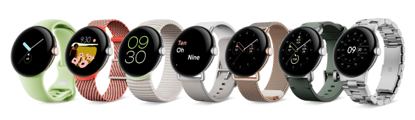
It’s a design approach on full display in the Pixel Watch, with a gently curved round face that was inspired by the continuous surface of a water droplet sitting on top of a leaf. Olsson says this was originally intended to be just a starting point—more mood board than design concept. “And then we discovered over time that this is actually really practical because it doesn’t catch on shirts and sleeves,” Olsson says. The rounded shape made so much sense both aesthetically and practically that it became the final design. “We call it function follows form.”
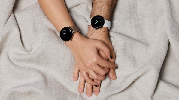
The watch is probably the most expressive of Google’s hardware products, with several recycled steel finishes and a rainbow of interchangeable bands. “Color is a way to create surprise and delight,” says Ivy Ross, Google’s vice president of design for devices and services. Patterns on the digital screen itself can also be color-coordinated with the watchbands, which come in recycled plastic weaves, stretch metals, and textiles. Ross, who had a successful career as a jewelry designer before joining Google and whose works are in the Smithsonian’s collection, says these touches create more options for customizability and expression. “Jewelry is all about details.”
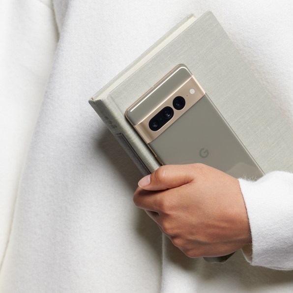
That ethos also guided the design of Google’s other big product launching this week, the Pixel 7 phone. Continuing the look of the previous version, the Pixel 7 features a wide horizontal band of metal on the backside where the camera’s lenses are located. Made completely out of recycled aluminum, the metal band harmonizes with the colors available for the plastic body while also serving as a protector for the lenses themselves. Ross says the design was optimized to reduce the number of pieces required to create the body and metal band for a more streamlined appearance of what the design team sees as the phone’s signature. “The idea was now that we have established that visual, let’s simplify everything,” Ross says. “Simplify and elevate.”
But that hasn’t meant these products are so simple they disappear. Instead, Google’s design approach appears to be moving in the opposite direction—refined color and material treatments that ensure these hardware products, even the utilitarian Wi-Fi router, get noticed.
Wi-Fi routers have two interrelated problems. In order to work well, they need to be out in the open and unobstructed. But few of them are left out to be seen because most of them are butt-ugly.
“People stick them into cabinets,” says Google industrial design head Isabelle Olsson.
The company, which is just releasing its latest line of Made By Google hardware products, thinks it may have designed a solution. Its new Nest WiFi Pro router is modeled after fine glassware and ceramics, with a glossy and seamless finish, making it look more like a small sculpture than a piece of internet networking hardware.
“It started with a pretty simple idea that Wi-Fi that’s out in the open performs a lot better,” says Olsson, whose full title is senior director of industrial design for home, wearables, and colors, materials, and finishes across Google Hardware. “Our main goal was to design something that people would want to put out in the open and that fits in with the rest of your interior design choices, whether it’s a vase from your grandma or a stack of books or some other ornament.”
Compared to the clunky, robot-looking routers most companies produce, Google’s new router uses delicate finishes and color treatments, combined with an overall attention to detail that should make sure they don’t end up in the back of a cabinet. It’s an aesthetics-first approach that’s spread across Google’s entire 2022 line of consumer hardware, including its latest Pixel phones, its Nest doorbells and thermostats, and its Pixel smartwatches. Available in earth tones, pastels, and a sorbet-like yellow the team calls Lemongrass, the products carry a bright cheeriness. Compared to previous models, which tended to have softer, textile features that let them blend into their surroundings, this year’s models are meant to stand out.
It’s a design approach on full display in the Pixel Watch, with a gently curved round face that was inspired by the continuous surface of a water droplet sitting on top of a leaf. Olsson says this was originally intended to be just a starting point—more mood board than design concept. “And then we discovered over time that this is actually really practical because it doesn’t catch on shirts and sleeves,” Olsson says. The rounded shape made so much sense both aesthetically and practically that it became the final design. “We call it function follows form.”
The watch is probably the most expressive of Google’s hardware products, with several recycled steel finishes and a rainbow of interchangeable bands. “Color is a way to create surprise and delight,” says Ivy Ross, Google’s vice president of design for devices and services. Patterns on the digital screen itself can also be color-coordinated with the watchbands, which come in recycled plastic weaves, stretch metals, and textiles. Ross, who had a successful career as a jewelry designer before joining Google and whose works are in the Smithsonian’s collection, says these touches create more options for customizability and expression. “Jewelry is all about details.”
That ethos also guided the design of Google’s other big product launching this week, the Pixel 7 phone. Continuing the look of the previous version, the Pixel 7 features a wide horizontal band of metal on the backside where the camera’s lenses are located. Made completely out of recycled aluminum, the metal band harmonizes with the colors available for the plastic body while also serving as a protector for the lenses themselves. Ross says the design was optimized to reduce the number of pieces required to create the body and metal band for a more streamlined appearance of what the design team sees as the phone’s signature. “The idea was now that we have established that visual, let’s simplify everything,” Ross says. “Simplify and elevate.”
But that hasn’t meant these products are so simple they disappear. Instead, Google’s design approach appears to be moving in the opposite direction—refined color and material treatments that ensure these hardware products, even the utilitarian Wi-Fi router, get noticed.
—
This article first appeared www.fastcompany.com
Seeking to build and grow your brand using the force of consumer insight, strategic foresight, creative disruption and technology prowess? Talk to us at +971 50 6254340 or engage@groupisd.com or visit www.groupisd.com/story