
You’re telling me this isn’t satire?
Look, we know logo design is a complicated business. Even the simplest and most minimal-looking logo can take an unprecedented amount of creativity and precision – even if the finished result makes it look effortless.
But anyone who thinks graphic design can sometimes be a touch pretentious is going to absolutely love (or is that loathe?) this utterly mind-boggling glimpse into Pepsi’s million-dollar rebrand from 2008. The design refresh centres around the word ‘breathtaking’ and, well, that’s certainly one way of putting it. (Looking for inspiration? Check out the best logos of all time.
The work in progress document (opens in new tab) was allegedly created by New York-based brand consultancy agency Arnell Group, and was leaked by an “industry insider” on Reddit in 2009. The whole thing is so ridiculous that some believe(opens in new tab) it’s a hoax.
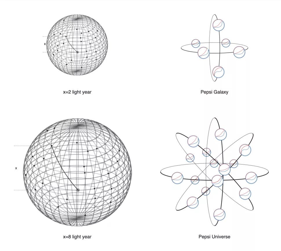
The 27-page document starts relatively normally. The designers talk about the golden ratio, and it’s cool to see how those circles take inspiration from Pepsi logos throughout history. But things then move in some, er, unexpected directions. Things get deep.
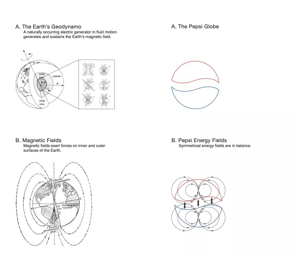
We’re told about the “Emotive forces shape the gestalt of the brand identity”. We are introduced to the Pepsi planet, the Pepsi galaxy and, of course, the Pepsi universe. We learn about the earth’s geodynamo – a naturally occurring electric generator in fluid motion which generates and sustains the earth’s magnetic field. And inspired the Pepsi logo, obviously. And perhaps the most preposterous claim in the entire document is that the Pepsi logo is based on the Mona Lisa.
Right (Image credit: Arnell Group)
Indeed, it’s one of the most infamous documents in the world of graphic design, and it’s just as outrageous today as in 2009. Lots of logos have fascinating histories, from the story of the Apple logo’s missing bite to Mercedes Benz’s hybrid design. But there’s only logo out there that can claim to take inspiration from the exponential expansion of the universe on the basis of the positive and negative definite matrices and optimization theorem.
ENDS
—
This article first appeared https://www.creativebloq.com
Seeking to build and grow your brand using the force of consumer insight, strategic foresight, creative disruption and technology prowess? Talk to us at +971 50 6254340 or engage@groupisd.com or visit www.groupisd.com/story