
How Pantone Became The Definitive Language Of Color
A few minutes into the Wizard of Oz, Dorothy opens her eyes and surveys the Technicolor world around her. Dorothy follows the Yellow Brick Road, she arrives at the Emerald City, and she clicks her Ruby Red slippers. Those vivid hues are seared into your memory. And guess what? Pantone has names for all of them. If you wanted to explain the precise colors to anyone, anywhere around the world all you have to do is dial up Pantone 14-0957 (Spectera Yellow), Pantone 16-6339 (Vibrant Green), and Pantone 17-1664 (Poppy Red).
The Pantone of today started as a graphic standards system for professional designers in 1963 but has morphed into a global design force starting in the 2000s due in part to calculated marketing efforts and initiatives. It’s not just about the Pantone Matching System (PMS for short); it’s the Color of The Year, the Pantone Color Institute, Pantone hotels, Pantone cafes, Pantone mugs, Pantone iPhone keyboards, Pantone lipstick, and tie-ins to the movie industry. (Looking at you, Minion Yellow.)
The elaborate web of products represents the company’s strategic and unwavering quest to become the universal language of color—and a brand synonymous with good design. While Pantone does not disclose earnings reports, it was acquired by X-Rite, a manufacturer of color measurement tools, for $180 million in 2007.
Pantone
“The core business standards, the color institute, which is trend forecasting, color consulting, and licensing . . . we look at that as a virtuous circle of mutual support,” says Ron Potesky, senior vice president of Pantone. “I don’t think one would live as comfortably without the other.”
Pantone‘s brand aspirations of today aren’t the same as they were in 1964. Is the company’s push for mainstream visibility a good, or has it diluted a insider’s brand in an attempt at mainstream recognition?
It Started With A Universal Language
Back in the early 1960s, Pantone was a printing company in Carlstadt, New Jersey, with a specialty in color charts for the cosmetic, fashion, and medical industries. Lawrence Herbert joined the company in 1956 and noticed how difficult it was for designers, ad agencies, and printers to communicate—identifying exact colors from names alone is tough. For example, there are red-based purples and blue-based purples, warm and cool shades, lighter and darker tones. Mistakes happened, there were tons of inefficiencies due to reprints, and Herbert knew there had to be a better way to do things. He bought Pantone in 1962 and launched the first PMS guide in 1963 with 10 colors in an effort to reduce the number of variables happening in the printing process. Creating an objective, numeric language means that any printer anywhere in the world can accurately produce a color.
Picture a shelf of Coke bottles where every other label was a slightly different shade. Yes, they’re technically all “red” but they’re not the right red. This might make you think some bottles are less fresh than others; therefore the brand isn’t reliable. (You even might grab a Pepsi instead.) Real Coke bottles in New York are the same red as ones in London or Mexico City or Mumbai: Pantone 185. While Pantone doesn’t sell actual ink, it does specify how to mix the right proportions of CMYK to yield the color.
Pantone wasn’t the first color-standards language, but it’s undoubtedly the most well known. While competitors like RAL or the Munsell System may be unknown to the average, non-designer type, most people have likely encountered Pantone, due in part to Herbert’s strategy to blanket the world with his product and establish his matching system as the definitive international standard.

Ron Potesky, vice president of Pantone.
“At its inception, Pantone drove its fan book to U.S., Europe, and Asia at almost the same time,” Potesky says. “This is my personal hypothesis, and I think that was the genesis of an amazingly successful company because they pushed product out quickly.”
By the 1970s, Pantone sold over 100,000 chip books. Today, the company estimates the total
“At its inception, Pantone drove its fan book to U.S., Europe, and Asia at almost the same time,” Potesky says. “This is my personal hypothesis, and I think that was the genesis of an amazingly successful company because they pushed product out quickly.”
By the 1970s, Pantone sold over 100,000 chip books. Today, the company estimates the total number of printed books to be in the millions. Pantone has a firm grip on the graphics industry and is the most widely used color-matching standard in every country except Japan.
“Pantone is the industry standard,” Michele Outland, creative director of Gather Journal, says. “It’s something that I automatically go to when I need to choose a color. It prints really accurately.” Gather, which has earned six Society of Publication Designers gold medals as well as a James Beard award, put this to the test for its most recent issue, Spectrum, organized so that each chapter presents recipes for a complete meal themed around a specific color. Outland needed to find a background color for the text pages that would jibe with each of the five or more photographs in the chapter that unite the section.
“Each photograph is different. And we had to make sure the chapters felt cohesive, that the right pink that wasn’t too cold, too warm, or too strong,” Outland says. “They also needed to be subtle colors. On press, when you have a four-color break you need to make sure the balance is nice and doesn’t swing all over the place.” Outland went to her Pantone book and picked about eight different colors for each section before narrowing it down to just the right one.
Branching Out Into New Design Disciplines
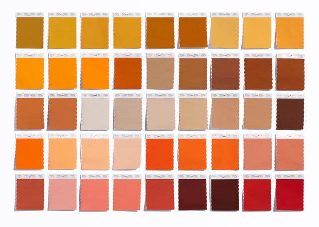
Graphics standards are certainly Pantone‘s bread and butter, counting for 70% of its revenue, but the company doesn’t rely on it to sustain business. It’s smartly expanded into other fields. Color is just as important to industrial, interior, and fashion designers; like the graphics industry, they all need a standard. One of the key differences with the fashion and home colors is that they have proper names.
“We saw the need for people to communicate color and the color palette had to be different because the needs were different,” says Laurie Pressman, vice president of the Pantone Color Institute. “If I say ‘chocolate,’ you have a vision. What does that vision conjure up for you? The name has to really fit with what the color looks like. Your mouth needs to water and emotionally connect. That’s the goal. That’s what color does—it’s all about associations.”

Laurie Pressman, vice president of the Pantone Color Institute.
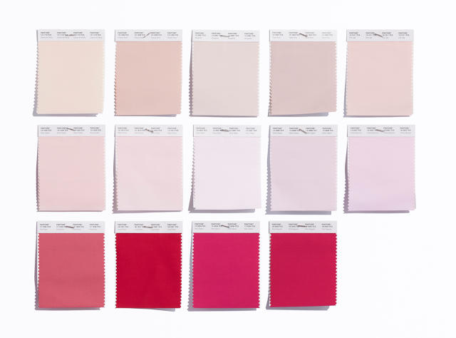
August saw Pantone beefing up its fashion and home palette with 210 new colors—bringing the total to 2,310—all based on gaps in their current guides, what their customers want, and where color trends are heading; for example, deeper blacks and more oranges, yellows, and pinks.
August saw Pantone beefing up its fashion and home palette with 210 new colors—bringing the total to 2,310—all based on gaps in their current guides, what their customers want, and where color trends are heading; for example, deeper blacks and more oranges, yellows, and pinks.
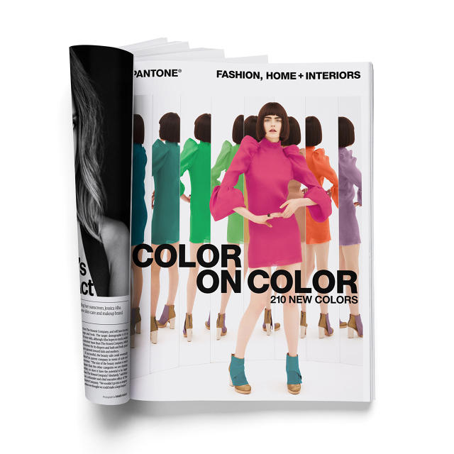
Pantone worked with the creative agency Base Design to come up with the campaign for the new fashion and home line. The two companies have collaborated on and off for nearly a decade on branding and advertising initiatives, one of the most major being the Plus series identity.
“When we first met Pantone, they really viewed themselves as a color authority, but they also want to be viewed as a partner for creativity, who is right there next to the designers as an inspiration,” Min Lew, the creative director and managing director of Base’s New York office, says. “In the past that had manifested in needing to express their own creativity to position themselves as a creative partner, meaning all the visuals were very expressive. From day one we said, you don’t have to do that. You’re not a fashion company, you are the color authority. You are recognized by pop culture when Uniqlo stacks its colorful T-shirts like a Pantone chip. So hold on to that, celebrate that, own that. Stay close to what Pantone is and its iconography.”
Pantone
Base’s approach with Pantone is to stay true to the brand’s DNA, but to add a little twist. “When we first branded Fashion and Home, we took the Pantone chip and just added little fabric cuts at the bottom. For the Pantone hotel, we took the Pantone chip and put a roof on it,” Geoff Cook, founding partner for Base New York, says. Similarly, the 2015 Color on Color campaign puts a vivid dress on a model who’s striking a fashion pose in front of mirrors. The reflections show a custom palette of colors that Pantone chose from the new line. It’s like a color chip in motion.
Color Of The Year Relates To Culture
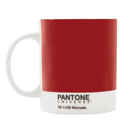
Every December, Pantone announces the color of the following year. For 2015 it was Marsala, a deep, liver-like maroon. Launched in partnership with their creative agency of record, Sub Rosa, the news builds buzz for the company outside of the design industry and establishes Pantone‘s relevance with current events. To conjure up color of the year, Pantone reads the cultural pulse and picks the color based on that.
“For us, it was coming up with a way to communicate what’s taking place in our language,” Pressman says. “It’s our way of chiming in. We speak a language of color. So we see things in color. We can explain things in color.”
Pantone launched color of the year in 2000. “It was an exciting time, but it was a scary time,” Pressman says. “You had Y2K, dot-coms bursting, you had all this information about people wanting more substance to their lives. It was about coming up with an answer to the excitement, an answer to the fear, and using color to do that.” Pantone chose Cerulean, a color with an optimistic feeling.
The Brand Expanded Into Services
Color can be a powerful design tool. Take the jewel-toned iMac G3s from 1998. The computers announced that Apple was full of energy, new ideas, and nothing like the greige of old computers. Use color right, and you could have a break-out product, assuming the rest of the functionality is there, too.
Pantone opened the Color Institute 1986 to help designers and brands harness the power of color. Its trend forecasting and books—which fetch about $800 each—and consulting services are a trusted resource for companies in retail, fashion, manufacturing, electronics, and more. Its experts travel the world and closely watch trends to predict the next big thing, which informs the Institute’s advice.
Pantone
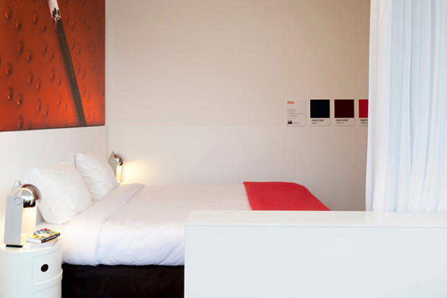
Cook got his start in the fashion industry at Donna Karan and says consulting could grow even more. “If you miss something, like a silhouette or a color—like this year orange is in and we chose to do red—it’s very very costly,” he says. “And where they can really push it—and they’re already doing it—is in color consulting, be it fashion, interiors, or otherwise. It’s a big, big opportunity for them.” It’s About Everyone Who Loves Color, Not Just Designers Around 15% of the brand’s business comes from the Pantone Universe of licensed products: the mugs, suitcases, coffee pots, hotels, etc. And that portion is growing. This is all part of the company’s strategy to appeal to a broad consumer market and not be limited to its core base.
Pantone
“We got very precise about identifying how big our community is,” Potesky says. “The concentric circle in the middle is about 7.7 million [professional designers]. Take that one step out to design-centric consumers or occasional professional designers and then you’re getting into the 10s of millions and that’s where we saw the first leg of ‘I want a Pantone mug.'”
“We got very precise about identifying how big our community is,” Potesky says. “The concentric circle in the middle is about 7.7 million [professional designers]. Take that one step out to design-centric consumers or occasional professional designers and then you’re getting into the 10s of millions and that’s where we saw the first leg of ‘I want a Pantone mug.'”
That color-keyed mug started it all—it first launched in 2005—but it’s lead to more licensed products and partnerships. (Cook theorizes that licensing came because the company knew it was on the brink of sale and wanted to pump up its valuation.) “The designer in New York, the ad agency in Chicago or San Francisco or Memphis of Jackson wants a Pantone mug because it says ‘I’m design centric,'” Potesky says. “The brand has expanded into the zeitgeist of design-oriented consumers as something that represents design excellence and of course it’s been the fastest growing part of our business.”
Pantone
“Each of Pantone‘s pillars—licensing, the Color Institute, core business, books—these areas of brand recognition exist at different points in someone’s lifecycle of design and they all support each other,” Potesky says.
Continues To Innovate
The “print is dead” challenge is not lost on Pantone and the company has developed products that speak to changes in technology, like adding RGB formulations and HTML codes for its colors in the 1990s. Instead of fearing or ignoring change, Pantone rolls with the times. “I think the brand keeps elevating because we’re in the right place at the right time,” Potesky says.
One of its most ambitious offerings is the MyPantone app, which debuted in 2009 and costs $10. It lets users take photos and extracts the colors in the image. “It allows for engagement and uses technology that’s current and in some ways disruptive,” Potesky says. “Having every Pantone color in your pocket is technically worth thousands of dollars, but for a few bucks you can buy the app. It’s not color perfect, but for a non-professional, it’s a great, fun tool to have.”

Pantone
THE COMPANY WAS EVEN CONTACTED BY A SPERM BANK TO LICENSE THE PRODUCT SO DONORS COULD BEEF UP PROFILES WITH INFO ON SKIN COLOR.
Part of innovating at the brand is making its products more usable. When Pantone first launched its textile matching system, the fabric swatches were flush mounted making it hard to take readings on a spectrometer. The company retooled the card in 2007 so the fabric was only attached at the top, allowing it to hang loose at the end, a direct result of Pantone listening to customer feedback.
Over-saturation can hinder a company—for example, Starbucks notoriously built too many franchises, diluted its brand, and lost nearly half of its stock value by 2008—but Pantone isn’t concerned. Their position is that the brand’s strength comes from being universally associated with color, and that’s something that surrounds us at all times. When a product doesn’t work—like the original fabric swatch cards—the company reevaluates and makes it better.
“I don’t think there’s any limit [to Pantone]because they are the world authority,” Cook says. “There are and were competitors in the space, but they are the major player. I don’t think there’s the possibility of over-saturation on their core business, because there continues to be new mediums like digital . . . If they can amp up that licensing division to really look at expanding into other areas that stand for color, I think there’s no end to how far they can go, because color is everywhere.”
Goes To Its Audience
Around 2009 the brand ramped up digital marketing. It was a pivotal year for the brand since, up until then, it still primarily thought of itself as a printing-related company. Its efforts center around social media and going to its audiences on Facebook, Instagram, Pinterest, Behance, and Twitter. “That’s kept us engaged and growing within a design community that’s skewing younger and younger,” Potesky says. The brand tracks social media engagement and values the fact that people use Pantone chips as part of their art projects and often posts those images from its community to its official account.
One of the trends Pantone has noticed—and really loves—is students decorating their graduation caps with Pantone chips. “It’s a huge recognition that even young designers, who we worry we might be losing because [of the perception that]Pantone is a stodgy old physical printer, think the brand is pretty cool,” Potesky says.
ONE OF THE TRENDS PANTONE HAS NOTICED—AND REALLY LOVES—IS STUDENTS DECORATING THEIR GRADUATION CAPS WITH PANTONE CHIPS.
Indeed, attracting younger audiences that will eventually use Pantone professionally is a key challenge, but the brand seems to be successfully navigating the terrain thanks to its calculated business model and success in becoming internationally synonymous with color in general.
History has shown that businesses who try to recalibrate and become mainstream haven’t always fared well. Take Michael Kors and Ralph Lauren, two fashion companies whose reputation and value has tanked because of over saturation. But here’s the difference with Pantone: becoming a household name furthers its ambition to become synonymous with color. Sure, Minion Yellow will come and go, and Sephora will undoubtedly discontinue some of its licensed lipsticks, but Pantone‘s credibility for designers—its base—isn’t married to those things; it’s tied to the color standards and that’s here to stay.
But buy a mug, too.
[All Photos (unless otherwise noted): Celine Grouard for Fast Company]