
IT’S LIKE THE FAST-FOOD JOINT VISITED BROOKLYN BUT STAYED AT A HOLIDAY INN EXPRESS.
Allow me to get a compliment out of the way.
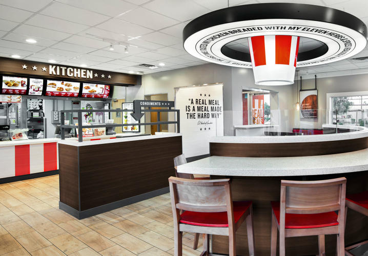
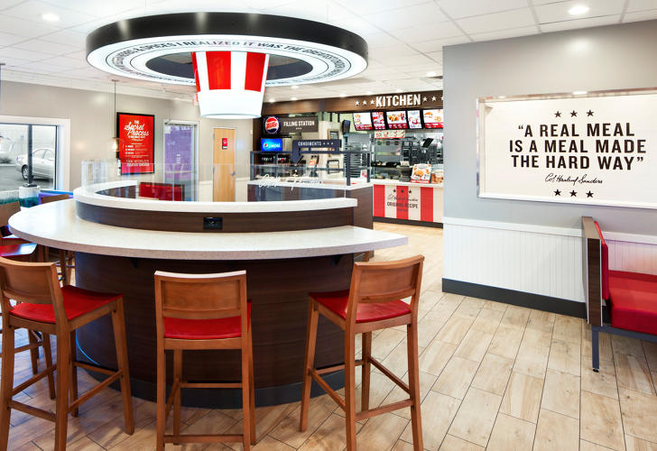
KFC is about to update 70% of the brand’s 4,500 retail stores by the end of 2017. And one part of its new store design is really great: KFC’s iconic red and white motif plays out in a giant ribbon hanging over the storefront. It’s eye-catching Americana. Attempt to look away; you physically can’t. It’s like the smell of KFC’s Original Recipe is burning into your corneas.
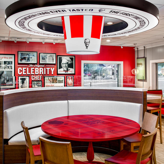
All the while, the Colonel’s smiling face beams at you like Oz. Stare long enough, and you’ll start to ask yourself if he’s extremely happy, or acutely sad. Look at the rest of his store, and you’ll have your answer.

KFC’s new store, created by global design and architecture firm FRCH Design Worldwide, is on one hand an absurd monument to millennial catchphrases, and on the other, far too conservative to appear momentous in any way.
Begging that you forget about the realities of processing 23 million chickens a year, it grounds itself in the farm-to-table movement. Messages like “a real meal is made the hard way” are plastered on the walls, while much of the store’s inspiration is born from Brooklyn’s rustic-chic restaurants. But the homestead aesthetic is executed in a way that borders on parody. What the press release calls a “rustic,” communal table (okay, booth) sits in the middle of the restaurant. Not only does it fail to evoke any feeling of farm life; it’s topped by a giant, bucket-o-chicken chandelier, a circusy lightbox that will only grow grosser over time as it slowly fills with flies.
On the wall, the Colonel himself is positioned as “the original celebrity chef” in what looks to be a weekend Pinterest project. And a chalkboard will be updated daily, by hand, with the “name of the farm that raised that day’s meal.” Monsanto?
But at least these mistakes are bold ones born from coked-up marketing sessions. A bucket chandelier? Don’t say some crushed art major didn’t at least try. The store’s less forgivable errors are born from simple, bad taste. It’s filled with the soulless finishes of a budget hotel chain (and in fact, that might not be a coincidence). KFC is the place where woodgrain tile meets dark wood trim meets baby poop wood chairs that will never hold up in the abusive environment of fast food mix.
Within this paradoxically cold fit and finish, in which wood somehow feels less human than clean white tile would, insult adds to injury as most seating is born from cafe tables. I’m sure these sounded “flexible” for “various party sizes” in a pitch meeting, but a cafe table overloaded with piles of fried chicken at a Missouri truck stop is not the same as a cafe table hosting an espresso and croissant on the streets of Paris. “The codes of Southern hospitality are an unwritten and subtle set of rules that highlight generosity of spirit and gratitude,” reads the press release. Just don’t sit at your tiny table too long; there are more customers coming in.
The more I look at this design, the more it seems to seethe with contempt for its own subject. I don’t get the impression that anyone who designed this KFC would dare share a meal in it. Who wants to break bread with their family in a hotel lobby under a giant glowing chicken bucket? The new KFC is boasting a 3% sales increase where it’s been installed so far, but it’s not enough to move the needle for its sinking business. This store isn’t good design. It’s a portrait of American fast food, born from elitists who would probably never touch the stuff.