
BEN BARRY ILLUMINATES HOW FACEBOOK GOT ITS BRAND ACT TOGETHER—SOMETHING OTHER COMPANIES COULD LEARN FROM.
Remember when Facebook was ugly? Truly ugly? Like the carpet of a dorm room after a weekend of Jell-O shots ugly? Then they started hiring designers, like Ben Barry, who in addition to serving as one of the company’s propaganda czars, helped guide the fledgling startup to the largely improved visual brand you know today.
In a post on his site, Barry outlines how, between 2012 and 2013, he led the shape-up of Facebook’s brand identity. It’s a problem that’s in no way exclusive to Facebook. All companies, big and small, have to consider how their brand evolves. A brand may be the face of a company, but most companies are in constant flux, offering new services and products all the time. In this regard, a visual brand has to both anchor the company’s identity and leave room for whatever comes next. Here are three lessons we gleaned from Barry’s post that might apply to your company:
1. Declare Your Center
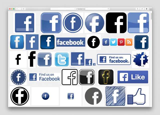
Facebook had so many different sub products (like Messenger and Camera), that its brand had become fragmented, with designers creating bespoke icons for everything. This wasn’t just lousy aesthetics or organization, though. It was a waste of designers’ time, Barry says. Without cohesive brand guidelines, they were forced to create a new logo for every new project that came their way. Barry solved that problem by working with Jorn van Dijk and Brandon Walkin to create the Facebook favicon—that now-ubiquitous Facebook “f”—and outlawing all other icons. The “f” was designed to work in a multitude of contexts—like rounded iOS apps and squared Android apps. It was at home in any context.
2. Know Where To Draw The Line On Your Brand. But Allow Flexibility
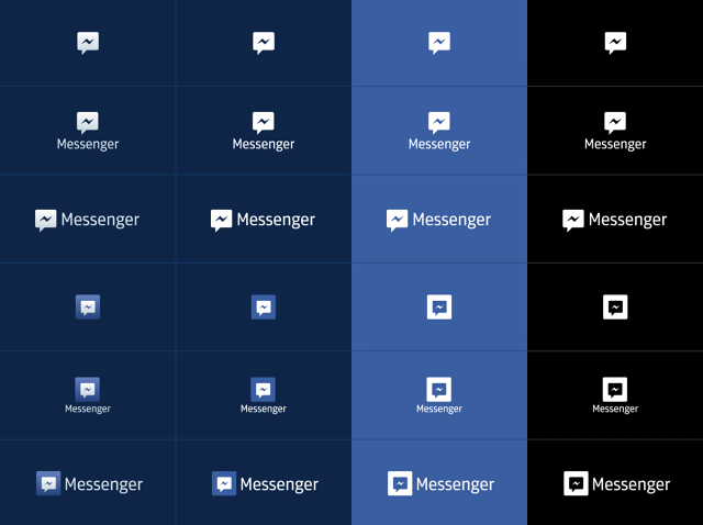
Curiously, one of Barry’s big rules was that Facebook not use the “f” for every context. He specifically didn’t want it re-used and re-configured for every sub-brand of Facebook. Just imagine if, at the bottom of your Facebook page, you had that same F used for Facebook Messenger, and for Facebook Calendar, and for Facebook Photos—it’d be absurd.
So he not only created new icons for every sub-brand, he offered examples of every way the icons could be mixed and matched in different contexts. Truth be told, he offered a lot of options—more options than many brand standards might allow—what I dare say were too many, even. As Barry puts it, “instead of trying to be very restrictive, I wanted to try to accommodate the past while moving us towards consistency.”
3. Rally Big Makeovers Through Low-Price Examples

Facebook didn’t always see the logic of his branding work. But he highlighted one project that helped him get more corporate buy-in. As a personal project, he tweaked the Facebook Camera app’s Klavika typeface, making it thinner and, as he puts it, “more humanist.” Internally, this relatively small project was a big hit. It bought him the capital (both political, and monetary) to bring in the Klavika typeface’s original designer to build a new version for Facebook. This typeface now lives at the heart of Facebook’s brand, and it informed all of the aforementioned improvements that Barry brought to the company. But to get it, he first had to create his own little preview of what it could be.
Of course, much of what Barry did is really just best branding practices. But sometimes, these fixes are more easily said than done. In that sense, Barry’s work is an apt archetype for fixing a brand in a company that underestimates its brand’s importance.
