
FROM 2006, THE LATE DESIGNER SHARES THE STORY BEHIND HIS INFAMOUS NEW YORK SUBWAY MAP AND WHY TYPOGRAPHIC ELEGANCE WILL PREVAIL.
Gary Hustwit: Can you talk about themap you designed for the New York subway system in the ’70s?
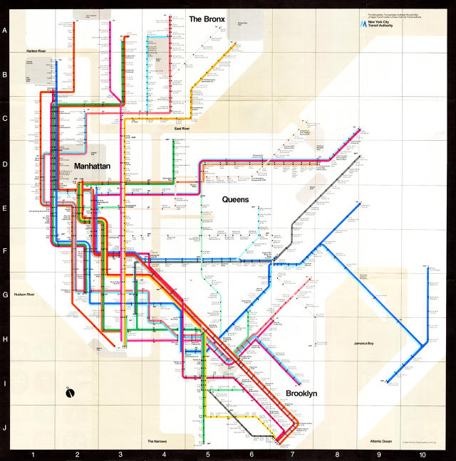
Such a controversial thing. It’s funny, but I realized the other day the mistake I made. So this is really the clearest kind of map I have ever seen in terms of information for the subway. It’s very simple. Every subway line on the map has a color, and in reality they already have one. And every station has a dot, you know. Every stop is a dot—no dot, no stop. It couldn’t be easier than that. There is nothing to fragment the legibility of this. Instead, if you look at today’s map, it’s a total disaster, with fragmentation all over the place. I can show it to you. And this is what we tried to avoid.
Now, 75 years ago, in London, they did the first map with a 90- and 45-degree grid like this one here, and it’s been working fine in London for all this time. But New York is a different kind of a city. And now I just realized that maybe, possibly, I made a mistake by indicating, even in a deformed way, the areas—Manhattan, Queens, the Bronx, et cetera. I probably should have done what they’ve done in London—not have any indication of the geography. It’s a completely blank, white background so that there is no suggestion of geography whatsoever.
One of the problems they had in New York is that the people, they couldn’t relate the geography with the station, with the lines, and they were confused by that. But it’s just because they shouldn’t. There were neighborhood maps in the subway stations, so really there’s no reason why this map had to be literal—it could be completely abstract. But I think that it would’ve been even better if I had pushed the envelope even further and not had anything, just the lines and the stops. Maybe that would have been better. Otherwise, it’s perfect—I think it’s the most beautiful spaghetti work ever done. It’s terrific. And it’s so clear, it’s unbelievable.
Now, the reality is that 50% of humanity is visually oriented, and 50% of humanity is verbally oriented. The visually oriented people have no problem reading any kind of map, and the verbal people, they can never read a map. But the verbal people have one great advantage over the visual people: they can be heard. And that’s why they changed this map! They started to complain, these people, opening their mouths, until this beautiful map was substituted with the junky one that you can see now by going into the subway station. It is a map that is so loaded with information, which is so difficult to retrieve, that it makes the whole point of the map useless. If I made a mistake, it was not making the geography abstract—making the water beige and the parks gray instead of green—it was just the fact that we indicated these things when we shouldn’t have. We should have just made it blank. It would have been better.
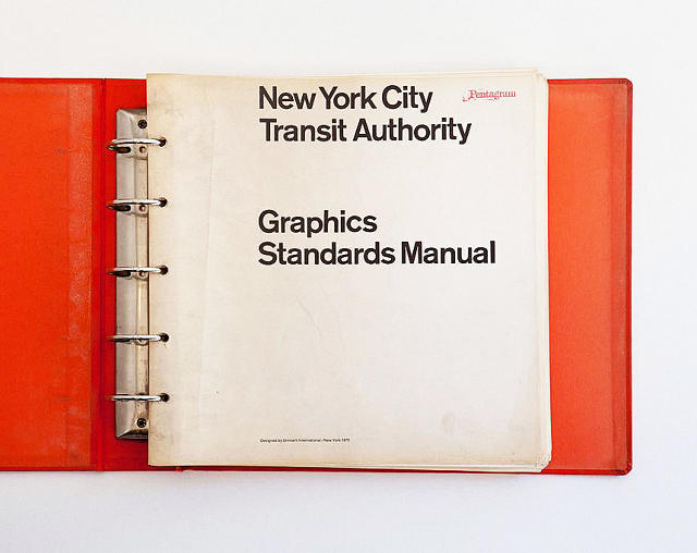
How did you get involved doing New York subway system signage [in addition to the map, Vignelli created a standards manual for the NYC subway]and what were the challenges?
Back in 1966 the Transit Authority realized that the signage they had was kind of poor for the job it had to do. So they went to MoMA, and asked them if they could suggest who would be the best designer to do that. And I had just arrived over here, so they told them, ‘Oh, you’re lucky because Vignelli can do these things very well, and he’s in New York.’ They got in touch with us. At that time we had a company that was called Unimark International. They came to Unimark, and we got the assignment.
They first asked us to study four stations, as a test, you know. Times Square was one of them; Grand Central, I think, was another one, and then another station in Queens, and then Broadway-Nassau, if I recall. We did the studies on these four stations, the traffic flow and all the analysis needed to determine where the points of decision were—because the whole thing in signage, the number one rule, is to give information at the point of decision. Never before and never after. When you drive, you find out most of the time that this rule is not followed—you’re getting information too early, so by the time you get to the fork, you miss it. Or it’s given too late, even after the fork, so you miss it. It’s very typical to make this kind of mistake in terms of signage. So to determine where the signs had to be was the first part of the study. Then, of course, it was, for us, obvious to use Helvetica. It was the perfect type, and legible. I must say that at the time it was not even around here, so we used Standard at the time of the study. Then eventually it turned into Helvetica.
The second thing was to standardize the supports for the signs. Prior to this the signs were made according to the amount of space that they had available in each instance—they were all done custom. In order to extend the signage throughout the whole system of 485 stations, we devised a system of supports and signs that were standardized. There were three categories of signage, and each one had its own appropriate size, which happened to be twice the size of the previous one. Everything had a relationship. This is not ‘one time like this, one time like that,’ you know?
The approach was consistent throughout, because consistency is extremely important in design. This is forgotten most of the time by people designing books, magazines, signs, packaging, whatever it is. The fewer number of typefaces you use, the better, and the fewer number of type sizes is even better. It all stems, naturally, from that good Swiss approach. The Swiss, maybe because they make watches, they are so precise.
Your subway signage manual is still in use, right?
I’s still in use. This was 1966, so it’s over 40 years. I mean, the background changed from white to black when they had the graffiti explosion, and somebody had the idea of doing the signs in black with white type. That’s okay; it’s fine. Not a big difference. I like the white background better, but that’s okay. I’m glad the signage was not changed. The map is an easy thing to change—it’s fast and inexpensive. The signage is a very expensive thing to change, so it’s going to be there for a long time.
What’s your opinion of the impact of the computer on typography?
In the ’60s, we were taking Standard and cutting the sides of the letters in order to get the type tighter. A good typographer always has sensitivity about the distance between letters. It makes a tremendous amount of difference. We think typography is black and white. Typography is really white, you know. It’s not even black, in a sense. It is the space between the blacks that really makes it. In a sense, it’s like music—it’s not the notes; it’s the space you put between the notes that makes the music. It’s very much the
same situation.
The spacing between letters is important, and the spacing between the lines is important, too. And what typographers do, what we do all the time, is continuously work with those two elements, kerning and leading. Now, in the old times we were all doing this with a blade and cutting type and cutting our fingers all the time. But eventually, thank God, the Apple computer came about. Apple made the right kind of computer for the communication field. IBM made the PC, and the PC was no good for communication. The PC was great for numbers, and they probably made studies that there were more people involved with numbers—banks, insurance companies, businesses of all kinds. But they made a tremendous mistake at the same time by not considering the size of the
communications world. That community is enormous, you know—newspapers, television, anything that is printed. It’s enormous. Advertising, design, you name it.
Anyhow, Apple, thank God, got the intuition of going after that market, and so in 1990 they came out with a computer that we designers could use. Now, let’s face it: the computer is a great thing, but it’s just a tool, just like a pencil is a tool. The computer has much more memory, the pencil has no memory whatsoever, and I have even less. But it is a fantastic tool which allowed the best typography ever done in the history of typography, because you can do the kerning perfectly for the situation. You can do the leading perfectly for whatever you’re encountering. Not only that, but you see it right away; you can print it right away. It brings immediacy to your thoughts, and that is something that never happened before in the history of mankind.
It allows you to do the best typography ever, but it also allows you to do the worst ever. So we have seen, particularly at the beginning when the computer came about, people taking type and doing all kinds of things. Everybody became a designer. They were taking type and squeezing it in, stretching it. It was unbelievable what they were doing. All of a sudden we were facing the greatest amount of vulgarity, or what I call visual pollution, that had ever been done before. But at the same time, we also had some of the best work ever done. Of course, the best work you never see, but vulgarity is very ubiquitous, so it’s everywhere.
This is another incentive for us. It gives us another reason to fight. The life of a designer is a life of fight, to fight against the ugliness. Just like a doctor fights against disease. For us, visual disease is what we have all around, and what we try to do is to cure it somehow with design, by eliminating, as much as possible, the people who make it. Not physically, but at least limiting their possibility of polluting the world. It’s a mission. Is it arrogant? Perhaps. Is it pretension? Perhaps. But so is every other field. You find the same attitude in music; you find the same attitude in literature; you find it in any kind of art, and in architecture. There’s a continuous fight against ugliness, a continuous fight against noise instead of music. It doesn’t surprise me that a great tool like the computer can allow this explosion of visual pollution. But in good hands, it’s the best thing that ever came about.

What are your thoughts about people’s awareness of type? Do you think the average person in New York notices the differences, consciously or unconsciously?
One of the interesting questions is, do people really care about type? Do they care about typography? Do they know anything? They don’t know about Helvetica, Bodoni, and Garamond, and Cooper Black, or things like that, you know. It’s funny, but you’d be surprised how much people respond to typefaces, and even if they don’t know the names, they say, “I like something like that.” So they have some kind of desire to be satisfied by a certain kind of type rather than another. I was just watching the other day a funny mini-documentary, whatever they call them, on TV. And they were saying that ABC, the television channel, has done all kinds of programs over the last 25 years. They have done documentaries about everything that you can imagine, but they’ve never once done something on graphic design, which is unbelievable. Their logo was designed by Paul Rand, who was the greatest American graphic designer of the century, and nobody knows him!
Everybody knows about singers, they know about architects, they know about painters, they know about writers, they know about good doctors, but very few people know about graphic designers. So maybe graphic design doesn’t have the right kind of exposure. They know sometimes, maybe, about somebody doing posters; I think more people are aware, for instance, of Milton Glaser, because he’s a terrific designer, an artist, and he does fabulous posters. People were aware of Peter Max back 30 years ago. But generally speaking, there is very little awareness of graphic design and graphic designers. Even with clients. Do they care about type, what kind of typeface we use, and so on and so forth? Sometimes they do, sometimes they don’t, and maybe it’s better that way.
What’s the future of typography and graphic design?
It’s hard to say. I don’t think that there are going to be drastic changes until the printed word is no longer around—it has to be done with typefaces. And the sensibilities come and go; newer technology comes and goes; the computer brings the use of certain type that is more appropriate for the computer, et cetera. So there might be new technology that changes it.
There are people who think that the type should be expressive—they have a different point of view from mine. I don’t think type should be expressive at all. I can write the word ‘dog’ with any typeface, and it doesn’t have to look like a dog. But there are people who, when they write ‘dog’ think it should bark, you know? So there are all kinds of people, and therefore, there will always people who will find work designing funky type, and it could be that all of a sudden a funky typeface takes the world by storm, but I doubt it. I’m a strong believer in intellect and intelligence, and I’m a strong believer in intellectual elegance, so that, I think, will prevent vulgarity from really taking over the world more than it has already.
Some defenses need to be put up, and I think, actually, that the more culture spreads out and the more refined education becomes, the more refined the sensibility about type becomes, too. The more uneducated the person is who you talk to, the more he likes horrible typefaces.
Look at comics like The Hulk, things like that. It’s not even type. Look at anything which is elegant and refined; you find elegant and refined typefaces. The more culture is refined in the future—this might take a long time, but eventually education might prevail over ignorance—the more you’ll find good typography. I’m convinced of that.
This interview was condensed and edited with the author’s permission. For more of Vignelli’s interview and interviews with 70 other designers, buy Helvetica/Objectified/Urbanized: The Complete Interviews here.
[Top Photo: Courtesy of Gary Hustwit]