
More and more companies are competing to claim attention and influence by announcing their own official color of the year.
Twenty years ago, the Pantone Color Institute began a tradition that’s become ubiquitous across the paint industry: The Color of the Year. Equal parts trend forecasting and marketing craze, the Color of the Year program elevates a single color to demigod status. The company’s first selection, in 1999, was Cerulean. “Lifestyle movements suggest that consumers will be seeking inner peace and spiritual fulfillment in the new millennium,” the company announced.
Over the past two decades, many other color and paint companies have followed Pantone’s lead, naming a Color of the Year they feel encapsulates not only where the world is, but where it’s going. “We view the Pantone Color of the Year as an educational program that is intended to highlight the relationship between what is taking place in our global culture and how it manifests itself in color,” says Laurie Pressman, VP of the Pantone Color Institute.”With color and context so intertwined, there really are reasons why a color family or individual color comes into prominence when it does, and for the most part the popularity of a color is symbolic of the age we are living in.”
Announcing a color of the year also helps these brands speak directly to consumers, whether they’re people buying paint at Home Depot or designers looking for trend forecasting as they develop new products. The latter is more important than you might imagine, in the $24 billion paint market. In a New York Times piece on color’s significance in culture, Bruce Falconer offers a glimpse at the influence of Pantone’s research. “Color forecasters like Shah and his team at Pantone have tremendous influence over the visible elements of the global economy—the parts of it that are designed, manufactured, and purchased—though their profession itself is all but invisible,” he writes.
Most companies begin researching a couple years in advance, visiting trade shows to see what’s happening in retail and following the lifestyle trends of trusted influencers on social media. But they also depend on intuition and experience to make their forecasts. Pressman says the Pantone team stays “on the lookout for the color we see as ascending, and seems to be building in importance across all areas of design—the one color that is really pushing through, and the single shade we think can communicate the color message that best reflects what is taking place in our culture at this moment in time.” Ideas can emerge from expected places, like fashion and design, but also sources more far afield. “Areas we look to can include the entertainment industry and films in production, traveling art collections and new artists, fashion, all areas of design, popular travel destinations, as well as new lifestyles, play styles, and socio-economic conditions. Influences may also stem from new technologies, materials, textures, and effects that impact color, relevant social media platforms and even upcoming sporting events that capture worldwide attention.”
While Pantone won’t announce its hotly anticipated hue until later this year, paint companies like Behr, Benjamin Moore, and Sherwin Williams have already released their picks for the new decade, along with what they believe those colors reflect about the year ahead. And, perhaps unsurprisingly, they’re all different.
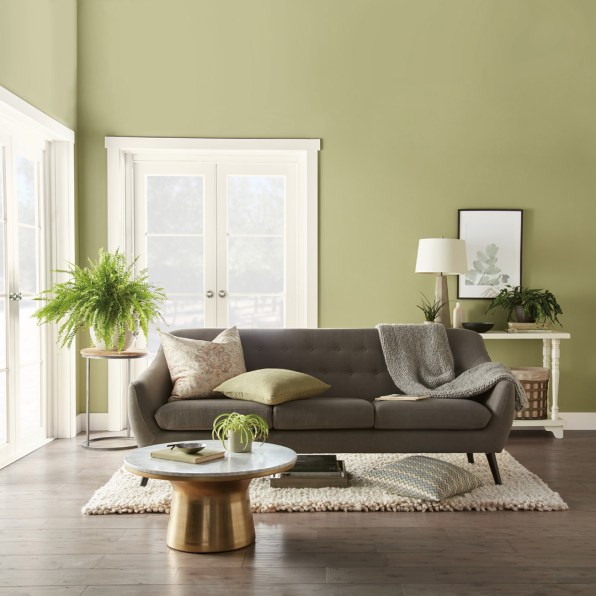
Behr’s selection, a soft and grassy shade of green called “Back to Nature,” is the company’s third official color of the year and was chosen for its association with the great outdoors. Emphasizing the preciousness—and precariousness—of the natural world, it taps into growing concerns about plastic and other sustainability issues, the rise of biophilic design, and the booming indoor plant industry. “It goes back to lifestyle and how we’re living, there’s kind of a social movement to get out there and engage with nature,” Erika Woelfel, Behr VP of Color and Creative Services, says. “We know that people are very aware that getting outside is really important.”
All kinds of green are trending at the moment, especially in the world of home decor. “There’s a huge trend of people bringing plants into their home, which cleans the air and has all these health benefits; that’s why we’re seeing jungle greens and desert greens,” Woelfel explains. ” ‘Back to Nature’ is a sweet spot: it’s not too dark and not too light, it’s fashion-forward in these sense that it’s not too dated, [and it can]create a sanctuary in your home. It really has that indoor, outdoor appeal.”
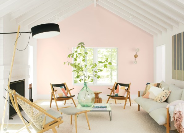
Benjamin Moore’s 2020 selection, a soft, rosy pink called “First Light,” was selected, in part, because the company’s forecasters kept seeing it pop up in their travels.
“One of our team members saw it during Dutch Design Week,” says Andrea Magno, Benjamin Moore’s director of Color Marketing & Development. “There was a sophistication, it wasn’t overly sweet but the soft, blush color has been around for a number of years and we’ve been tracking it.”
In this sense, paint companies become curators; they seek out popular design aesthetics and distill them for consumers. Annual colors of the year not only provide inspiration for interiors, but also help guide homeowners toward living amongst a fresh palette of colors that may not be in their immediate field of view.
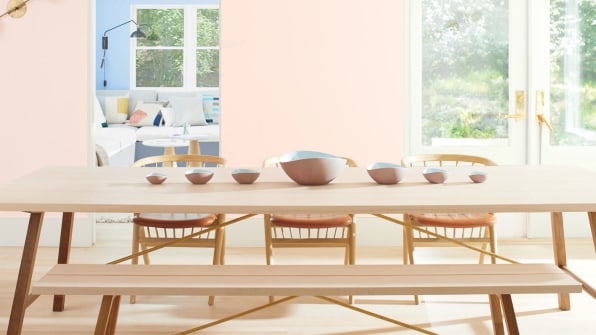
“[First Light] is one of those colors that can live in a lot of different rooms, you can see how it becomes this really beautiful backdrop. It can almost serve as a neutral and give a warm glow to the room,” Magno says. “We thought it was really indicative of fresh thinking. We’re on the dawn of a new decade and we thought: ‘How do we want to embody that?’” While this rosy shade is certainly fresh, it’s not so dissimilar from the ubiquitous whisper of Millennial Pink, a color that has been exhausted to the point of polite mockery. Perhaps First Light’s slightly softer tone will situate it more as a delicate accent color, rather than its dominant and highly branded millennial cousin.
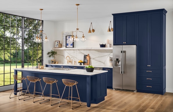
Meanwhile, Sherwin Williams’s 2020 Color of the Year conjures no feelings of a verdant meadow or a fresh morning. The company’s pick, “Naval,” is a rich and brooding navy shade—and is a refreshing departure from the more cheery colors that have dominated the past couple years.
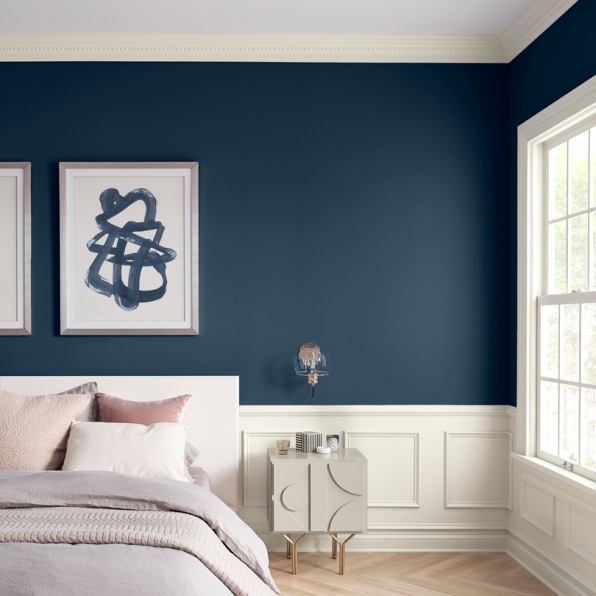
“We knew navy was going to be a big color, [because]we could see black and white and monochromatic was a big trend,” says Sue Wadden, director of color marketing at Sherwin-Williams. “Our 2020 forecast is about taking wellness into the next decade, and [navy]was a great design trend. A really calming, timeless hue that’s always going to look good.”
Naval is Sherwin Williams’s tenth color of the year, and was selected in February during the company’s annual forecast meeting. “We have 12 team members and we all get together and hash this out,” Wadden says. “It’s like a three-day process, and by the end of it one color usually rises to the top.”
While companies are concerned with being on trend, they also need to make selections that are distinct from the colors they celebrated the year prior, which may help explain why these companies don’t often land on similar colors. Ultimately, it comes down to the instincts of each particular team of palette creators. In the case of Wadden and her team at Sherwin-Williams, a deep, bold hue felt right.
These teams of designers and marketers are tasked not only with responding to culture, but attempting to participate in it, too.
Take “Living Coral,” Pantone’s 2019 pick. The company wanted to select a color reflecting critical global trends, and chose a hue that was meant to carry symbolic meaning. “Just as coral reefs provide sustenance and shelter to sea life, vibrant yet mellow Living Coral embraces us with warmth and nourishment to provide comfort and buoyancy in our continually shifting environment,” Pressman says. Some felt the color didn’t place enough emphasis on the environmental issue of coral bleaching, even offering alternatives like a grey “Dead Coral” or all-white “Bleached Coral.”
Color touches nearly every object and industry; far from superficial, it plays an essential role in shaping the world and how we see it. But the public’s interest in color forecasting may also reflect confusion about an ambiguous future, whether in terms of climate change or polarizing politics. A single color that serves to explain the coming year seems like a balm for the confusion.
“There’s been this neutral mania, so it’s exciting to see things ripening . . . I think people are excited to bring color back [into the home], I like the arc we’re on,” Wadden says. “We’re here to inspire, we know what color can do and how it affects mood . . . that’s my goal moving into 2020, is to get people excited about color.”
–
This article first appeared in www.fastcompany.com
Seeking to build and grow your brand using the force of consumer insight, strategic foresight, creative disruption and technology prowess? Talk to us at +9714 3867728 or mail: info@groupisd.com or visit www.groupisd.com