
Netflix’s New Brand
When Netflix’s internal design team quietly unveiled a new, flat logo last year, at least one critic made a stink. What was Netflix if not a shout of extrusions and redness?
Now, we know.
The creative studio Gretel has published the fruits of a year-long collaboration with Netflix, building the company a whole new brand identity capable of operating on a global scale.
“The big challenge was unifying everything. They’re really successful, obviously, but the brand itself was a little fractured because they were working with partners and agencies around the word,” explains Gretel Creative Director Ryan Moore. “They had the logo and some basic text guidelines, but due to the sheer growth, they couldn’t oversee digital, print, trailers, and social media. What they needed was an idea to stitch everything together—a conceptual approach—but certainly a visual system all these agencies could look at and adapt to any format they needed to.”
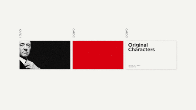
Any random graphic designer who lands a Netflix job needs to be able to easily create on-brand visuals, and so what the Gretel team developed was a simple, flexible card system called “the Stack.” In any brand manifestation of Netflix, there are three core cards that you’ll see: The first is a photograph or video of a “character” (like Kevin Spacey’s Frank Underwood), the second is a splash of color (generally white or red), and the third is text of some sort (like a movie title or tagline). In aggregate, the three stacks become the Netflix brand.
It works. Not only is the stack equally recognizable at various scales and mediums—whether it appears on a banner ad or the side of a building, or whether it happens to be still or in motion—the stack has another useful feature. Its three layers don’t need to exist as equals. Their intensity is tweakable depending on an ad’s context.
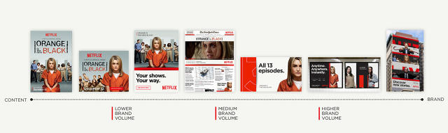
“We called it brand volume. [The brand] could be turned up or down,” Moore says. Because in some contexts, the characters themselves might actually speak fine for the entire Netflix brand, while in others, all of Netflix’s original content might be unrecognizable. “For a billboard of Orange Is the New Black in the U.S., it might need a subtle hint of Netflix branding. But if it’s launching in Germany, you might need more volume to stamp wit with Netflix look and feel.”
However, the longer you look at the stack in motion, the more it feels like it was built, not just for ad-based branding, but to function as user interface on iPhones and Xboxes. Its cards—that are treated with real weight and shadow—have hints of Google’s recent approach to UX at the core.
That feel is by design, as Gretel built the language to scale into Netflix’s interactive products, too. “I know the lack of UI is a trend. You’re seeing it on the Xbox—gestures and voice command—and my iPhone can ask Siri anything. Part of our design challenge wasn’t about stripping away the UI experience, but enhancing something about Netflix’s core position as a service, as service that can rally accurately guess what I might like and serve up content from a seemingly endless catalog.”
In this regard, Gretel doesn’t make any firm distinction between branding a company and branding a company’s product or even UX. It’s all a continuum.
“This is something we talk about a lot internally, the idea of behavior,” says Gretel Executive Creative Director Greg Hahn. “Really it translates across all parts of branding: Language behavior. Type behavior. Motion behavior. We’re trying to create things that can speak and have signature behaviors across any medium.”
“The hope is that [Netflix] will begin trickling this into the UI at some point, but we don’t know at this point to what extent,” he adds later. “It’s a much longer lead time for UI implementation than for the rest of marketing.”
[via Brand New]
[All Images: via Gretel]
