
Skincare Brand Aesop Reveals Its 4 Secrets For Standout Retail Design
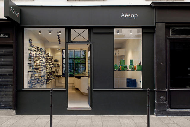
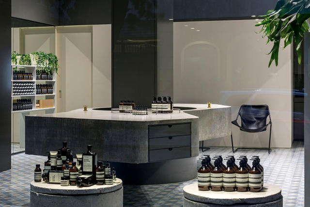
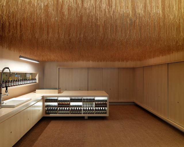
Each one of Aesop‘s meticulously designed shops is purpose-built to stop you in your tracks, but how the Australian skincare brand accomplishes that is different every time. Hundreds of Paris Review quarterlies are suspended from the ceiling of its storefront in Chelsea; shoppers traipse over emerald-green tile in the Covent Garden, London, location and the Saint-Honoré outpost in Paris boasts shelves that disappear into the jigsaw of wood planks cladding the walls.
While some companies—ahem, Amazon—have tried to do their best to ensure shoppers never have to set foot into a physical store, Aesop takes a different path, fully embracing retail design.
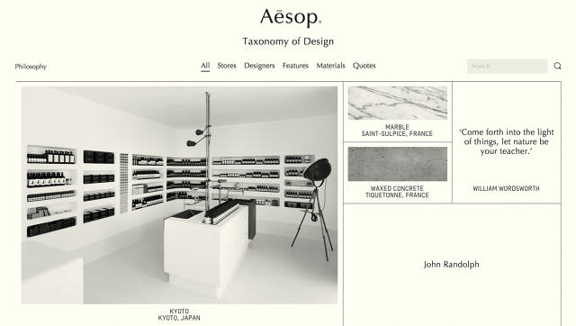
Masterminded by a roster of highly regarded architects—Snøhetta, Ilse Crawford, and Paulo Mendes da Rocha, to name a few—no two Aesop stores are the same. But they do all share a common design language. After numerous customers kept asking Aesop to publish a book chronicling the wildly creative shops and the details that compose each one, the brand decided to build a website instead called the Taxonomy of Design.
Want to know precisely what materials comprise your favorite shop? Or which design classics furnished the space? Head to the website. It’s a toolkit that’ll give readers a look into the design intent behind each space and how it was executed. (It’ll surely be helpful for people renovating their bathrooms.)
While the stores don’t hew to a singular design vision, they do share a similar philosophical approach. Co.Design spoke with Marsha Meredith, Aesop‘s creative director, about how the brand forges drop-dead gorgeous retail spaces.
“The core thing that we try to do is create a little respite from the clutter of everyday live,” Meredith says. “The shops offer a moment of sanctuary and calm—you can appreciate the sense that good design offers.”
Respect what designers bring to the table
Aesop works organically when selecting designers and architects for a new location. “The conversation starts in a very gentle, fluid way,” Meredith says. “It’ll begin with a conversation, with a dinner, with a glass of wine—really trying to understand their personality.”
In the beginning of the design process for any given shop, Aesop might reference a film, artist, or piece of furniture to serve as the baseline for the project. Then Aesop lets the designers for the project run with it. “We want to respect the architects and what they bring to us,” Meredith says. “All of the shops feel Aesop, they feel us and it’s from respect for each other. We have developed a language over time and it’s respected by the people who work with us.”
Speak to the local character and community
Aesop tends to work with the context of a shop’s surroundings instead of imposing a pre-determined concept. “When we sat down and thought about the core component that would feed back into our philosophy, we thought in each community we should work with the fabric of the street,” Meredith says. “When we boil it down to specific components, it was materials, architects, features, and aesthetics based on the location.”
Design for fluidity and change
As Aesop‘s brand grows and evolves, it tries to reflect that in the retail design. For example, the Nolita storefront is made from nearly half a million sheets of newspaper that will patina over time. Because the brand isn’t beholden to specific guidelines, it allows itself a wide level of creative freedom.
Reject sameness—but keep a tight edit
“Such a great thought from the beginning was to reject sameness,” Meredith says. “From the first store in St. Kilde, even though we didn’t have a rule book, [founder Dennis Paphitis]instinctively rejected sameness.”
On the flip side, maintaining a strong brand identity in spite of the constant push for new retail spaces is key. They’re like different manifestations of one personality. “The discipline is really in the stripping back and keeping it as minimal as possible,” Meredith says. “It’s a challenging thing to do. Anyone creating a painting or a piece of music wants to add a little more. The beauty with all the new stores is that they’re simply elegant, be it modern or vintage.”
[All Images: Aesop/Taxonomy of Design]