
Hundreds of years ago, Edo period sign designers were using the same principles as today’s brands.
![Mokei kanban for a wig shop from the 19th century [Photo: courtesy Mingei International]](https://assets.fastcompany.com/image/upload/w_707,h_397,c_fit,f_auto,q_auto:best,fl_lossy/wp-cms/uploads/sites/4/2017/09/8-the-secret-genius-of-17th-century-japanese-branding.jpg)
![Kanban for seal shop from the 20th century [Photo: courtesy Mingei International]](https://assets.fastcompany.com/image/upload/w_394,h_221,c_fit,f_auto,q_auto:best,fl_lossy/wp-cms/uploads/sites/4/2017/09/6-the-secret-genius-of-17th-century-japanese-branding.jpg)
![Kanban for soy sauce shop from the 19th century [Photo: courtesy Mingei International]](https://assets.fastcompany.com/image/upload/w_394,h_221,c_fit,f_auto,q_auto:best,fl_lossy/wp-cms/uploads/sites/4/2017/09/9-the-secret-genius-of-17th-century-japanese-branding.jpg)
![Mokei kanban for thread shop from the 19th century. [Photo: courtesy Mingei International]](https://assets.fastcompany.com/image/upload/w_394,h_221,c_fit,f_auto,q_auto:best,fl_lossy/wp-cms/uploads/sites/4/2017/09/11-the-secret-genius-of-17th-century-japanese-branding-1024x742.jpg)
![Shitta kanban for blade shop from the
late 19th century
[Photo: courtesy Mingei International]](https://assets.fastcompany.com/image/upload/w_394,h_221,c_fit,f_auto,q_auto:best,fl_lossy/wp-cms/uploads/sites/4/2017/09/12-the-secret-genius-of-17th-century-japanese-branding.jpg)
![Shitta kanban for blade shop from the
late 19th century [Photo: courtesy Mingei International]](https://assets.fastcompany.com/image/upload/w_394,h_221,c_fit,f_auto,q_auto:best,fl_lossy/wp-cms/uploads/sites/4/2017/09/13-the-secret-genius-of-17th-century-japanese-branding-1024x682.jpg)
![[Photo: courtesy Mingei International]](https://assets.fastcompany.com/image/upload/w_394,h_221,c_fit,f_auto,q_auto:best,fl_lossy/wp-cms/uploads/sites/4/2017/09/14-the-secret-genius-of-17th-century-japanese-branding.jpg)
![Shitta kanban for greengrocer from the late 19th century
[Photo: courtesy Mingei International]](https://assets.fastcompany.com/image/upload/w_394,h_221,c_fit,f_auto,q_auto:best,fl_lossy/wp-cms/uploads/sites/4/2017/09/16-the-secret-genius-of-17th-century-japanese-branding.jpg)
![Kattamen kanban for sake brewer, from the 19th century
[Photo: courtesy Mingei International]](https://assets.fastcompany.com/image/upload/w_394,h_221,c_fit,f_auto,q_auto:best,fl_lossy/wp-cms/uploads/sites/4/2017/09/17-the-secret-genius-of-17th-century-japanese-branding-1024x658.jpg)
![Mokei kanban for rosary shop from the 19th century [Photo: courtesy Mingei International]](https://assets.fastcompany.com/image/upload/w_394,h_221,c_fit,f_auto,q_auto:best,fl_lossy/wp-cms/uploads/sites/4/2017/09/18-the-secret-genius-of-17th-century-japanese-branding.jpg)
![Mokei kanban for rosary shop from the 19th century [Photo: courtesy Mingei International]](https://assets.fastcompany.com/image/upload/w_394,h_221,c_fit,f_auto,q_auto:best,fl_lossy/wp-cms/uploads/sites/4/2017/09/19-the-secret-genius-of-17th-century-japanese-branding.jpg)
![Mokei kanban for stationery shop from the early 20th century
[Photo: courtesy Mingei International]](https://assets.fastcompany.com/image/upload/w_394,h_221,c_fit,f_auto,q_auto:best,fl_lossy/wp-cms/uploads/sites/4/2017/09/20-the-secret-genius-of-17th-century-japanese-branding.jpg)
![Sage kanban for pipe shop from the late 19th century
[Photo: courtesy Mingei International]](https://assets.fastcompany.com/image/upload/w_394,h_221,c_fit,f_auto,q_auto:best,fl_lossy/wp-cms/uploads/sites/4/2017/09/21-the-secret-genius-of-17th-century-japanese-branding.jpg)
![Moji kanban for preserved seaweed paste shop from the early 20th century[Photo: courtesy Mingei International]](https://assets.fastcompany.com/image/upload/w_394,h_221,c_fit,f_auto,q_auto:best,fl_lossy/wp-cms/uploads/sites/4/2017/09/22-the-secret-genius-of-17th-century-japanese-branding-1024x682.jpg)
![Tsuitate kanban for pharmacy selling Tsurigan laxative
from the late 19th century [Photo: courtesy Mingei International]](https://assets.fastcompany.com/image/upload/w_394,h_221,c_fit,f_auto,q_auto:best,fl_lossy/wp-cms/uploads/sites/4/2017/09/23-the-secret-genius-of-17th-century-japanese-branding.jpg)
When you think of signage in Japan, the country’s famously vibrant neon placards probably come to mind. But Japanese signage of the 16th and 17th centuries was very different, relying purely on iconography to grab the eye. Nonetheless, it’s easy to see the outlines of today’s branding already emerging more than 400 years ago.
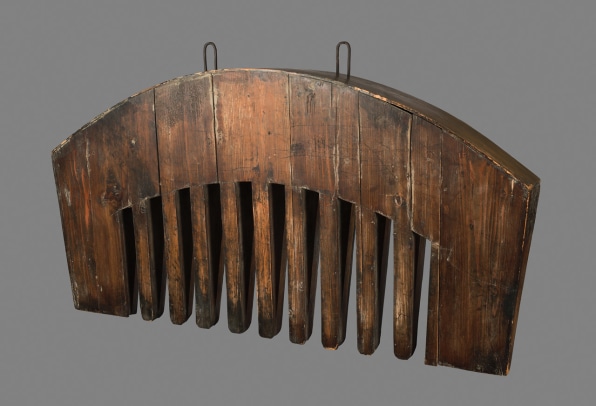
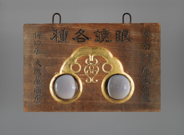
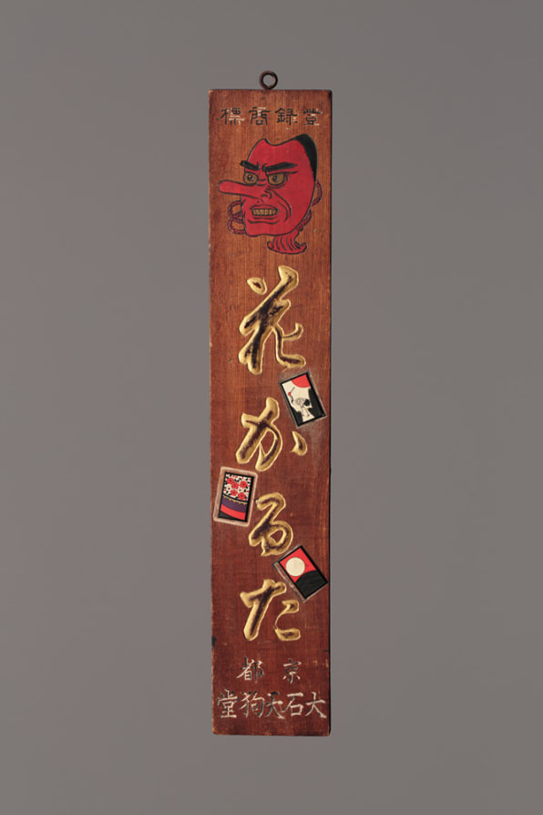
These centuries-old handmade signs from the Edo period, called kanban, are the subject of a current exhibition at Mingei International Museum in San Diego. Often made of wood, lacquer, and gold leaf, the signs usually took the form of the product or service they were advertising. For instance, a barber shop would have a giant, four-foot-long comb hanging above its door, while a soy sauce maker’s storefront would feature a sign of few words that spoke volumes through its iconic bottle shape. The exhibition features about 60 of these signs, many of which have never been shown before. They advertise shops selling pipes, wigs, and medicine.The design was all in the name of attracting customers–something the branding of today still aspires to. “People of that era were dealing with: How do you capture the eye, how do you differentiate yourself from your competitor?” says Alan Scott Pate, the exhibition’s curator. “All the things Coca-Cola is dealing with today, Edo merchants were dealing with through kanban. They wanted to project an aura of success and reliability and often that came down to the quality of the kanban.”
The kanban also had a larger place in popular culture–like brands do today. They’d show up in popular kabuki theatrical performances, where actors would wave them around during the show–the Edo version of product placement. Generally, Pate explains, the more detailed and beautiful the sign was, the more it projected success and wealth–a concept not dissimilar to the way corporations brand their stores and offices today. “Behind every kanban was one goal–to sell something. It was crass commercialism,” Pate says. “How do you tickle the fancy of the consumer? It’s just more crazy today and we have more avenues open to us.”
Many of the most intricate, giant kanban were basically 17th century billboards for the pharmaceutical industry. One five-foot sign, made of gold leaf and lacquer, was in the shape of a coin with a profile of a person inside it. It advertised brain medicine, apparently supposed to help the modern man adapt to the strain of modern life. Another medical sign is a three-foot-tall club-wielding red demon. While that symbolism might not make sense to a contemporary audience, red at the time was seen as a potent, talismanic color that diseases were attracted to. The theory went that illnesses would go into that object instead of the person.Others are much more straightforward, their message remaining clear to viewers today. One particularly over-the-top kanban is a four-foot-long, double sided wooden clog, with a real leather thong–a giant traditional Japanese shoe hanging in midair to tempt passersby. “You can’t not notice that thing,” Pate says.
It is these signs, simple in form but bold in size, that contains a design principle for the ages: “It creates a minimalism, but an incredible effectiveness. Everyone was so familiar with it, but it was a clear identifier,” Pate says. “That ability to pierce through nonsense and communicate in a laser-like way, I think that’s majestic. They had it reduced to the ultimate outline.”
–
This article first appeared in www.fastcodesign.com
Seeking to build and grow your brand using the force of consumer insight, strategic foresight, creative disruption and technology prowess? Talk to us at +9714 3867728 or mail: info@groupisd.com or visit www.groupisd.com
