“People told us they had tears in their eyes because they could finally see what was happening.”
“Like every proper nerd, I love trains,” says Moritz Stefaner, one of the demigods of contemporary data visualization.

A year ago, Stefaner was offered a job by Christian Au, a manager at Deutche Bahn Fernverkehr, the long-distance arm of the massive state-run company that operates Germany’s train system. Au had a tricky problem: Ridership on Germany’s intra-city trains has been growing quickly at 5% a year, thanks to improvements in the trains themselves and rapidly increasing gas prices. But that growth made it hard to anticipate and react during demand spikes. Managers could see the data for a single train, but it was almost impossible to get a sense of what the system was doing–and how adjustments such as surge pricing and train capacity should be meted out across the country. “You had to know exactly what you were looking for–what train at what time,” explains Stefaner. “You didn’t have the change to discover things you weren’t aware of.”Au, Stefaner, and their team–developers from Studio NAND and UX design from Christian Laesser–spent a year rapidly prototyping a tool alongside train managers. What they’ve produced, a piece of software called Peak Spotting, is novel in the field of cutting-edge data visualization. Not only is it pretty to look at, but it’s affecting change in ways that are easy to measure, but also profound. The visualizations are quietly helping transform the long-distance operations of Deutsche Bahn–which, with $45 billion in revenues across all its trains, calls itself the second-largest transport company in the world.
THE PROBLEM
Let’s nerd out on trains for a second. When you buy a ticket on most intra-city train systems around the world, you’re buying a seat reservation. Once there are no more seats on the train, there are no more tickets to buy. Deutsche Bahn doesn’t work like that. Instead, it’s operated like a subway: Anyone can buy a ticket and hop on. But if a train gets too full, it can’t keep operating due to safety concerns. It has to stop until people get off. As a result, the impossible can sometimes happen: Some trains in Germany don’t run on time.
Train managers have a few levers to help prevent that from happening: They can adjust prices to entice people to travel at different times. They can warn passengers of potential bottlenecks and advise alternate routes. And they can make sure that a train has enough cars to meet demand. The trick is doing that proactively, which requires a deep understanding of demand at every level, from the system to the day to the time to the segment.
That kind of holistic but also nuanced view is exactly what Deutsche Bahn lacked. Usually, the experience and intelligence of its managers were enough to compensate. But even they often had to rely on incomplete information, because the data was so hard to access or required a half dozen steps and a small team to analyze. That’s where the data visualization came in.

FINDING A NEEDLE IN A HAYSTACK
Stefaner and the team developing the data visualization worked with train managers to constantly prototype what sorts of charts they might need, gathering input about what actually helped them make decisions and what they really might use not just once in awhile, but constantly, throughout the day. The focus was on creating charts that led directly to a decision that a human might have to make.
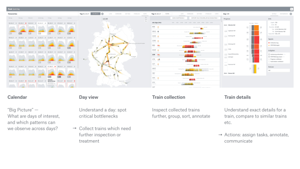
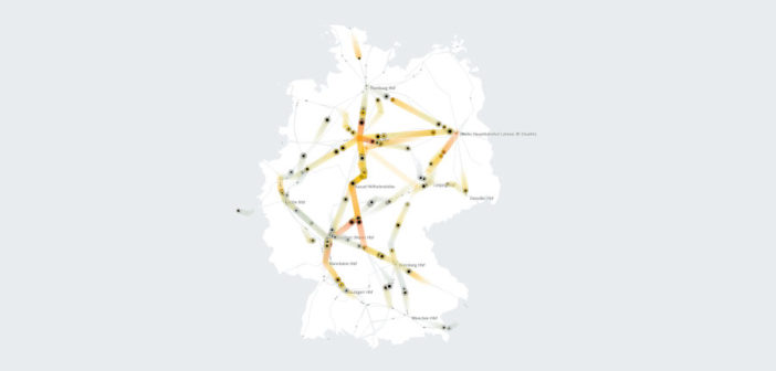
Though the Peak Spotting software looks a bit daunting to a layman, it’s actually quite simple in its overall organization. The visualization is a drill down that takes you from a system-wide view across many days. The initial “fingerprint” charts show a thumbnail view of what demand looks like on a given day; a user can see rows and rows of these at the same time, all lined up, so that she might, for example, see that three Fridays from now will see a spike in demand. That helps regional managers point their staff toward the days that need further study. By clicking into those days, the user can see a more detailed view of a single day, such as a comparison of trains traveling similar routes. From there, an operations staffer can see demand on individual legs of a route–and thus see exactly what train routes need pricing changes or customer notifications.
But one of the most powerful features of the interface is the ability for machine-learning algorithms to proactively tag which routes are likely to be problematic–and then allow the managers to filter what they see based only on the routes that need attention. This is a subtle and powerful change in the mental model for fixing train routes. Before, managers had to know what trains they were interested in, then query their databases to find out what was likely to happen. Now, they are being told what trains to worry about.
It’s the difference between finding a needle in a haystack and having someone present you with a package of needles. That’s the promise of so much of machine learning: to free humans from searching for the needles so that they might simply get to sewing. “Knowing [what routes need addressing]effects how many people you need to run the system. We’re better at filtering signal from noise. It means we can focus on the most important trains,” says Au. “People would joke that they had tears in their eyes because they could finally see what was happening.”
A MICRO-SCALE TOOL FOR MACRO-SCALE CHANGE
Peak Spotting is a model for how machine learning might augment the capability of humans rather than simply telling them what to do. For Deutsche Bahn, the latter wouldn’t work because of all the nuances required to make decisions about train routes—such as knowledge of current events or sporting events. The machine might accomplish tasks that couldn’t be done otherwise, but its predictions break down unless a human is in the loop. Thus, Peak Spotting’s interface is less about making decisions than flagging what needs to be decided.
Au says that the effects of the Peak Spotting tool have been immediate and easy to measure: Deutsche Bahn can see how many potential stoppages were avoided and it can monitor how often the passengers on crowded trains were proactively advised to try a different route. But the greater changes may be more subtle–and more far-reaching.
In the past, Deutsche Bahn has organized its staff around managing prices and travel advisories at a network-wide level. What Peak Spotting has helped reveal is that it may need to reorganize so that people can specialize on managing individual routes, simply because so much variability can be found there that would be overlooked at a system level. “Looking at the whole network isn’t good enough,” says Au. “We’ve started the journey to change that.”
And the tool itself may be changing how people view their own jobs. Au points out that the beauty of the tool becomes a functional benefit. Whereas before, digging into data might have meant writing a database query, Peak Spotting’s beautiful charts and ease-of-use invite the user to play. “It doesn’t feel like work,” says Au. “When people start playing with the data, they start seeing stuff they hadn’t realized before.”
–
Featured Image : Moritz Stefaner
This article first appeared in www.fastcodesign.com
Seeking to build and grow your brand using the force of consumer insight, strategic foresight, creative disruption and technology prowess? Talk to us at +9714 3867728 or mail: info@groupisd.com or visit www.groupisd.com


